 |
 |
 |
 |
 |
 |
 |
 |
 |
 |
 |
 |
 |
 |
 |
 |
 |
 |
 |
 |
 |
 |
 |
 |
 |
 |
 |
 |
 |
 |
 |
 |
 |
 |
 |
 |
 |
 |
 |
 |
 |
 |
 |
 |
 |
 |
 |
 |
 |
 |
 |
 |
 |
 |
 |
 |
 |
 |
 |
 |
Zeena Benjamin: “Reflection”

“Reflection”
(Text and artwork © Zeena Benjamin)
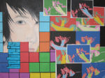
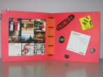
In this class we have discussed a variety of topics that fall under the theme of “Practices of Looking.” These themes, ranging from images and power, to meaning, spectatorship, visual technologies, mass media, consumer culture, postmodernism and popular culture, have become a regular and significant part of our studies. For my final project I decided that I would include aspects from the three themes I enjoyed most this semester: spectatorship, power and knowledge, and popular culture. Rather than creating one image for each of these themes, I included all three In a combination of media and an unconventional visual setup.
The concept of “the gaze” was something we became increasingly familiar with in this class. Although I was really interested in including this theme in my final project, I did not want to do so in a predictable way. Instead of typically depicting a conventionally beautiful female as the object of the gaze, I decided I would break apart from tradition and demonstrate “the gaze” through a male. Using oil paints, I began painting a male subject with piercing blue eyes. I continued to paint the subject’s black hair, nose and a barely significant portion of his pouty lips, but I wanted to focus primarily on the frame around his inviting eyes in order to focus the viewer’s attention on “the gaze” rather than his entire face. Although I did incorporate “the gaze” in a unique manner, I also touched on society’s expectations of beauty by making the subject handsome, with a striking set of baby blues.
As I continued to paint, I realized that I wanted to include more of what we had learned from class into my final project. That is when I decided that I would not only produce the image of an attractive male, but I would also include something vibrant and colourful in the background. At this point, the first thing that came to mind was to borrow ideas from popular culture, but at the same time, I had something more abstract in mind for the background. I almost immediately thought of the popular Nintendo video game from the 1990s, “Tetris,” and I thought it would be interesting to incorporate the colourful shapes from this game into my project. To transmit this idea visually, I decided to print off the various block shapes that fall in “Tetris” in a variety of colours and stick them onto my canvas, slightly overlapping the painted male subject. Perhaps this idea was mainly inspired by Andy Warhol and his tendency to borrow ideas from popular culture, which can be seen through his famous recreation of the Campbell’s soup can. I enjoyed playing Tetris as a child, so the inclusion of this compositional element holds significant meaning for me.
Using “Tetris” as an inspiration for my final project, or in other words, using popular culture and turning it into art, motivated me to take this inspiration further. I remember discussing technology in class, and how we talked about the ways in which visual culture has actually influenced some technological inventions. One technological creation that has been inspired by art is the “photobooth” option on the new Mac computers. With this option, the owner of the computer is able to take photographs in a multitude of styles using the built-in camera. Two of these styles include “comic art,” where benday dots are used for shading, much like Roy Lichtenstein’s art, and “pop art,” where the image is reproduced in four different colour schemes, much like Andy Warhol’s paintings and prints. I printed off numerous images of the pop art-inspired photographs and couldn’t help but think of how this type of image making relates to mass production. These images were added to my final project like a collage, slightly overlapping the “Tetris” shapes and one another.
In conclusion, multiple topics and media inspired my final project. Instead of feeling pressured to choose just one topic or just one means of production I thought of ways that I could explore a number of ideas that interested me. This assignment motivated me to brainstorm ideas of how certain topics we discussed in class could be directly incorporated into artwork, and it also allowed me to actually put what I have learned this semester to good use.
© Zeena Benjamin
Visual Arts — Year 1
Brock University
Oxana Berda: “The Awkward Book”

“The Awkward Book”
(Text and artwork © Oxana Berda)
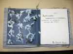
For my final project I chose to do an artist book. The cover is linen—like material with blue and white stripes. The first page has the word “awkward” and its definition written by hand in black ink. The rest of the book is comprised of a series of eighteen mixed media images on nine pages (front and back). The subject matter is implied on the first page, “awkwardness.”
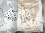
The images within the book are layers of different media. The paper is thick watercolour paper, therefore it provides a dramatic texture. The first layer is watercolour and it includes random spills, paint drags and stamps with various small objects such as coins, bottle caps, little model toys, finger and hand prints. The colour palette consists of pale yellow, muddy orange, grey, and light pale green. The second layer is a woodcut print with acrylic paint. There are two prints and they alternate in succession, colour and subject matter. The first is of a girl’s lap, it is in a greyish brown colour. The second is of a boy’s lap and it is in grey. These images are alternated throughout the book. The woodcuts were not washed off before each new print. This gave the prints an interesting look as the paint got thicker, and as the acrylic would begin to dry the layers would peel off and create darker shades and texture. The third layers are pen and ink drawings of hands, girl hands and boy hands. The book speaks about awkwardness. To portray this I chose to show hands when they have nothing to be occupied with and how awkward they look. The alteration between the male hands and the female hands represent a sense of awkwardness in relationships.
Every page of the book was made by hand, giving the book a sense of completeness that a project done with a computer and/or by more than one person would not possess. Every page has different elements that neither the previous or the following page possesses. The murky colours and the cover give the book an “easy going” feel; this is not something that needs to be handled gently or fussed over. This puts the viewer at ease, letting the art be more accessible. There is, however, a sense of irony here: if hands are empty and have nothing in them, should they not be at ease? Why does “nothing” cause awkwardness?
Although the single images can stand as single pieces, they are more effective together. In this project, repetition helps emphasize the point. Also, without the definition of the word “awkward” at the front of the book, the meaning is lost. The inclusion of the word “awkward” helps frame expectations of this project, although the hard part for the viewer is to really clue into exactly what the message of this piece is.
The ink drawing of the hands are referents, they simply look like hands. There is no universal idea of what hands represent. I chose hands for this project because hands do a lot of things: we cook with them, we clean with them, we handle instruments, etc. We also experience intensely personal moments with our hands, such as holding someone else’s hand for the first time or touching their face or playing with their hair. In the context of two lovers, when hands are doing nothing it becomes an awkward situation; because limp hands are unreadable the situation becomes “difficult to handle and manage.” The latter thought belongs specifically to the artist, and is not a universal thought that every viewer who looks at the book will automatically comprehend. When presenting personal thoughts to a large audience it is expected that denotative meaning will be lost.
The book is not meant to be looked at hung up on the wall, it is meant to be held and touched, so the texture became important. The colours were selected to be soft for both the first and second layers. Also, it was important to me that the last layer had a recognizable referent because the other two layers did not. The decision to have the hands drawn by pen and ink in black was to give the book a sense of graphic strength. The sharp colour and lines contrast nicely against the soft background, they also match the words in the first page, connecting the word “awkward” directly to the hands. Lastly, to give the book a closed—in, uniform look in contrast to what is happening within the pages, I surged the top and bottom of every page, excluding the very first one. This frames the images and, in spite of the broadness of the discussion they fuel, physically closes the idea in. To write a book about the complexity of a specific relationship is next to impossible It would be unorganized, scattered and confusing. To paint, print and draw a book about a specific relationship gives the artist freedom to ignore chronology and focus on the feeling. The mix of abstract elements with realistic art, with text and texture, allows a thought to take physical shape.
© Oxana Berda
Visual Arts — Year 1
Brock University
Oxana Berda: “The Awkward Book”

“The Awkward Book”
(Text and artwork © Oxana Berda)
For my final project I chose to do an artist book. The cover is linen—like material with blue and white stripes. The first page has the word “awkward” and its definition written by hand in black ink. The rest of the book is comprised of a series of eighteen mixed media images on nine pages (front and back). The subject matter is implied on the first page, “awkwardness.”
The images within the book are layers of different media. The paper is thick watercolour paper, therefore it provides a dramatic texture. The first layer is watercolour and it includes random spills, paint drags and stamps with various small objects such as coins, bottle caps, little model toys, finger and hand prints. The colour palette consists of pale yellow, muddy orange, grey, and light pale green. The second layer is a woodcut print with acrylic paint. There are two prints and they alternate in succession, colour and subject matter. The first is of a girl’s lap, it is in a greyish brown colour. The second is of a boy’s lap and it is in grey. These images are alternated throughout the book. The woodcuts were not washed off before each new print. This gave the prints an interesting look as the paint got thicker, and as the acrylic would begin to dry the layers would peel off and create darker shades and texture. The third layers are pen and ink drawings of hands, girl hands and boy hands. The book speaks about awkwardness. To portray this I chose to show hands when they have nothing to be occupied with and how awkward they look. The alteration between the male hands and the female hands represent a sense of awkwardness in relationships.
Every page of the book was made by hand, giving the book a sense of completeness that a project done with a computer and/or by more than one person would not possess. Every page has different elements that neither the previous or the following page possesses. The murky colours and the cover give the book an “easy going” feel; this is not something that needs to be handled gently or fussed over. This puts the viewer at ease, letting the art be more accessible. There is, however, a sense of irony here: if hands are empty and have nothing in them, should they not be at ease? Why does “nothing” cause awkwardness?
Although the single images can stand as single pieces, they are more effective together. In this project, repetition helps emphasize the point. Also, without the definition of the word “awkward” at the front of the book, the meaning is lost. The inclusion of the word “awkward” helps frame expectations of this project, although the hard part for the viewer is to really clue into exactly what the message of this piece is.
The ink drawing of the hands are referents, they simply look like hands. There is no universal idea of what hands represent. I chose hands for this project because hands do a lot of things: we cook with them, we clean with them, we handle instruments, etc. We also experience intensely personal moments with our hands, such as holding someone else’s hand for the first time or touching their face or playing with their hair. In the context of two lovers, when hands are doing nothing it becomes an awkward situation; because limp hands are unreadable the situation becomes “difficult to handle and manage.” The latter thought belongs specifically to the artist, and is not a universal thought that every viewer who looks at the book will automatically comprehend. When presenting personal thoughts to a large audience it is expected that denotative meaning will be lost.
The book is not meant to be looked at hung up on the wall, it is meant to be held and touched, so the texture became important. The colours were selected to be soft for both the first and second layers. Also, it was important to me that the last layer had a recognizable referent because the other two layers did not. The decision to have the hands drawn by pen and ink in black was to give the book a sense of graphic strength. The sharp colour and lines contrast nicely against the soft background, they also match the words in the first page, connecting the word “awkward” directly to the hands. Lastly, to give the book a closed—in, uniform look in contrast to what is happening within the pages, I surged the top and bottom of every page, excluding the very first one. This frames the images and, in spite of the broadness of the discussion they fuel, physically closes the idea in. To write a book about the complexity of a specific relationship is next to impossible It would be unorganized, scattered and confusing. To paint, print and draw a book about a specific relationship gives the artist freedom to ignore chronology and focus on the feeling. The mix of abstract elements with realistic art, with text and texture, allows a thought to take physical shape.
© Oxana Berda
Visual Arts — Year 1
Brock University
Gerg Berkhout: “Tea and Oranges (All the Way From China)”

“Tea and Oranges (All the Way From China)”
(Text and artwork © Greg Berkhout)
For my creative project I have decided to look at the way in which aesthetic and social notions of art making and art viewing have changed over time. In addition to this, I also wanted to create something that tied into my own interest in the processes and results of early printmaking and etching. Although I could not do an actual etching for this project, I wanted my drawings to in some way reflect or reference that form of art making. The triptych that I have made attempts to subtly guide the viewer through early notions of Dutch graphic art, revolutions in thinking, the practice of art making, and contemporary ideas about art in the postmodern world.
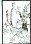
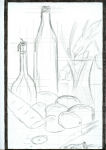
The first drawing attempts to represent a still life image found throughout all ages of graphic art. I chose to make this piece using ink, pencil, and powdered chalk to try and give the drawing the black and white look of an etching. While this removes some of the sensual properties that can be found in other media, such as painting, I wanted to show the importance of graphic art in popular culture. While other media could replicate works through a long, arduous process of draft and revision, printmakers could print multiple copies of their works from one plate. This ability to produce many works of high quality enabled the printmaker to reach the widest possible audience while retaining a level of quality and craftsmanship that was uniform throughout each of the subsequent editions. Within this drawing I have used objects that reference the popular styles of still life painting, using objects which are full of both literal and symbolic meaning.
In the second drawing I have attempted to render the same still life, this time in pencil only. In addition to this, the drawing has been overlaid with the beginnings of a simply grid pattern. The grid overlay signals to the viewer that a distinct process is being used to create the artwork, and references everything from mathematics and geometry to a sense of imposed artificiality. In presenting the piece in this way I wanted to show that art making is an involved process that relies on both talent and skill. I also wanted to show the ability to reproduce an image using the principles of geometry and, therefore, in some way relate the piece to science. Just as etching and printmaking rely on the science of chemistry and physics, this drawing relies on the scientific principles of observation and basic geometry. In using the grid to denote the ability to reproduce an image I wanted to reference the art of etching and its ability to provide mass produced artworks. Just as early prints were widely available to the public (such as early French erotic prints), I wanted my drawing to show the relationship between both contemporary and early art making practices.
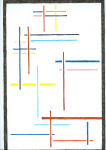
In the third piece I attempted to remove the drawing from behind the grid, allowing only portions of a grid to remain. These remaining portions, represented by lines of varying colour and thickness, reveal an artwork within itself, which would normally be hidden from view. In presenting this as an artwork, I have attempted to alter notions about what is or is not art. What is normally taken only as a scientific tool to aid in image reproduction is now a part of the work itself and becomes something other than what it was originally intended to be. In addition, I wanted the piece to question notions of what art is and to effectively blur the line between aesthetic and cultural value. while this piece would not have been seen as “Art” in previous centuries, the advent of the modern era allows for expressive freedom and completely new ways of seeing. Though simple—looking and, ultimately, minimalist, this piece is wrapped in the history of 20th century art. The addition of colour to this piece serves to further its aesthetic qualities but is really completely irrelevant to the overall concept of the piece.
© Greg Berkhout
VISA 1Q98
Brock University
Greg Berkhout: “Tea and Oranges (All the Way From China)”

“Tea and Oranges (All the Way From China)”
(Text and artwork © Greg Berkhout)
For my creative project I have decided to look at the way in which aesthetic and social notions of art making and art viewing have changed over time. In addition to this, I also wanted to create something that tied into my own interest in the processes and results of early printmaking and etching. Although I could not do an actual etching for this project, I wanted my drawings to in some way reflect or reference that form of art making. The triptych that I have made attempts to subtly guide the viewer through early notions of Dutch graphic art, revolutions in thinking, the practice of art making, and contemporary ideas about art in the postmodern world.
The first drawing attempts to represent a still life image found throughout all ages of graphic art. I chose to make this piece using ink, pencil, and powdered chalk to try and give the drawing the black and white look of an etching. While this removes some of the sensual properties that can be found in other media, such as painting, I wanted to show the importance of graphic art in popular culture. While other media could replicate works through a long, arduous process of draft and revision, printmakers could print multiple copies of their works from one plate. This ability to produce many works of high quality enabled the printmaker to reach the widest possible audience while retaining a level of quality and craftsmanship that was uniform throughout each of the subsequent editions. Within this drawing I have used objects that reference the popular styles of still life painting, using objects which are full of both literal and symbolic meaning.
In the second drawing I have attempted to render the same still life, this time in pencil only. In addition to this, the drawing has been overlaid with the beginnings of a simply grid pattern. The grid overlay signals to the viewer that a distinct process is being used to create the artwork, and references everything from mathematics and geometry to a sense of imposed artificiality. In presenting the piece in this way I wanted to show that art making is an involved process that relies on both talent and skill. I also wanted to show the ability to reproduce an image using the principles of geometry and, therefore, in some way relate the piece to science. Just as etching and printmaking rely on the science of chemistry and physics, this drawing relies on the scientific principles of observation and basic geometry. In using the grid to denote the ability to reproduce an image I wanted to reference the art of etching and its ability to provide mass produced artworks. Just as early prints were widely available to the public (such as early French erotic prints), I wanted my drawing to show the relationship between both contemporary and early art making practices.
In the third piece I attempted to remove the drawing from behind the grid, allowing only portions of a grid to remain. These remaining portions, represented by lines of varying colour and thickness, reveal an artwork within itself, which would normally be hidden from view. In presenting this as an artwork, I have attempted to alter notions about what is or is not art. What is normally taken only as a scientific tool to aid in image reproduction is now a part of the work itself and becomes something other than what it was originally intended to be. In addition, I wanted the piece to question notions of what art is and to effectively blur the line between aesthetic and cultural value. while this piece would not have been seen as “Art” in previous centuries, the advent of the modern era allows for expressive freedom and completely new ways of seeing. Though simple—looking and, ultimately, minimalist, this piece is wrapped in the history of 20th century art. The addition of colour to this piece serves to further its aesthetic qualities but is really completely irrelevant to the overall concept of the piece.
© Greg Berkhout
VISA 1Q98
Brock University
Jessica Butt: “The Postmodern Olympia”

“The Postmodern Olympia”
(Text and artwork © Jessica Butt)
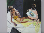
For this final project I chose to reproduce Manet’s Olympia with respect to what is considered beautiful in Western society today. I created this project by flipping through magazines over the semester and cutting out photographic images portraying sections of women’s bodies. The images I selected were those that inspired inadequacy in my own body image; specific parts that are considered perfect in popular culture. Ironically, the woman who replaced Olympia in my composition is anything but perfect. In fact, she looks rather monstrous and grotesque. I decided to title the project “The Postmodern Olympia” because my project challenges modern society’s expectations of women and the lack of healthy body image that these expectations have produced. The finished composition also includes themes of authenticity and aura, technological transitions, questions of power and other recognizable aspects of the postmodern era.
Questions of authenticity and aura arise in this project. I am referencing a historical painting — has it lost its sense of originality? I would argue that, in fact, my piece is authentic, and has not lost its aura. Although my project deliberately references another painting, the main focus and meaning has been critically altered and, as such, a new piece of art is created. The reference to Manet’s work is only meant to facilitate a sense of intertextuality in the mind of the viewer who will likely associate the changing ideals of beauty across time with the “reclining female” found in many famous paintings. If the painting was an exact replica of Manet’s Olympia it would not be an authentic work. However, one may say that even the woman is not authentic because she is made up from a variety of mass—produced images.
Another important theme that my project addresses is the contrast between new and old technologies. The paint—on—canvas portion symbolizes old technologies, while the female figure is made up of mass—produced images taken from a number of different magazines. The different parts of her body can be found in magazines like Vogue, Glow, Fashion, People and Shape and have been reproduced thousands of times. Also, these images have been digitally altered in order to achieve the illusion of a ”perfect” body. This digital altering can raise many questions: are these true representations of the female body at all?
This type of image manipulation has been blamed for the high levels of negative body image in our culture. After discovering this I wondered why advertisers are predominantly targeting women’s body images and why our society sets up the ideal beauty as something unattainable. I came to the conclusion that these corporations are not necessarily looking for people to buy their products, but, rather, they are selling the ideals of a capitalist lifestyle. This lifestyle is characterized by the need to consume products and the inability to live without them. For these corporations women are an easy target because have been inundated with messages about what is considered to be beautiful since they were very young.
This relates directly to the theme of power dynamics displayed in my project. These power dynamics are very complex because of its postmodern nature. Originally these images were meant to take away power from the viewer, to encourage a lack of satisfaction with one’s current image in order to sell consumer products. However, the way in which I put the composition together was meant to empower the viewer. By recontextualizing these images I wanted to make the viewer aware of the dangers of advertising and let them decide what “true beauty” is.
There is a further interesting tie between Manet’s original Olympia and my Postmodern Olympia —— we can see the threads of the “male gaze” woven into both societies. As Manet depicted a reclining nude female (who was, in fact, a prostitute), so does much of advertising in society today. In many of the images that the parts of my composition were taken from, the woman in the advertisement was resting, somewhat exposed, and in some cases posed in provocative positions. The eyes of the women are averted, as if unaware of (or unwilling to meet?) our gazes.
The purpose of my project was to comment on the way women desire to be beautiful. I found it very important to include the slave into the reproduction because this further signifies the concept of “the gaze.” The slave is not thin, is wearing tattered clothes and is dark—skinned, in all respects the opposite of the “ideal” of beauty perpetuated by mainstream culture. In this picture she is looking at the subject with a look of disgust and sarcasm on her face. The slave represents the audience that the advertiser is targeting, but here she is acting an appropriate manner and casting scepticism on this sense of “ideal beauty.”
My goal in referencing Manet’s Olympiais to inspire thought in the viewer about the cultural meaning of beauty as expressed through the image of the reclining female figure. This is reflexive because the reclining female is a cultural icon of beauty that many members of society can recognize. By adding the “ad woman” into the scheme, the reflexive message transforms from codes of postmodern advertising to that of postmodern high culture. As Cindy Sherman create reflexive photography that commented on the viewer’s perceptions of the roles of women, the Postmodern Olympia comments on the audience perception of the ideal body image that many women want to achieve. The real art in the composition is in the minds of the audience; what the different parts tell them about their own body. The composition is not complete without an audience.
© Jessica Butt
Concurrent Education —Year 1
Brock University
Lauren Caldwell: “Practices of Flipping”

“Practices of Flipping”
(Text and artwork © Lauren Caldwell)
This piece plays off the idea of reflection. As one flips through the pages they see themselves reflected within the images due to the use of a mirror. This is symbolic of the way that visual culture is reflected into our society in all different aspects. Similarly, we as individuals, reflect our values and ideals onto culture. At the end of the book is a blank cut of mirror allowing the viewer to determine they, as an individual, can situate themselves in this process.
© Lauren Caldwell
Concurrent Education — Year 1
Brock University
Lauren Caldwell: “Practices of Flipping”

“Practices of Flipping”
(Text and artwork © Lauren Caldwell)
This piece plays off the idea of reflection. As one flips through the pages they see themselves reflected within the images due to the use of a mirror. This is symbolic of the way that visual culture is reflected into our society in all different aspects. Similarly, we as individuals, reflect our values and ideals onto culture. At the end of the book is a blank cut of mirror allowing the viewer to determine they, as an individual, can situate themselves in this process.
© Lauren Caldwell
Concurrent Education — Year 1
Brock University
Greg Caskie: “Two T—Shirts and a Skateboard Graphic”

“Two T—Shirts and a Skateboard Graphic”
(Text and artwork © Greg Caskie)
I took this class to learn a little bit more about visual culture and have come away with a better understanding of how things have been viewed in history, and how they are being viewed today. Despite this I still found it very challenging to come up with any creative ideas to create some form of visual culture myself. In the end I chose to produce three pieces of visual culture, two t—shirts and one skateboard graphic. Each piece deals with a separate topic that we have dealt with in VISA 1Q98.
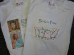
The first t—shirt I made deals with the concept of celebrity icons in our society. It includes two photos — one of David Bowie and the other of Britney Spears. The goal is for the viewer to compare these two celebrities and think about what they represent in our society. Upon looking at Britney Spears, for instance, you are not just looking at a young woman of twenty—five years old, who is currently going through a divorce. You are also looking at one of the most successful and well—known singers in the last decade. Britney Spears has come to be representative of every young female pop singer. She has also come to represent the height of celebrity, one who is followed relentlessly by paparazzi. I put question marks next to the text, “PROFESSION: musician,” which appears under her picture to force the viewer to think about the fact that Britney Spears is not in the news for her music anymore. David Bowie is another musical icon and he is pictured here from his Ziggy Stardust era, circa 1972. David Bowie, especially during his Ziggy period, represents glam rock and roll taken to extremes. In comparing these two icons, we can see that both Britney Spears and David Bowie have pushed society’s sexual boundaries through the characters they have portrayed. Britney Spears dared to be overtly sexual at a very young age and David Bowie dared to develop a character that was openly homosexual at a time when that was still taboo.
Another aspect in which these two icons can be compared is their impact on visual culture within the music industry. David Bowie was known for his flamboyant appearance, and allowed those who followed him musically to express themselves more than they would have been able to prior to him. As well, the argument can be made that Britney Spears is better known for her music videos and live stage performances than she is for her actual music. Both icons took full advantage of the still young medium of television to further their music career. I wanted to viewer to question the value of both of these icons on popular culture, and to determine who they valued and why they idolized that musician.
The second piece is another t—shirt, this time with what I have dubbed the “Rainbow Posse.” The “Rainbow Posse” is an attempt at postmodern art. They are essentially a group of little more than stick people standing together with their arms raised. I attempted to challenge what art was by making this collection of basic figures. There are three goals related to this piece. First of all, I wanted to make the viewer question how an image’s value is determined in our society. Does this image have any value? Who decides this? My second goal was to challenge the social and racial segregation that still exists today. My image shows many characters of different colours standing together. The goal was to demonstrate that many people of many different races can live together in harmony. Furthermore, by calling the group a “posse” I am attempting to show the strength of this group of characters. It is also meant to be a tad ironic, as rainbows and stick people do not normally convey strength. Still, the ultimate goal is to bring about some sort of emotion in the viewer, to make them smile at the simplicity of this piece of visual culture. The characters have their arms raised, presumably out of happiness. I was hoping to create an emotional connection that was the exact opposite to what was seen in the lecture material on photojournalism, where we saw photos like Eddie Adams’ photo General Loan Executing a Vietcong Suspect and Nick Ut’s Children Fleeing a Napalm Strike. Hopefully my image will make viewers smile.
It is important to note that these t—shirts made use of new technologies. Both used the computer as a means of production, and represent how technology shapes visual culture. Now anyone with a computer and printer can purchase t—shirt transfer paper and can place n image on a t—shirt to represent anything they want. This allows people to express themselves in a way that is not subject to commercial brands available in stores. Before people may have chosen to express themselves through the brands they wore; the current technology allows almost anyone to combat the commodity culture that we currently live in.
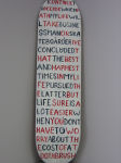
The final image I chose to create, and by far the most challenging, was the skateboard graphic. I chose the medium of a skateboard because it is part of the struggle that the narrative discusses. I felt that using this medium for the project was a way of combining both aspects that I am struggling with, namely the pursuit of a Bachelor of Business Administration Degree (VISA 1Q98 counts as one of my electives), and the pursuit of things in life that I truly enjoy. Basically the narrative implies that I’m concerned that business success may lead to personal unhappiness as I pursue financial success above all else. I felt that in the context of this assignment I could almost combine the two and perhaps demonstrate that business success and the pursuit of the things in life that I enjoy are not necessarily mutually exclusive.
I considered using a couple of different methods of painting, including stencilling the text, and using paint markers which are significantly easier to handle, but chose to use brushes. I made this decision in order to create a kind of more sloppy effect on the graphic. I wanted this because it represents skateboarding more accurately —— skateboarding is sloppy. The graphic will become scratched when I ride this board in the future, and the tips will be come chipped and will grind down. My shoes and clothes will become ripped as I fall, hopefully my skin can avoid the same fate. But the point is that the sloppy brush strokes are demonstrating the sloppy nature of the activity in which this will be used. I had in mind the impressionistic paintings when I was choosing this method. Artists like Monet tried to capture not just the exact landscape that they painted, but the light and the feel and how they interacted. In this image I tried to demonstrate the interaction between the sloppy image and the sloppy nature of the activity. Also, this image is text and tells a narrative; specifically it talks about me and my thoughts. I wanted the viewer to be aware of the means of production of this graphic, basically that I have painted this graphic. I thought this was important to convey the “do it yourself” mentality that has made skateboarding one of the most important aspects of pop culture in the past fifty years.
Each aspect of my final project for VISA 1Q98 had a goal. The first t—shirt was meant to challenge the viewer to think about just what they idolize. The second t—shirt image has many subplots, such as questioning the criteria used to determine if something is “art,” the need to eliminate segregation in our society, and to make the viewer smile. The final image of the skateboard graphic was done mainly for me, to write something that I was feeling and put it on display for others who may be feeling the same way. I am actually quite pleased with how all these pieces turned out, given my lack of artistic training.
© Greg Caskie
Business Administration Co—op Program — Year 4
Brock University
Greg Caskie: “Two T—Shirts and a Skateboard Graphic”

“Two T—Shirts and a Skateboard Graphic”
(Text and artwork © Greg Caskie)
I took this class to learn a little bit more about visual culture and have come away with a better understanding of how things have been viewed in history, and how they are being viewed today. Despite this I still found it very challenging to come up with any creative ideas to create some form of visual culture myself. In the end I chose to produce three pieces of visual culture, two t—shirts and one skateboard graphic. Each piece deals with a separate topic that we have dealt with in VISA 1Q98.
The first t—shirt I made deals with the concept of celebrity icons in our society. It includes two photos — one of David Bowie and the other of Britney Spears. The goal is for the viewer to compare these two celebrities and think about what they represent in our society. Upon looking at Britney Spears, for instance, you are not just looking at a young woman of twenty—five years old, who is currently going through a divorce. You are also looking at one of the most successful and well—known singers in the last decade. Britney Spears has come to be representative of every young female pop singer. She has also come to represent the height of celebrity, one who is followed relentlessly by paparazzi. I put question marks next to the text, “PROFESSION: musician,” which appears under her picture to force the viewer to think about the fact that Britney Spears is not in the news for her music anymore. David Bowie is another musical icon and he is pictured here from his Ziggy Stardust era, circa 1972. David Bowie, especially during his Ziggy period, represents glam rock and roll taken to extremes. In comparing these two icons, we can see that both Britney Spears and David Bowie have pushed society’s sexual boundaries through the characters they have portrayed. Britney Spears dared to be overtly sexual at a very young age and David Bowie dared to develop a character that was openly homosexual at a time when that was still taboo.
Another aspect in which these two icons can be compared is their impact on visual culture within the music industry. David Bowie was known for his flamboyant appearance, and allowed those who followed him musically to express themselves more than they would have been able to prior to him. As well, the argument can be made that Britney Spears is better known for her music videos and live stage performances than she is for her actual music. Both icons took full advantage of the still young medium of television to further their music career. I wanted to viewer to question the value of both of these icons on popular culture, and to determine who they valued and why they idolized that musician.
The second piece is another t—shirt, this time with what I have dubbed the “Rainbow Posse.” The “Rainbow Posse” is an attempt at postmodern art. They are essentially a group of little more than stick people standing together with their arms raised. I attempted to challenge what art was by making this collection of basic figures. There are three goals related to this piece. First of all, I wanted to make the viewer question how an image’s value is determined in our society. Does this image have any value? Who decides this? My second goal was to challenge the social and racial segregation that still exists today. My image shows many characters of different colours standing together. The goal was to demonstrate that many people of many different races can live together in harmony. Furthermore, by calling the group a “posse” I am attempting to show the strength of this group of characters. It is also meant to be a tad ironic, as rainbows and stick people do not normally convey strength. Still, the ultimate goal is to bring about some sort of emotion in the viewer, to make them smile at the simplicity of this piece of visual culture. The characters have their arms raised, presumably out of happiness. I was hoping to create an emotional connection that was the exact opposite to what was seen in the lecture material on photojournalism, where we saw photos like Eddie Adams’ photo General Loan Executing a Vietcong Suspect and Nick Ut’s Children Fleeing a Napalm Strike. Hopefully my image will make viewers smile.
It is important to note that these t—shirts made use of new technologies. Both used the computer as a means of production, and represent how technology shapes visual culture. Now anyone with a computer and printer can purchase t—shirt transfer paper and can place n image on a t—shirt to represent anything they want. This allows people to express themselves in a way that is not subject to commercial brands available in stores. Before people may have chosen to express themselves through the brands they wore; the current technology allows almost anyone to combat the commodity culture that we currently live in.
The final image I chose to create, and by far the most challenging, was the skateboard graphic. I chose the medium of a skateboard because it is part of the struggle that the narrative discusses. I felt that using this medium for the project was a way of combining both aspects that I am struggling with, namely the pursuit of a Bachelor of Business Administration Degree (VISA 1Q98 counts as one of my electives), and the pursuit of things in life that I truly enjoy. Basically the narrative implies that I’m concerned that business success may lead to personal unhappiness as I pursue financial success above all else. I felt that in the context of this assignment I could almost combine the two and perhaps demonstrate that business success and the pursuit of the things in life that I enjoy are not necessarily mutually exclusive.
I considered using a couple of different methods of painting, including stencilling the text, and using paint markers which are significantly easier to handle, but chose to use brushes. I made this decision in order to create a kind of more sloppy effect on the graphic. I wanted this because it represents skateboarding more accurately —— skateboarding is sloppy. The graphic will become scratched when I ride this board in the future, and the tips will be come chipped and will grind down. My shoes and clothes will become ripped as I fall, hopefully my skin can avoid the same fate. But the point is that the sloppy brush strokes are demonstrating the sloppy nature of the activity in which this will be used. I had in mind the impressionistic paintings when I was choosing this method. Artists like Monet tried to capture not just the exact landscape that they painted, but the light and the feel and how they interacted. In this image I tried to demonstrate the interaction between the sloppy image and the sloppy nature of the activity. Also, this image is text and tells a narrative; specifically it talks about me and my thoughts. I wanted the viewer to be aware of the means of production of this graphic, basically that I have painted this graphic. I thought this was important to convey the “do it yourself” mentality that has made skateboarding one of the most important aspects of pop culture in the past fifty years.
Each aspect of my final project for VISA 1Q98 had a goal. The first t—shirt was meant to challenge the viewer to think about just what they idolize. The second t—shirt image has many subplots, such as questioning the criteria used to determine if something is “art,” the need to eliminate segregation in our society, and to make the viewer smile. The final image of the skateboard graphic was done mainly for me, to write something that I was feeling and put it on display for others who may be feeling the same way. I am actually quite pleased with how all these pieces turned out, given my lack of artistic training.
© Greg Caskie
Business Administration Co—op Program — Year 4
Brock University
Cindy Chan: “Practices of Looking: Defining Beauty”

“Practices of Looking: Defining Beauty”
(Text and artwork © Cindy Chan)
When flipping through a magazine or looking through a school yearbook with a friend, comments like “she’s pretty!” are said frequently. But what exactly defines beauty? The artwork included in my final VISA 1Q98 project are pencil sketches that focus on this theme. Let them be a practice of looking at beauty from different perspectives.
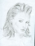
The first sketch I did is of a typical model commonly portrayed in fashion magazines. Advertisers try to manipulate viewers by presenting an ideal image of a woman that would appeal to readers of these magazines. This form of visual culture has implanted in many people’s minds the idea that those who possess perfectly sculpted bodies and unblemished visages are the only ones that can be considered beautiful. According to modern advertising, for women to be considered glamorous they must have a made—up face, a chic hairstyle and a fresh appearance. In short, women who can achieve standards of these models are labelled by the media as “beautiful.”
The second drawing is of a ballerina with her back turned towards the viewer. Often the art of ballet dancing is associated with grace and beauty; it is perceived by many to be an art of the upper—class and the aristocratic. There are many reasons that influence this perception. For the dancer, ballet lessons represent a considerable amount of financial investment, and for spectators, tickets to see these shows are expensive. Classifying ballet as an art form of beauty may just be an ideology of the high society.
The third drawing is taken from a Nike sports ad. It shows a female model posed as a professional beach volleyball player. In this instance, the model in this picture displays a strong sense of self—empowerment, confidence and individualism. Her active stance is resistant to traditional images of women perpetuated in the media. This ideal of beauty, therefore, is very much determined by the taste and personal opinion of those viewing images like this.
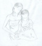
The fourth image is a sketch taken from a family photograph. The young woman on the left is my cousin and the one on the right is her daughter. This picture was included as a form of beauty for unique reasons. First of all, this is not a type of beauty necessarily appreciated by all members of society. This is because these two people hold sentimental value to specific people, such as the woman’s husband, her close relatives and friends. This, this is a personal view of beauty, not one that is determined by superficial appearances such as facial features or toned muscles, but, instead, by the relationships developed between these young women and those looking at this image. My cousin’s husband, for instance, considers these two young women to be the most beautiful beings on earth.
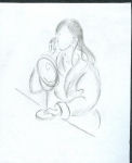
The last image is a sketch of a woman looking at her own reflection in a dressing table mirror. Although the character in the picture is female, this image can be applied equally to both men and women. For instance, many people spend extra time perfecting their looks in the morning and make sure to check from all views in the mirror so that what reflects satisfies their eyes. Here, self image becomes an important aspect of beauty. Some people are dissatisfied with what they see in the mirror and try to reshape their looks to appear like the model in the first image. While most people are caught up in fixing their looks, there are some who learn to appreciate their uniqueness despite what others may think of them. These are the people who remain uninfluenced by the media ideology that states that women must be slim, stylish and trendy in order to be considered beautiful.
When you look at these five sketches together, it is immediately obvious that only the first image includes detailed facial features. I did this deliberately to emphasize the fact that fashion models are typically the icon of beauty in today’s society. The remaining images many not be interpreted the same way for different viewers. Besides superficial aspects, what qualities make someone beautiful? Indeed, these are examples exceptional to each individual influenced by their cultural background, family values and intimate relationships.
© Cindy Chan
Concurrent Education (French) — Year 1
Brock University
Cindy Chan: “Practices of Looking: Defining Beauty”

“Practices of Looking: Defining Beauty”
(Text and artwork © Cindy Chan)
When flipping through a magazine or looking through a school yearbook with a friend, comments like “she’s pretty!” are said frequently. But what exactly defines beauty? The artwork included in my final VISA 1Q98 project are pencil sketches that focus on this theme. Let them be a practice of looking at beauty from different perspectives.
The first sketch I did is of a typical model commonly portrayed in fashion magazines. Advertisers try to manipulate viewers by presenting an ideal image of a woman that would appeal to readers of these magazines. This form of visual culture has implanted in many people’s minds the idea that those who possess perfectly sculpted bodies and unblemished visages are the only ones that can be considered beautiful. According to modern advertising, for women to be considered glamorous they must have a made—up face, a chic hairstyle and a fresh appearance. In short, women who can achieve standards of these models are labelled by the media as “beautiful.”
The second drawing is of a ballerina with her back turned towards the viewer. Often the art of ballet dancing is associated with grace and beauty; it is perceived by many to be an art of the upper—class and the aristocratic. There are many reasons that influence this perception. For the dancer, ballet lessons represent a considerable amount of financial investment, and for spectators, tickets to see these shows are expensive. Classifying ballet as an art form of beauty may just be an ideology of the high society.
The third drawing is taken from a Nike sports ad. It shows a female model posed as a professional beach volleyball player. In this instance, the model in this picture displays a strong sense of self—empowerment, confidence and individualism. Her active stance is resistant to traditional images of women perpetuated in the media. This ideal of beauty, therefore, is very much determined by the taste and personal opinion of those viewing images like this.
The fourth image is a sketch taken from a family photograph. The young woman on the left is my cousin and the one on the right is her daughter. This picture was included as a form of beauty for unique reasons. First of all, this is not a type of beauty necessarily appreciated by all members of society. This is because these two people hold sentimental value to specific people, such as the woman’s husband, her close relatives and friends. This, this is a personal view of beauty, not one that is determined by superficial appearances such as facial features or toned muscles, but, instead, by the relationships developed between these young women and those looking at this image. My cousin’s husband, for instance, considers these two young women to be the most beautiful beings on earth.
The last image is a sketch of a woman looking at her own reflection in a dressing table mirror. Although the character in the picture is female, this image can be applied equally to both men and women. For instance, many people spend extra time perfecting their looks in the morning and make sure to check from all views in the mirror so that what reflects satisfies their eyes. Here, self image becomes an important aspect of beauty. Some people are dissatisfied with what they see in the mirror and try to reshape their looks to appear like the model in the first image. While most people are caught up in fixing their looks, there are some who learn to appreciate their uniqueness despite what others may think of them. These are the people who remain uninfluenced by the media ideology that states that women must be slim, stylish and trendy in order to be considered beautiful.
When you look at these five sketches together, it is immediately obvious that only the first image includes detailed facial features. I did this deliberately to emphasize the fact that fashion models are typically the icon of beauty in today’s society. The remaining images many not be interpreted the same way for different viewers. Besides superficial aspects, what qualities make someone beautiful? Indeed, these are examples exceptional to each individual influenced by their cultural background, family values and intimate relationships.
© Cindy Chan
Concurrent Education (French) — Year 1
Brock University
Cindy Chan: “Practices of Looking: Defining Beauty”

“Practices of Looking: Defining Beauty”
(Text and artwork © Cindy Chan)
When flipping through a magazine or looking through a school yearbook with a friend, comments like “she’s pretty!” are said frequently. But what exactly defines beauty? The artwork included in my final VISA 1Q98 project are pencil sketches that focus on this theme. Let them be a practice of looking at beauty from different perspectives.
The first sketch I did is of a typical model commonly portrayed in fashion magazines. Advertisers try to manipulate viewers by presenting an ideal image of a woman that would appeal to readers of these magazines. This form of visual culture has implanted in many people’s minds the idea that those who possess perfectly sculpted bodies and unblemished visages are the only ones that can be considered beautiful. According to modern advertising, for women to be considered glamorous they must have a made—up face, a chic hairstyle and a fresh appearance. In short, women who can achieve standards of these models are labelled by the media as “beautiful.”
The second drawing is of a ballerina with her back turned towards the viewer. Often the art of ballet dancing is associated with grace and beauty; it is perceived by many to be an art of the upper—class and the aristocratic. There are many reasons that influence this perception. For the dancer, ballet lessons represent a considerable amount of financial investment, and for spectators, tickets to see these shows are expensive. Classifying ballet as an art form of beauty may just be an ideology of the high society.
The third drawing is taken from a Nike sports ad. It shows a female model posed as a professional beach volleyball player. In this instance, the model in this picture displays a strong sense of self—empowerment, confidence and individualism. Her active stance is resistant to traditional images of women perpetuated in the media. This ideal of beauty, therefore, is very much determined by the taste and personal opinion of those viewing images like this.
The fourth image is a sketch taken from a family photograph. The young woman on the left is my cousin and the one on the right is her daughter. This picture was included as a form of beauty for unique reasons. First of all, this is not a type of beauty necessarily appreciated by all members of society. This is because these two people hold sentimental value to specific people, such as the woman’s husband, her close relatives and friends. This, this is a personal view of beauty, not one that is determined by superficial appearances such as facial features or toned muscles, but, instead, by the relationships developed between these young women and those looking at this image. My cousin’s husband, for instance, considers these two young women to be the most beautiful beings on earth.
The last image is a sketch of a woman looking at her own reflection in a dressing table mirror. Although the character in the picture is female, this image can be applied equally to both men and women. For instance, many people spend extra time perfecting their looks in the morning and make sure to check from all views in the mirror so that what reflects satisfies their eyes. Here, self image becomes an important aspect of beauty. Some people are dissatisfied with what they see in the mirror and try to reshape their looks to appear like the model in the first image. While most people are caught up in fixing their looks, there are some who learn to appreciate their uniqueness despite what others may think of them. These are the people who remain uninfluenced by the media ideology that states that women must be slim, stylish and trendy in order to be considered beautiful.
When you look at these five sketches together, it is immediately obvious that only the first image includes detailed facial features. I did this deliberately to emphasize the fact that fashion models are typically the icon of beauty in today’s society. The remaining images many not be interpreted the same way for different viewers. Besides superficial aspects, what qualities make someone beautiful? Indeed, these are examples exceptional to each individual influenced by their cultural background, family values and intimate relationships.
© Cindy Chan
Concurrent Education (French) — Year 1
Brock University
Cindy Chan: “Practices of Looking: Defining Beauty”

“Practices of Looking: Defining Beauty”
(Text and artwork © Cindy Chan)
When flipping through a magazine or looking through a school yearbook with a friend, comments like “she’s pretty!” are said frequently. But what exactly defines beauty? The artwork included in my final VISA 1Q98 project are pencil sketches that focus on this theme. Let them be a practice of looking at beauty from different perspectives.
The first sketch I did is of a typical model commonly portrayed in fashion magazines. Advertisers try to manipulate viewers by presenting an ideal image of a woman that would appeal to readers of these magazines. This form of visual culture has implanted in many people’s minds the idea that those who possess perfectly sculpted bodies and unblemished visages are the only ones that can be considered beautiful. According to modern advertising, for women to be considered glamorous they must have a made—up face, a chic hairstyle and a fresh appearance. In short, women who can achieve standards of these models are labelled by the media as “beautiful.”
The second drawing is of a ballerina with her back turned towards the viewer. Often the art of ballet dancing is associated with grace and beauty; it is perceived by many to be an art of the upper—class and the aristocratic. There are many reasons that influence this perception. For the dancer, ballet lessons represent a considerable amount of financial investment, and for spectators, tickets to see these shows are expensive. Classifying ballet as an art form of beauty may just be an ideology of the high society.
The third drawing is taken from a Nike sports ad. It shows a female model posed as a professional beach volleyball player. In this instance, the model in this picture displays a strong sense of self—empowerment, confidence and individualism. Her active stance is resistant to traditional images of women perpetuated in the media. This ideal of beauty, therefore, is very much determined by the taste and personal opinion of those viewing images like this.
The fourth image is a sketch taken from a family photograph. The young woman on the left is my cousin and the one on the right is her daughter. This picture was included as a form of beauty for unique reasons. First of all, this is not a type of beauty necessarily appreciated by all members of society. This is because these two people hold sentimental value to specific people, such as the woman’s husband, her close relatives and friends. This, this is a personal view of beauty, not one that is determined by superficial appearances such as facial features or toned muscles, but, instead, by the relationships developed between these young women and those looking at this image. My cousin’s husband, for instance, considers these two young women to be the most beautiful beings on earth.
The last image is a sketch of a woman looking at her own reflection in a dressing table mirror. Although the character in the picture is female, this image can be applied equally to both men and women. For instance, many people spend extra time perfecting their looks in the morning and make sure to check from all views in the mirror so that what reflects satisfies their eyes. Here, self image becomes an important aspect of beauty. Some people are dissatisfied with what they see in the mirror and try to reshape their looks to appear like the model in the first image. While most people are caught up in fixing their looks, there are some who learn to appreciate their uniqueness despite what others may think of them. These are the people who remain uninfluenced by the media ideology that states that women must be slim, stylish and trendy in order to be considered beautiful.
When you look at these five sketches together, it is immediately obvious that only the first image includes detailed facial features. I did this deliberately to emphasize the fact that fashion models are typically the icon of beauty in today’s society. The remaining images many not be interpreted the same way for different viewers. Besides superficial aspects, what qualities make someone beautiful? Indeed, these are examples exceptional to each individual influenced by their cultural background, family values and intimate relationships.
© Cindy Chan
Concurrent Education (French) — Year 1
Brock University
Cindy Chan: “Practices of Looking: Defining Beauty”

“Practices of Looking: Defining Beauty”
(Text and artwork © Cindy Chan)
When flipping through a magazine or looking through a school yearbook with a friend, comments like “she’s pretty!” are said frequently. But what exactly defines beauty? The artwork included in my final VISA 1Q98 project are pencil sketches that focus on this theme. Let them be a practice of looking at beauty from different perspectives.
The first sketch I did is of a typical model commonly portrayed in fashion magazines. Advertisers try to manipulate viewers by presenting an ideal image of a woman that would appeal to readers of these magazines. This form of visual culture has implanted in many people’s minds the idea that those who possess perfectly sculpted bodies and unblemished visages are the only ones that can be considered beautiful. According to modern advertising, for women to be considered glamorous they must have a made—up face, a chic hairstyle and a fresh appearance. In short, women who can achieve standards of these models are labelled by the media as “beautiful.”
The second drawing is of a ballerina with her back turned towards the viewer. Often the art of ballet dancing is associated with grace and beauty; it is perceived by many to be an art of the upper—class and the aristocratic. There are many reasons that influence this perception. For the dancer, ballet lessons represent a considerable amount of financial investment, and for spectators, tickets to see these shows are expensive. Classifying ballet as an art form of beauty may just be an ideology of the high society.
The third drawing is taken from a Nike sports ad. It shows a female model posed as a professional beach volleyball player. In this instance, the model in this picture displays a strong sense of self—empowerment, confidence and individualism. Her active stance is resistant to traditional images of women perpetuated in the media. This ideal of beauty, therefore, is very much determined by the taste and personal opinion of those viewing images like this.
The fourth image is a sketch taken from a family photograph. The young woman on the left is my cousin and the one on the right is her daughter. This picture was included as a form of beauty for unique reasons. First of all, this is not a type of beauty necessarily appreciated by all members of society. This is because these two people hold sentimental value to specific people, such as the woman’s husband, her close relatives and friends. This, this is a personal view of beauty, not one that is determined by superficial appearances such as facial features or toned muscles, but, instead, by the relationships developed between these young women and those looking at this image. My cousin’s husband, for instance, considers these two young women to be the most beautiful beings on earth.
The last image is a sketch of a woman looking at her own reflection in a dressing table mirror. Although the character in the picture is female, this image can be applied equally to both men and women. For instance, many people spend extra time perfecting their looks in the morning and make sure to check from all views in the mirror so that what reflects satisfies their eyes. Here, self image becomes an important aspect of beauty. Some people are dissatisfied with what they see in the mirror and try to reshape their looks to appear like the model in the first image. While most people are caught up in fixing their looks, there are some who learn to appreciate their uniqueness despite what others may think of them. These are the people who remain uninfluenced by the media ideology that states that women must be slim, stylish and trendy in order to be considered beautiful.
When you look at these five sketches together, it is immediately obvious that only the first image includes detailed facial features. I did this deliberately to emphasize the fact that fashion models are typically the icon of beauty in today’s society. The remaining images many not be interpreted the same way for different viewers. Besides superficial aspects, what qualities make someone beautiful? Indeed, these are examples exceptional to each individual influenced by their cultural background, family values and intimate relationships.
© Cindy Chan
Concurrent Education (French) — Year 1
Brock University
Alice Chang: “Questions of Authenticity”

“Questions of Authenticity”
(Text and artwork © Alice Chang)
My project reflects the affects technology has had on visual arts. I have chosen to do a painting to address some subjects that fall under this theme. The reason for doing a painting, as opposed to working with other media, was so that I could relate to earlier ways of making art.
Part of my project deals with the reproduction of images. As the technology to reproduce images developed, concerns regarding authenticity arose. In the past artists would have to copy by hand any reproductions of a painting they wished to make. Now that photography is available, copies of the original pieces can be quickly and infinitely reproduced. To respond to this shift, I have taken elements from past visual practices and attempted to connect them to present—day visual technologies this was done with the intention to address questions regarding authenticity.
The materials I chose for this project were specifically picked to represent the evolution of technology from previous historical periods to the postmodern era. The wood panel was my selected choice of painting surface. It is one of the most ancient materials used in painting. Up until the sixteenth century, oil paintings were done on wooden panels. However, wooden panels did not always provide the kind of longevity an artist hoped for, so the preferred surface became canvas. In this project, my choice of a wood panel symbolizes the place this material had in the history of painting. To fuse the past with the present I have selected acrylic paint for the pigment in this project. Acrylic paint is a fairly recent technology and its increased popularity has to do with its advantages over oil paints. For one thing, its drying time is much faster than that of oil paint. Other advantages include to its versatility; due to chemical compounds in acrylic it binds easily to many surfaces and the colours do not fads as easily as oil paint.
To further emphasize the effect technology has had on the production of artwork, I selected to use the technique of image transfer. This is done using an acrylic medium gel on inkjet printed photographs. The usage of inkjet photos brings in what I wanted to communicate with this project. The photos represent the technology to mass reproduce images. In my project, one image has been printed out more than once and transferred onto the wooden panel. I did not take the photographs myself; I merely “grabbed” them off the internet. This shows the wide accessibility to information via the World Wide Web. My actions raise questions to the value of images from the web page as well questions regarding ownership also apply. How much are these concerns valued in our society?
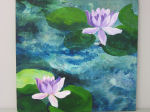
Having introduced the materials, I will now explain the process of how the final product came about. The choice of having lotus flowers as my subject was just a personal liking of the flower. However, the focus here isn’t about the subject per se, it is about questioning the value and meaning of reproduced image. After mentally sketching out where the placements of the flowers were going to be, it was time to transfer the images onto the panel. After this process was complete I applied acrylic paint over the images to pull the whole composition together. Inkjet photos are usually not the best quality, thus I applied the acrylic paint to bring out the life absent from the images. In doing this I have appropriated the original photos. Now this is where my questions arise: do I take sole credit for this painting? Do the original photographs lose their authenticity and aura? Do I give the original photographer recognition? Is this an appropriate practice? Do these concerns even matter?
© Alice Chang
Visual Arts — Year 1
Brock University
Danielle Chartrand: “Re—creating the Creation of Mankind”

“Re—creating the Creation of Mankind”
(Text and artwork © Danielle Chartrand)
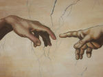
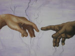
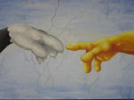
I was inspired by Michelangelo’s painting, The Creation of Adam and decided to base my final VISA 1Q98 project on this celebrated Renaissance masterpiece. The three paintings I have completed for this project are reproductions, primarily based on one iconic element of Michelangelo’s famous painting, the touching fingers. The first painting is based quite closely on Michelangelo’s original composition, however, it projects a different meaning in the context of my project. The two additional paintings touch on such topics as gender, taste, high and low culture, power and parody.
Michelangelo’s painting is one of the extraordinarily painted frescoes on the ceiling of the Sistine Chapel. The painting illustrates the biblical story of the book of Genesis, in which God creates Adam, the first man. In reproducing my own versions of the touching fingers the meaning has been altered. In my project the fingers reaching out for one another can symbolize a personal connection between any two individuals because this scene is taken out of its original biblical context. This is especially emphasized in the second painting where I have changed the skin tones of the outstretched arms. My intention was to propose that the hands or arms could represent anyone, regardless of gender, cultural background or sexual orientation. The third painting in my series is a parody of the original reproduction. The characters represented in this parody are the famous cartoon duo, Sylvester and Tweety. I wanted to show that parody is often used in postmodern art, giving the impression that our generation seems not to value ideas of authenticity and creativity in the same way that previous generations may have. Although this reproduction is making fun of the original Michelangelo piece, I wanted to maintain the recognizable, iconic elements of the original painting.
© Danielle Chartrand
VISA 1Q98
Brock University
Danielle Chartrand: “Re—creating the Creation of Mankind”

“Re—creating the Creation of Mankind”
(Text and artwork © Danielle Chartrand)
I was inspired by Michelangelo’s painting, The Creation of Adam and decided to base my final VISA 1Q98 project on this celebrated Renaissance masterpiece. The three paintings I have completed for this project are reproductions, primarily based on one iconic element of Michelangelo’s famous painting, the touching fingers. The first painting is based quite closely on Michelangelo’s original composition, however, it projects a different meaning in the context of my project. The two additional paintings touch on such topics as gender, taste, high and low culture, power and parody.
Michelangelo’s painting is one of the extraordinarily painted frescoes on the ceiling of the Sistine Chapel. The painting illustrates the biblical story of the book of Genesis, in which God creates Adam, the first man. In reproducing my own versions of the touching fingers the meaning has been altered. In my project the fingers reaching out for one another can symbolize a personal connection between any two individuals because this scene is taken out of its original biblical context. This is especially emphasized in the second painting where I have changed the skin tones of the outstretched arms. My intention was to propose that the hands or arms could represent anyone, regardless of gender, cultural background or sexual orientation. The third painting in my series is a parody of the original reproduction. The characters represented in this parody are the famous cartoon duo, Sylvester and Tweety. I wanted to show that parody is often used in postmodern art, giving the impression that our generation seems not to value ideas of authenticity and creativity in the same way that previous generations may have. Although this reproduction is making fun of the original Michelangelo piece, I wanted to maintain the recognizable, iconic elements of the original painting.
© Danielle Chartrand
VISA 1Q98
Brock University
Danielle Chartrand: “Re—creating the Creation of Mankind”

“Re—creating the Creation of Mankind”
(Text and artwork © Danielle Chartrand)
I was inspired by Michelangelo’s painting, The Creation of Adam and decided to base my final VISA 1Q98 project on this celebrated Renaissance masterpiece. The three paintings I have completed for this project are reproductions, primarily based on one iconic element of Michelangelo’s famous painting, the touching fingers. The first painting is based quite closely on Michelangelo’s original composition, however, it projects a different meaning in the context of my project. The two additional paintings touch on such topics as gender, taste, high and low culture, power and parody.
Michelangelo’s painting is one of the extraordinarily painted frescoes on the ceiling of the Sistine Chapel. The painting illustrates the biblical story of the book of Genesis, in which God creates Adam, the first man. In reproducing my own versions of the touching fingers the meaning has been altered. In my project the fingers reaching out for one another can symbolize a personal connection between any two individuals because this scene is taken out of its original biblical context. This is especially emphasized in the second painting where I have changed the skin tones of the outstretched arms. My intention was to propose that the hands or arms could represent anyone, regardless of gender, cultural background or sexual orientation. The third painting in my series is a parody of the original reproduction. The characters represented in this parody are the famous cartoon duo, Sylvester and Tweety. I wanted to show that parody is often used in postmodern art, giving the impression that our generation seems not to value ideas of authenticity and creativity in the same way that previous generations may have. Although this reproduction is making fun of the original Michelangelo piece, I wanted to maintain the recognizable, iconic elements of the original painting.
© Danielle Chartrand
VISA 1Q98
Brock University
Marcia Costa: “Do You Know ’Penelope’ Yet?”

“Do You Know ’Penelope’ Yet?”
(Text and artwork © Marcia Costa)
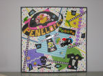
For my final project I chose to create an advertisement for a store called “Penelope’s Planet” that a friend of mine opened in downtown St. Catharines a few months ago. My friend had asked me to create an advertisement for her store and her store’s mascot, Penelope (a yellow rubber ducky). My friend’s name is Kerry Parsons and she has a very fun, funky and social personality. This means that her store contains lots of fun and funky merchandise. I designed the advertisement with her in mind because I wanted it to reflect her personality and style. I also chose to make this advertisement because I have some personal connection with the store — I was there helping clean, paint and set up her business in the preliminary stages. I was also able to witness first-hand the style that Kerry wanted her store to have and I feel that I have done a good job encapsulating that within this advertisement.
Within the advertisement I used the idea of abstraction in order to accomplish portraying Kerry’s funky personality and the store’s image. I did this by using lots of bright colours along with basic shapes and textures. There is no hint of realism in this advertisement, which was very deliberate on my part. This is due to the fact that the store is meant to portray “Penelope’s Planet” — a world different from other stores. The world that Kerry had intended to portray was also very colourful and graphic, almost like a comic book.
Another technique I used in this project was appropriation. This was done by including the words “Kerry wants you” within the advertisement. In this case, I appropriated the slogan from a historical military recruitment poster with the American national icon “Uncle Sam” saying “I Want YOU for U.S. Army.” I changed this familiar text, but viewers will still be able to recognize the reference to the original slogan. This can also be considered an intertextual reference, as the concept of intertextuality refers to the practice of incorporating meanings of one text within another in a reflexive fashion. Our textbook for VISA 1Q98 explains this using the example of “The Simpsons.” This popular television show often includes references to other television shows, films, and celebrities. In my case, I incorporated the words “Kerry wants you” in order to be reflexive of the words associated with “Uncle Sam.” This technique is intended to capture a viewer’s attention by reminding them of something already familiar to them.
When I began this project my goal was to represent Kerry and her store appropriately. I think I accomplished that and that Kerry will be proud of the advertisement. I hope that “Penelope” and her “planet” will be more recognizable now.
© Marcia Costa
Child & Youth Studies — Year 1
Brock University
Quin Dodge: “The Evolution of Scientific Looking and the Human Form”

“The Evolution of Scientific Looking and the Human Form”
(Text and artwork © Quin Dodge)
At a very young age I became interested in the human body and how it worked. Being involved in athletics all of my life I was constantly surrounded by injuries, many of these injuries being my own. The hospital was full of visual images and representations of the human body and how it functioned, and even through my pain, they managed to keep my attention long enough to inspire and interest me. I had never seen so many different ways of displaying the human body and was always interested in where these image came from, how they were created and the influence that these images had on the general public, specifically in terms of understanding biomedical science and their own bodies. I realized that if we choose to, we have the ability to use these visual resources to view our internal structures and, at the same time, learn and understand how these internal structures work. However, it was not always like this.
During the time of Leonardo da Vinci, pencil drawings were one of the main ways in which the inner workings of the human body could be depicted. Dissection of human cadavers often provided the details of these sketches. In our contemporary society there are various additional ways to view the human form through visual images. From x—rays and interior biomedical photography to scanning electron microscopes and digital technologies, the possibilities for visual representations of the human body seem endless.
This practice of “scientific looking” and looking at science is the theme that I chose to represent and discuss for my final project in VISA 1Q98. More importantly I chose to focus on the sub—theme of medical and scientific images of the human body and the way society understands and interprets these images. When I thought about scientific and technological advances and their effects on the depiction of the human body, I immediately thought about the evolution of these things and how I could represent them. I thought back to one of the first forms of viewing the human form, Leonardo da Vinci’s drawings, and knew that I would use his male and female torso drawings as my initial source of inspiration. However, instead of drawing all the organs and structures with pencil, I decided to use a variety of medical and scientific images of the internal human structures in order to better display the evolution of science and technology and their effects on the depiction of the human form. As I thought of evolution I thought about layers and how there are so many different layers of scientific and technological advances. What better way to show this than by using literal layers of paper in my project?
I began with the oldest form of representation, a pencil drawing of the outer layer of the human form, the skin. I then moved on to more contemporary visual representations made using digital imaging and electron microscopes on the inner layers of the human form, the internal organs and structures. In order to show these various layers, I cut slits in the “skin” layer of the drawing to create flaps that revealed the corresponding organ or structure underneath. I then labelled the structures with letters a—h, and around the body of the pregnant female I wrote in text what each letter was depicting and through which scientific method it was being displayed. In this technique I was influenced by an old representation of the human form in a picture entitled, “Autumn” from the engravings of the four seasons in the Duke University Medical Center Library. This piece of art included both a male and female body, each with their torsos slit down the middle with flaps revealing their internal organs.
With some of the internal structures and/or organs I wanted to show the transition from the oldest forms of visual representation to the newest forms used today. An example of this can be seen with the interior biomedical image of the fetus inside of the womb. The face and hands of the fetus is a photography, while the head and body are drawn in pencil. This represents and relates to the revolution of medical science and technologies.
The relation of this project to themes from VISA 1Q98 can be seen in many different aspects of “scientific looking,” particularly with the focus on the visual representation of the human body. My project can relate to the topic of the camera image as objective knowledge. Scientific imagery comes to us with confident authority and as well through photographic images; because of this we, the general public, often assume that this information represents objective knowledge. These images are not questioned and are accepted as truth. However, as we discussed in lecture, we know that photographic mages do not always represent truth and objective knowledge as they can be easily manipulated and morphed. In science this is also true. Scientific and medical images can be very helpful to educate and in diagnosis, however, they can also create a misconception of what the human body actually looks like. Diagrams often include colourful and perfectly shaped organs, but in real life this is not how the human body appears.
My project can also relate to the idea that scientific looking is culturally dependent. The desire to visualize the interior of the human body has not been a central aspect of all cultures. In Western culture we are constantly surrounded by visual images representing the body and have been made aware of new technologies through news, media and popular culture. I thought be creating the two different layers for the visual representation for the human body it would accurately display the cultural dependence of scientific and medical images.
Continuing with the topic of popular culture and news, these two forms of media have shaped some of the initial ideas about new technologies used in medical science. I chose to include an x—ray of the ribs and clavicle as well as an ultrasound and interior biomedical image of a living human fetus to represent this. When these technologies were first introduced to the general public, there was a lot of media and popular attention on them. Further, I chose to use the fetal sonogram and interior biomedical image o of the fetus as I wanted to represent how these images are not only scientific but cultural and political as well. It has been proven that fetal sonograms are not medically necessary, yet they are still widely used today. This is because this type of image has come to serve a different purpose, a purpose beyond medical science, a cultural purpose. The fetal sonogram has come to be known as the first “portrait” of an unborn baby. The well—known photographer Lennart Nilsson took the interior biomedical image of the fetus’s face I included in my project. On April 30, 1965, his image were placed on the front of
I also chose to include a computer—generated image of human DNA (deoxyribonucleic acid). This image is there to represent and relate to the newest form of scientific looking at the human body: human genetics. The study of human genetics does not only focus on human chromosomes, but also on diseases, behaviours and physical traits relating to each chromosome. This has an ironic historical connection. One of the earliest applications of photographic technology was to document diseases and physical traits that may accompany certain illnesses. People believed that physical appearance, the things that could be visually documented in this way, were what measured humankind. Now, with the new uses and types of technologies, we have come to believe that humankind should be measured by DNA, something that even the most advanced technology cannot “see.” I thought that this was a very important topic to include in my project since it will be one of the central ways to visualize the human form in the near future.
As seen through all of these topics, my final project helps to relate the importance of scientific and technological advances to the visual representation of the human body. It also relates and represents how these advances have shaped the way the general public views the human body from the technical and scientific methods used to do so. Science and art do not exist on their own, they work together to educate and represent to the general public information about their own bodies, how they work and how to properly maintain them. Science and art will continue to co—exist and evolve together, and have a place not only in the medical world, but also in the social and cultural world. My hope as a physical education major and an art student is to continue to be able to educate people through the use of visual images. These medical and scientific representations of the human body were able to catch my attention at a young age and will hopefully continue to do the same thing to others in the near future.
© Quin Dodge
Physical Education — Year 1
Brock University
Quin Dodge: “The Evolution of Scientific Looking and the Human Form”

“The Evolution of Scientific Looking and the Human Form”
(Text and artwork © Quin Dodge)
At a very young age I became interested in the human body and how it worked. Being involved in athletics all of my life I was constantly surrounded by injuries, many of these injuries being my own. The hospital was full of visual images and representations of the human body and how it functioned, and even through my pain, they managed to keep my attention long enough to inspire and interest me. I had never seen so many different ways of displaying the human body and was always interested in where these image came from, how they were created and the influence that these images had on the general public, specifically in terms of understanding biomedical science and their own bodies. I realized that if we choose to, we have the ability to use these visual resources to view our internal structures and, at the same time, learn and understand how these internal structures work. However, it was not always like this.
During the time of Leonardo da Vinci, pencil drawings were one of the main ways in which the inner workings of the human body could be depicted. Dissection of human cadavers often provided the details of these sketches. In our contemporary society there are various additional ways to view the human form through visual images. From x—rays and interior biomedical photography to scanning electron microscopes and digital technologies, the possibilities for visual representations of the human body seem endless.
This practice of “scientific looking” and looking at science is the theme that I chose to represent and discuss for my final project in VISA 1Q98. More importantly I chose to focus on the sub—theme of medical and scientific images of the human body and the way society understands and interprets these images. When I thought about scientific and technological advances and their effects on the depiction of the human body, I immediately thought about the evolution of these things and how I could represent them. I thought back to one of the first forms of viewing the human form, Leonardo da Vinci’s drawings, and knew that I would use his male and female torso drawings as my initial source of inspiration. However, instead of drawing all the organs and structures with pencil, I decided to use a variety of medical and scientific images of the internal human structures in order to better display the evolution of science and technology and their effects on the depiction of the human form. As I thought of evolution I thought about layers and how there are so many different layers of scientific and technological advances. What better way to show this than by using literal layers of paper in my project?
I began with the oldest form of representation, a pencil drawing of the outer layer of the human form, the skin. I then moved on to more contemporary visual representations made using digital imaging and electron microscopes on the inner layers of the human form, the internal organs and structures. In order to show these various layers, I cut slits in the “skin” layer of the drawing to create flaps that revealed the corresponding organ or structure underneath. I then labelled the structures with letters a—h, and around the body of the pregnant female I wrote in text what each letter was depicting and through which scientific method it was being displayed. In this technique I was influenced by an old representation of the human form in a picture entitled, “Autumn” from the engravings of the four seasons in the Duke University Medical Center Library. This piece of art included both a male and female body, each with their torsos slit down the middle with flaps revealing their internal organs.
With some of the internal structures and/or organs I wanted to show the transition from the oldest forms of visual representation to the newest forms used today. An example of this can be seen with the interior biomedical image of the fetus inside of the womb. The face and hands of the fetus is a photography, while the head and body are drawn in pencil. This represents and relates to the revolution of medical science and technologies.
The relation of this project to themes from VISA 1Q98 can be seen in many different aspects of “scientific looking,” particularly with the focus on the visual representation of the human body. My project can relate to the topic of the camera image as objective knowledge. Scientific imagery comes to us with confident authority and as well through photographic images; because of this we, the general public, often assume that this information represents objective knowledge. These images are not questioned and are accepted as truth. However, as we discussed in lecture, we know that photographic mages do not always represent truth and objective knowledge as they can be easily manipulated and morphed. In science this is also true. Scientific and medical images can be very helpful to educate and in diagnosis, however, they can also create a misconception of what the human body actually looks like. Diagrams often include colourful and perfectly shaped organs, but in real life this is not how the human body appears.
My project can also relate to the idea that scientific looking is culturally dependent. The desire to visualize the interior of the human body has not been a central aspect of all cultures. In Western culture we are constantly surrounded by visual images representing the body and have been made aware of new technologies through news, media and popular culture. I thought be creating the two different layers for the visual representation for the human body it would accurately display the cultural dependence of scientific and medical images.
Continuing with the topic of popular culture and news, these two forms of media have shaped some of the initial ideas about new technologies used in medical science. I chose to include an x—ray of the ribs and clavicle as well as an ultrasound and interior biomedical image of a living human fetus to represent this. When these technologies were first introduced to the general public, there was a lot of media and popular attention on them. Further, I chose to use the fetal sonogram and interior biomedical image o of the fetus as I wanted to represent how these images are not only scientific but cultural and political as well. It has been proven that fetal sonograms are not medically necessary, yet they are still widely used today. This is because this type of image has come to serve a different purpose, a purpose beyond medical science, a cultural purpose. The fetal sonogram has come to be known as the first “portrait” of an unborn baby. The well—known photographer Lennart Nilsson took the interior biomedical image of the fetus’s face I included in my project. On April 30, 1965, his image were placed on the front of
I also chose to include a computer—generated image of human DNA (deoxyribonucleic acid). This image is there to represent and relate to the newest form of scientific looking at the human body: human genetics. The study of human genetics does not only focus on human chromosomes, but also on diseases, behaviours and physical traits relating to each chromosome. This has an ironic historical connection. One of the earliest applications of photographic technology was to document diseases and physical traits that may accompany certain illnesses. People believed that physical appearance, the things that could be visually documented in this way, were what measured humankind. Now, with the new uses and types of technologies, we have come to believe that humankind should be measured by DNA, something that even the most advanced technology cannot “see.” I thought that this was a very important topic to include in my project since it will be one of the central ways to visualize the human form in the near future.
As seen through all of these topics, my final project helps to relate the importance of scientific and technological advances to the visual representation of the human body. It also relates and represents how these advances have shaped the way the general public views the human body from the technical and scientific methods used to do so. Science and art do not exist on their own, they work together to educate and represent to the general public information about their own bodies, how they work and how to properly maintain them. Science and art will continue to co—exist and evolve together, and have a place not only in the medical world, but also in the social and cultural world. My hope as a physical education major and an art student is to continue to be able to educate people through the use of visual images. These medical and scientific representations of the human body were able to catch my attention at a young age and will hopefully continue to do the same thing to others in the near future.
© Quin Dodge
Physical Education — Year 1
Brock University
Daphni Dremetsikas: “A Swift Kick in the Ads”

“A Swift Kick in the Ads”
(Text and artwork © Daphni Dremetsikas)
In VISA 1Q98 we were introduced to some of the key concepts relating to the study of visual culture. For instance, we drew upon examples from the realms of advertising images in order to study how visual culture interacts with and informs social, cultural, political and economic aspects of human society. My art piece closely ties into these themes.
Advertising is all around us. Every time we sit in front of the TV or walk past a billboard, we absorb the “art” of persuasive communication. There is a saying that states “to the fish, the water is invisible.” In other words, when you are surrounded by something all the time you don’t notice it. You take it for granted and assume that it is natural, or that it has always been there. You could say that advertising has become the water in which we swim. We encounter so much advertising each day that we hardly notice it anymore. In my piece, the ad images that cover the walls of the gallery are telling many stories and sending many ideas to the people viewing them.
Some argue that a lot of advertising is designed to engage people’s hearts, not their minds. This suggests that ads affect us emotionally, not rationally. A common promotional strategy in advertising is showing someone or something being changed in a dramatic way. We have all seen the “before” and “after” photographs in magazines, showing the effects of a new shampoo or skin cream. The “after” part usually implies not just shinier hair or whiter clothes, but that we can receive other things that deep down most of us want even more: to fit in, to be accepted, to be loved, to be good at something, to have fun and to be successful. In fact some people think that this aspect of advertising is what makes it so powerful. They point out that if people didn’t care so much about these things, advertising wouldn’t have so much influence in our society. We are vulnerable to messages promising that our lives will be richer and more exciting. In my piece, this is depicted in the tall blond girl who is simply amazed at what she is seeing.
In the past advertisers did not pay too much attention to kids, but things have certainly changed. Advertisers began to realize that kids not only had money of their own to spend, but they also influenced a lot of the shopping decisions their parents made. In my piece I address this by including not only the young boys, but also the little baby because advertisers consider kids a valuable audience. A number of companies create toy—like mascots to promote their products and these are clearly designed with kids in mind. Research also tells advertiser that if they hook you when you are young, chances are that you will continue buying their products as they get older. This is called brand loyalty.
Branding is a term that advertisers borrowed from the ranch. Its original meaning referred to the act of burning the rancher’s identifying symbol into the flesh of a cow — leaving a permanent mark so everyone would know whose cow it was. Check your shoes, bike, computer or TV — chances are there is a brand clearly displayed. When companies create a product or line of products, part of their goal is to make the name and logo so familiar to you that it is “burned” into your memory. Some companies have been amazingly successful at this. Adidas’ brand, for instance, is represented by its distinctive three stripes. The symbol is so simple and it is seen so often and in so many places that most of us automatically associate it with the company’s name and athletic wear.
Advertisers know that the more conscious you are of the fact that they are trying to sell you something you may not need, the harder it will be to convince you to buy it. So they are always on the lookout for new and unusual places to sneak in promotional messages without making it obvious that that is what they are doing. It is getting harder and harder for advertisers to stand out and, as a result, they are getting more and more creative about where they place their ads. In the past few years advertisers have even put up ads in public washroom stalls. If you are stilling in a bathroom cubicle or standing at a urinal, you’re pretty much a captive audience!
With this in mind, I chose to use the art gallery as my setting because an art gallery is an space for the exhibition of art. In this case it can have two meanings: the literal (the ads are on the walls of the gallery because they are a form of art) or the symbolic (people have come to enjoy an art exhibit and are ambushed by advertisements also found in this space). This is represented by the old man in my piece. He is angry because he has been surrounded by ads for so long and is tired of seeing them everywhere — now they are even on the walls of a gallery!
Although advertising is essentially a commercial activity, it can also be a very potent cultural force. TV and radio commercials effortlessly convey the moral principles, social values, traditions and lifestyles of a culture. In the 21st century it is hard to imagine a world without ads, but it is important to remember that a key element of advertising is the creation of wants and the perception of needs.
© Daphni Dremetsikas
Concurrent Education — Year 1
Brock University
Hayley Elsaesser: “Authenticity and Image Reproduction”

“Authenticity and Image Reproduction”
(Text and artwork © Hayley Elsaesser)
In the 20th century the reproduction of art pieces became increasingly common. As a result, art pieces that were once highly respected have lost some of their value, status and even authenticity. Great works of art are no longer commonly viewed as unique things; instead they are brushed off as images one sees far too often. The piece I created addresses this idea; I have created a tote bag with a painting of Vincent Van Gogh’s Starry Night. This tote bag features an image that is incredibly famous, yet, at the same time, it could be argued that this image has lost some of its value because nearly everyone in today’s society has seen this image on a website or in a book. Few individuals can say they have experienced the actual authentic Starry Night in person. Over time the many copies of the image reproduced have added to the loss of true authenticity that art works such as this have. This is especially true when the image is reproduced on gimmicky commercial products such as the tote bag I created.
Before technology allowed images to be mechanically reproduced, each work of art was one of a kind and appreciated for its rarity. These original works of art had an “aura” — a quality that is only true to the original piece. The aura of the unique original piece of art is what makes it so revered. Even the most perfect reproduction of a work of art does not have the aura of the original. Paintings that were once unique and highly valued for this uniqueness have now become images that are seen everywhere in our society. The most famous paintings in our culture are not famous simply for their beauty, rather they are also famous for the fact that they are widely reproduced and can be found almost everywhere (i.e.: coffee mugs, t—shirts and even beach towels!). These once highly—respected paintings are now seen as everyday objects; the authenticity and the aura of these pieces have been lost in the mass reproduction. Instead of going to museums, people can now purchase a t—shirt and wear “art” proudly. In this process the original poignancy of the painting is lost and it becomes another commodity.
The art piece I made is a commentary on this issue. Of course my painting is not a direct reproduction of Van Gogh’s Starry Night, yet it is a clear representation of it. I placed my version of the image on a small tote bag. The size of the painting in my project is nowhere near as large as the original and has far less detail. The true essence of the image is lost in this representation. These is no aura or sense of authenticity with this image, it is simply a painting of a painting that was done many years ago which has now been placed on a purse this is very typical of our society, an image that has been reproduced and placed on a commercial item intended for sale. The tote bag I have created represents the commercialism of this process.
It is now easy to view any major artwork from anywhere in the world; any number of people can be viewing a print of the same painting at the same time. The special quality the original painting has is lost in the reproductions. Once it became easy for works of art to be reproduced, and even put on commercial items, much of the uniqueness and value of the original image was lost along the way.
© Hayley Elsaesser
Psychology —Year 1
Brock University
Hayley Elsaesser: “Authenticity and Image Reproduction”

“Authenticity and Image Reproduction”
(Text and artwork © Hayley Elsaesser)
In the 20th century the reproduction of art pieces became increasingly common. As a result, art pieces that were once highly respected have lost some of their value, status and even authenticity. Great works of art are no longer commonly viewed as unique things; instead they are brushed off as images one sees far too often. The piece I created addresses this idea; I have created a tote bag with a painting of Vincent Van Gogh’s Starry Night. This tote bag features an image that is incredibly famous, yet, at the same time, it could be argued that this image has lost some of its value because nearly everyone in today’s society has seen this image on a website or in a book. Few individuals can say they have experienced the actual authentic Starry Night in person. Over time the many copies of the image reproduced have added to the loss of true authenticity that art works such as this have. This is especially true when the image is reproduced on gimmicky commercial products such as the tote bag I created.
Before technology allowed images to be mechanically reproduced, each work of art was one of a kind and appreciated for its rarity. These original works of art had an aura a quality that is only true to the original piece. The aura of the unique original piece of art is what makes it so revered. Even the most perfect reproduction of a work of art does not have the aura of the original. Paintings that were once unique and highly valued for this uniqueness have now become images that are seen everywhere in our society. The most famous paintings in our culture are not famous simply for their beauty, rather they are also famous for the fact that they are widely reproduced and can be found almost everywhere (i.e.: coffee mugs, t—shirts and even beach towels!). These once highly—respected paintings are now seen as everyday objects; the authenticity and the aura of these pieces have been lost in the mass reproduction. Instead of going to museums, people can now purchase a t—shirt and wear art proudly. In this process the original poignancy of the painting is lost and it becomes another commodity.
The art piece I made is a commentary on this issue. Of course my painting is not a direct reproduction of Van Gogh’s Starry Night, yet it is a clear representation of it. I placed my version of the image on a small tote bag. The size of the painting in my project is nowhere near as large as the original and has far less detail. The true essence of the image is lost in this representation. These is no aura or sense of authenticity with this image, it is simply a painting of a painting that was done many years ago which has now been placed on a purse this is very typical of our society, an image that has been reproduced and placed on a commercial item intended for sale. The tote bag I have created represents the commercialism of this process.
It is now easy to view any major artwork from anywhere in the world; any number of people can be viewing a print of the same painting at the same time. The special quality the original painting has is lost in the reproductions. Once it became easy for works of art to be reproduced, and even put on commercial items, much of the uniqueness and value of the original image was lost along the way.
© Hayley Elsaesser
Psychology —Year 1
Brock University
Holly Gabel: “Framing Nature”

“Framing Nature”
(Text and artwork © Holly Gabel)
Images can be manipulated in many ways to create a desired meaning. Manipulations in the framing, context or content of images can affect how viewers interpret visual culture. My project is meant to illustrate the ways that images can be cropped or manipulated to create a desired effect. The collected images have been framed by my camera to make them appear to have been taken in a variety of untrue locations. Some of the photographs were taken in the Niagara region, although the intent was to make them look as if they had been taken in Europe. Some of the photographs included in this project were actually taken in Europe. The challenge is to figure out which images were taken where, and to see if the viewer can distinguish the correct location. In this project, the power is in the hands of the photographer. The photographer makes the choice about subject matter. Whatever angle the photographer takes the picture at changes the way it is interpreted by the viewer. The selected framing of an image can make the viewer believe one thing to be true, when in fact it is not. This is further complicated by the inclusion of more than one title under each photograph. Which is true?
© Holly Gabel
Visual Arts — Year 1
Brock University
Holly Gabel: “Framing Nature”

“Framing Nature”
(Text and artwork © Holly Gabel)
Images can be manipulated in many ways to create a desired meaning. Manipulations in the framing, context or content of images can affect how viewers interpret visual culture. My project is meant to illustrate the ways that images can be cropped or manipulated to create a desired effect. The collected images have been framed by my camera to make them appear to have been taken in a variety of untrue locations. Some of the photographs were taken in the Niagara region, although the intent was to make them look as if they had been taken in Europe. Some of the photographs included in this project were actually taken in Europe. The challenge is to figure out which images were taken where, and to see if the viewer can distinguish the correct location. In this project, the power is in the hands of the photographer. The photographer makes the choice about subject matter. Whatever angle the photographer takes the picture at changes the way it is interpreted by the viewer. The selected framing of an image can make the viewer believe one thing to be true, when in fact it is not. This is further complicated by the inclusion of more than one title under each photograph. Which is true?
© Holly Gabel
Visual Arts — Year 1
Brock University
Holly Gabel: “Framing Nature”

“Framing Nature”
(Text and artwork © Holly Gabel)
Images can be manipulated in many ways to create a desired meaning. Manipulations in the framing, context or content of images can affect how viewers interpret visual culture. My project is meant to illustrate the ways that images can be cropped or manipulated to create a desired effect. The collected images have been framed by my camera to make them appear to have been taken in a variety of untrue locations. Some of the photographs were taken in the Niagara region, although the intent was to make them look as if they had been taken in Europe. Some of the photographs included in this project were actually taken in Europe. The challenge is to figure out which images were taken where, and to see if the viewer can distinguish the correct location. In this project, the power is in the hands of the photographer. The photographer makes the choice about subject matter. Whatever angle the photographer takes the picture at changes the way it is interpreted by the viewer. The selected framing of an image can make the viewer believe one thing to be true, when in fact it is not. This is further complicated by the inclusion of more than one title under each photograph. Which is true?
© Holly Gabel
Visual Arts — Year 1
Brock University
Danielle Ghent: “What Does This Image Mean?”

“What Does This Image Mean?”
(Text and artwork © Danielle Ghent)
For this project I chose to focus on how the interpretation of an image involves personal experience. The context in which an image is seen and cultural experience influence an individual’s understanding of visual culture.
For example I took a picture of a dime that was lost in the dirt and placed the words “ten cents to an American” across it. Beside this photograph I placed an image of a Mexican child holding a banana and a piece of bread which was taken when I was working in the Mexican desert this past March. Across the bottom of this image I placed the words “ten cents to a Mexican child living in the desert.” These images display how the value of money is different to different people. Americans tend to have more money to spend and waste, which is illustrated by the dime lost in the dirt. Unfortunately, the money wasted in America could be used to purchase food to fill the empty stomachs of poor children living in Mexico. This is illustrated by the photograph of the child holding the bread. My point is that Americans tend not to realize how much of the money they spend on frivolous things could mean to a child living in a poverty—stricken area of the world. The inclusion of these words on these images helps ensure that viewers understand what I am trying to convey. Without the inclusion of text, the image of the dime would be just a random image with little meaning, and the image of the girl would be a cute picture of a Mexican child. Even with these words making my purpose clear, it is possible that some people may read them differently when viewed in different contexts. For example, if these images were shown at a part where many wealthy Americans were in attendance, some viewers might be offended and interpret what I am suggesting as an insult. Similarly, if these images were shown at a political conference discussing the problem of poverty some people may respond to the images with a sense of scorn, believing that the poor are not helping themselves and, therefore, do not deserve any further assistance.
The context in which images are shown is not the only factor which influences the interpretation of visual culture. If a person who had experience living in poverty saw the image of the dime they may be disgusted. Due to past experience this person may understand the value of the money that is literally being thrown away. On the contrary, a person who has never experienced poverty may not even have a clue about how valuable a dime could be, instead thinking “it is only a dime.”
Another related example deals with the two paintings in my final project. Both of the paintings focus on the subject of feet, but, as I explain below, both have different sets of meanings. Experience and personal memories may shape how each of these paintings is interpreted. The first painting is an image of two adult feet and two baby feet. A mother who has lost a child may feel a pang of sadness or grief at the reminder of the baby. A different mother may remember when her children were young and smile at the happy memories this picture evokes. To a child this image could evoke ideas of parental safety or protection.
Cultural experience also influences the way a viewer interprets an image. Culture changes what a person finds aesthetically pleasing because what is aesthetically pleasing is taught throughout generations. Various cultures have different interpretations of taste; which is something gained by exposure to different social values and the assumptions that certain social classes conclude about taste. One of the paintings I created for this project depicts two tiny Chinese feet poised above a teacup. This image shows that the practice of Chinese foot binding created feet about three inches long, approximately the size of a teacup. This painting evokes different reactions in viewers from different cultural backgrounds, depending on their level of familiarity and comfort with this practice.
The old saying that “beauty is in the eye of the beholder” is true on account that culture, context and past experiences all influence the way an individual interprets an image. The numerous ways that image can be interpreted are what gives rise to the variety of art circulating today.
© Danielle Ghent
Physical Education — Year 1
Brock University
Danielle Ghent: “What Does This Image Mean?”

“What Does This Image Mean?”
(Text and artwork © Danielle Ghent)
For this project I chose to focus on how the interpretation of an image involves personal experience. The context in which an image is seen and cultural experience influence an individual’s understanding of visual culture.
For example I took a picture of a dime that was lost in the dirt and placed the words “ten cents to an American” across it. Beside this photograph I placed an image of a Mexican child holding a banana and a piece of bread which was taken when I was working in the Mexican desert this past March. Across the bottom of this image I placed the words “ten cents to a Mexican child living in the desert.” These images display how the value of money is different to different people. Americans tend to have more money to spend and waste, which is illustrated by the dime lost in the dirt. Unfortunately, the money wasted in America could be used to purchase food to fill the empty stomachs of poor children living in Mexico. This is illustrated by the photograph of the child holding the bread. My point is that Americans tend not to realize how much of the money they spend on frivolous things could mean to a child living in a poverty—stricken area of the world. The inclusion of these words on these images helps ensure that viewers understand what I am trying to convey. Without the inclusion of text, the image of the dime would be just a random image with little meaning, and the image of the girl would be a cute picture of a Mexican child. Even with these words making my purpose clear, it is possible that some people may read them differently when viewed in different contexts. For example, if these images were shown at a part where many wealthy Americans were in attendance, some viewers might be offended and interpret what I am suggesting as an insult. Similarly, if these images were shown at a political conference discussing the problem of poverty some people may respond to the images with a sense of scorn, believing that the poor are not helping themselves and, therefore, do not deserve any further assistance.
The context in which images are shown is not the only factor which influences the interpretation of visual culture. If a person who had experience living in poverty saw the image of the dime they may be disgusted. Due to past experience this person may understand the value of the money that is literally being thrown away. On the contrary, a person who has never experienced poverty may not even have a clue about how valuable a dime could be, instead thinking “it is only a dime.”
Another related example deals with the two paintings in my final project. Both of the paintings focus on the subject of feet, but, as I explain below, both have different sets of meanings. Experience and personal memories may shape how each of these paintings is interpreted. The first painting is an image of two adult feet and two baby feet. A mother who has lost a child may feel a pang of sadness or grief at the reminder of the baby. A different mother may remember when her children were young and smile at the happy memories this picture evokes. To a child this image could evoke ideas of parental safety or protection.
Cultural experience also influences the way a viewer interprets an image. Culture changes what a person finds aesthetically pleasing because what is aesthetically pleasing is taught throughout generations. Various cultures have different interpretations of taste; which is something gained by exposure to different social values and the assumptions that certain social classes conclude about taste. One of the paintings I created for this project depicts two tiny Chinese feet poised above a teacup. This image shows that the practice of Chinese foot binding created feet about three inches long, approximately the size of a teacup. This painting evokes different reactions in viewers from different cultural backgrounds, depending on their level of familiarity and comfort with this practice.
The old saying that “beauty is in the eye of the beholder” is true on account that culture, context and past experiences all influence the way an individual interprets an image. The numerous ways that image can be interpreted are what gives rise to the variety of art circulating today.
© Danielle Ghent
Physical Education — Year 1
Brock University
Danielle Ghent: “What Does This Image Mean?”

“What Does This Image Mean?”
(Text and artwork © Danielle Ghent)
For this project I chose to focus on how the interpretation of an image involves personal experience. The context in which an image is seen and cultural experience influence an individual’s understanding of visual culture.
For example I took a picture of a dime that was lost in the dirt and placed the words “ten cents to an American” across it. Beside this photograph I placed an image of a Mexican child holding a banana and a piece of bread which was taken when I was working in the Mexican desert this past March. Across the bottom of this image I placed the words “ten cents to a Mexican child living in the desert.” These images display how the value of money is different to different people. Americans tend to have more money to spend and waste, which is illustrated by the dime lost in the dirt. Unfortunately, the money wasted in America could be used to purchase food to fill the empty stomachs of poor children living in Mexico. This is illustrated by the photograph of the child holding the bread. My point is that Americans tend not to realize how much of the money they spend on frivolous things could mean to a child living in a poverty—stricken area of the world. The inclusion of these words on these images helps ensure that viewers understand what I am trying to convey. Without the inclusion of text, the image of the dime would be just a random image with little meaning, and the image of the girl would be a cute picture of a Mexican child. Even with these words making my purpose clear, it is possible that some people may read them differently when viewed in different contexts. For example, if these images were shown at a part where many wealthy Americans were in attendance, some viewers might be offended and interpret what I am suggesting as an insult. Similarly, if these images were shown at a political conference discussing the problem of poverty some people may respond to the images with a sense of scorn, believing that the poor are not helping themselves and, therefore, do not deserve any further assistance.
The context in which images are shown is not the only factor which influences the interpretation of visual culture. If a person who had experience living in poverty saw the image of the dime they may be disgusted. Due to past experience this person may understand the value of the money that is literally being thrown away. On the contrary, a person who has never experienced poverty may not even have a clue about how valuable a dime could be, instead thinking “it is only a dime.”
Another related example deals with the two paintings in my final project. Both of the paintings focus on the subject of feet, but, as I explain below, both have different sets of meanings. Experience and personal memories may shape how each of these paintings is interpreted. The first painting is an image of two adult feet and two baby feet. A mother who has lost a child may feel a pang of sadness or grief at the reminder of the baby. A different mother may remember when her children were young and smile at the happy memories this picture evokes. To a child this image could evoke ideas of parental safety or protection.
Cultural experience also influences the way a viewer interprets an image. Culture changes what a person finds aesthetically pleasing because what is aesthetically pleasing is taught throughout generations. Various cultures have different interpretations of taste; which is something gained by exposure to different social values and the assumptions that certain social classes conclude about taste. One of the paintings I created for this project depicts two tiny Chinese feet poised above a teacup. This image shows that the practice of Chinese foot binding created feet about three inches long, approximately the size of a teacup. This painting evokes different reactions in viewers from different cultural backgrounds, depending on their level of familiarity and comfort with this practice.
The old saying that “beauty is in the eye of the beholder” is true on account that culture, context and past experiences all influence the way an individual interprets an image. The numerous ways that image can be interpreted are what gives rise to the variety of art circulating today.
© Danielle Ghent
Physical Education — Year 1
Brock University
Alicia Hore: “Sonograms and Family Portraits Are Not the Same”

“Sonograms and Family Portraits Are Not the Same”
(Text and artwork © Alicia Hore)
Sonograms, ultrasounds and the concept of “fetal personhood” are controversial issues. Ever since sonograms and ultrasounds were discovered, many researchers have debated the safety and necessity of these practices. Sonograms and ultrasounds can show many different things to a pregnant woman, the most common, of course, being the health and development of the unborn child inside her womb. For my project, I wanted to show how sonograms and ultrasounds are a very important aspect of life in today’s society. This extends beyond the health of individual infants and incorporates the idea of “fetal personhood. ” When viewed from this perspective sonograms are not just scientific documents, but also have a cultural and personal aspect to them.
Sonogram and ultrasound technology allow expectant parents to see the first glimpse of their child before he or she is even born. These images often result in strong emotional bonding between parents and their child/children since the bonding had already begun before the child was born. It is in this way that the line between the scientific and cultural aspects of these imaging technologies becomes blurred. Although sonograms are very important because they give parents the first view of their child, they should not be treated like the baby’s first photograph. In my project I included both sonograms and portraits of pregnant women in various poses including: with their family, by themselves, with another of their children, or with their spouse/boyfriend. By including both types of images (sonograms and family portraits), I wanted to show the difference between the two. Sonograms and family portraits are completely different things and should be treated this way. Sonograms and ultrasounds should first and foremost be used in their intended scientific purpose.
© Alicia Hore
Concurrent Education — Year 1
Brock University
Vanessa Iannantuono: “Juvenile Gossip”

“Juvenile Gossip”
(Text and artwork © Vanessa Iannantuono)
Visual culture is continually influenced by technological transformations. The camera is a visual tool that demonstrates how technological developments throughout history not only transform visual culture, but also enhance and complicate the values and meanings associated with images. At the same time some images, regardless of the medium used to create them, represent iconic subject matter, where meanings are assumed to be universally understood. My final project for VISA 1Q98 incorporates both of these aspects; the purpose of my piece was to present an iconic subject matter, while simultaneously drawing attention to the vast cultural and technological associations relating to the history of photography. My final piece consists of once canvas, with the same proportions of a regular enlarged photograph. The brown and yellow tones used in this painting evoke the feeling of an aged photograph. However, this image is not a photograph; it is an oil painting of two children outdoors. The children are wearing jackets as though it is a cool day, however they both appear to be happy because they are smiling.
Using children as subject matter in art and visual culture often symbolizes the universal concepts of childhood emotions and attributes. Young children in Western contemporary culture are often perceived to be innocent of the detrimental pressures of society. They are pure beings who have not been shaped by media influences and biased cultural norms. Therefore, this image of children is iconic of these associations with childhood and the historical innocence they represent. The subject matter of children in this case would represent the notion of childhood in twentieth century Western culture. In this way it is similar to Dorothea Lange’s photograph entitled Migrant Mother, Nipomo, California, taken in 1936. Lange’s photograph makes further reference to the hardship many families faced in America during the 1930s.
My painting makes reference to another old photograph of children. A photographic reference was chosen due to the fact that the intention was to present the viewer with the same questions associated with modern photography: is it a “truthful” image or has it been manipulated? How do we make these distinctions? The reproduction of a photograph in paint creates a subtle tension as each type of image carries with it its own set of expectations. The assumption most often related to photography is that it is an accurate and objective rendering of reality. The tension of this image relates to the fact that it was recreated using oil paint, a medium which, historically, has not had the same associations with “truth” and objectivity. If a viewer assumes the referenced photograph is true, do they assume the image represents a true event?
Throughout the history of photography, the camera has been used to make family portraits. The photograph this painting was based on is no exception. To this day, photographs are still used as the primary way of remembering significant life events, especially within the family, and therefore it must be noted that portrait photography has continually been highly valued by many members of society. The image of two children referenced in my painting is actually a photograph of my mother and father as children. To the creator of this piece, the painting holds many of the same values as the photograph it references. One last question is posed to the viewer: have your interpretations and associations of the painting changed with this further knowledge about the subject matter?
© Vanessa Iannantuono
BA Integrated Studies/BEd — Year 2
Brock University
Kaila Janzen: “Final Project: Visual Culture”

“Final Project: Visual Culture”
(Text and artwork © Kaila Janzen)
For my project I wanted to show that though many people can be looking at or interpreting a single image, it can end up representing many meanings. Secondly, the act of taking a single image and placing it in many different settings also creates different interpretations of the image. Finally, the producer of a set of images (in this case, myself) will have a set meaning for each picture. However, because the images are being looked at by a number of different people in a number of different contexts a number of different meanings can arise.
At the centre of my project is a drawing of a BMW car. This is a brand of car that many people recognize, although people will have different associations with this model of vehicle. For example, one person could look at this picture of a BMW and interpret it as something that is pleasurable. Another person could look at the BMW and interpret it as dangerous and a waste of money. Through these different interpretations, this single image represents the different ways people can look at the same image or object. To further underscore this point, I decided to focus on the different types of associations people could have with this single image of a BMW car. I made another 14 drawings of this car, but in the rest of the drawings I decided to add a theme to each picture. For instance, in one picture I focused on the theme of adventure some might associate with the BMW car so I drew a man rock climbing in behind the car and two people skydiving.
In each of my drawings I placed the car in a different settings in order to convey a different set of associations. Although I have a set of intended meanings for each one of the 15 drawings in this series, I have no control over how other people will interpret my drawings, which is the whole point. Just because an artist creates an image to have a certain meaning does not mean that the image is not going to be subject to different meanings. Every person is different and no two people are always going to interpret each image the same way. Visual culture is not just about the images themselves, it is about the meanings that people relate to them and how the meanings relate to the world as a whole.
© Kaila Janzen
Visual Arts — Year 1
Brock University
Kaila Janzen: “Final Project: Visual Culture”

“Final Project: Visual Culture”
(Text and artwork © Kaila Janzen)
For my project I wanted to show that though many people can be looking at or interpreting a single image, it can end up representing many meanings. Secondly, the act of taking a single image and placing it in many different settings also creates different interpretations of the image. Finally, the producer of a set of images (in this case, myself) will have a set meaning for each picture. However, because the images are being looked at by a number of different people in a number of different contexts a number of different meanings can arise.
At the centre of my project is a drawing of a BMW car. This is a brand of car that many people recognize, although people will have different associations with this model of vehicle. For example, one person could look at this picture of a BMW and interpret it as something that is pleasurable. Another person could look at the BMW and interpret it as dangerous and a waste of money. Through these different interpretations, this single image represents the different ways people can look at the same image or object. To further underscore this point, I decided to focus on the different types of associations people could have with this single image of a BMW car. I made another 14 drawings of this car, but in the rest of the drawings I decided to add a theme to each picture. For instance, in one picture I focused on the theme of adventure some might associate with the BMW car so I drew a man rock climbing in behind the car and two people skydiving.
In each of my drawings I placed the car in a different settings in order to convey a different set of associations. Although I have a set of intended meanings for each one of the 15 drawings in this series, I have no control over how other people will interpret my drawings, which is the whole point. Just because an artist creates an image to have a certain meaning does not mean that the image is not going to be subject to different meanings. Every person is different and no two people are always going to interpret each image the same way. Visual culture is not just about the images themselves, it is about the meanings that people relate to them and how the meanings relate to the world as a whole.
© Kaila Janzen
Visual Arts — Year 1
Brock University
Natalie Malo: “Scientific Imaging”

“Scientific Imaging”
(Text and artwork © Natalie Malo)
Medical imaging bestows a gift to doctors: the ability to look inside another human’s body without causing them any pain. The concept of medical imaging is very interesting because so much can be taken from a single image. For instance, a picture of a fetus inside a mother’s womb can be used for medical investigations, education, or for an anti—abortion ad in a magazine. On page 293 of Practices of Looking an ad even depicts a fetus for a safe car commercial. Some of the greatest components of medical imaging are x—rays, magnetic resonance imaging (MRI), medical drawings, plastination, and CT scans. A single medical image can affect the lives of millions of people, and that is why this topic interests me so much.
The x—rays in my project were all from different people that were diagnosed at a local hospital. The x—ray of an elderly woman’s right hand depicts severe arthritis. The x—ray allowed doctors to see the stress points of her hand as well as where the arthritis was most severe. The x—ray of a person’s left foot shows a screw that was inserted into the talus to secure the bone. The remaining x—rays of the lower leg and knee depict what a healthy person’s leg might resemble. When looking at these x—rays it is easy to understand why this technology was so impressive to society when they were first invented.
One of the earliest forms of medical imaging was anatomical drawings which depicted the structure and function of the body. Leonardo da Vinci is one of the most well—known artists in the history of this field. The harmony that he found between technical accuracy and artistic talent allowed his creations to be viewed as both educational models and art. While technology has improved greatly since the time of Leonardo, the educational aspect of medical imaging is still useful today. It can be argued that the computer—generated image is closely related to anatomical drawing. In both cases, detailed views and labelling can be used to help the viewer understand what they are looking at. The picture in my project of the small intestines is a computer generated image. This is a key aspect of medical imaging, which is why I felt it was necessary to include it in my project. While much advancement has been made in medical imaging there is still a strong pulse of historical methods being used in society today.
A more recent invention in medical imaging is the magnetic resonance imaging machine, or MRI. This is a large camera used to view the inside of the human body through high quality images. The cross—sectional MRI of the right thigh in my project shows how valuable a tool this machine really is. The detail visible on a printed copy is incredible. The femur and major muscles are clearly visible as well as the difference in cell types. Personally I find some MRIs to be very visually appealing. The abdominal MRI in my project uses colour for clarity, but in doing so actually creates a beautiful image. In researching this project I found many photographs of colour MRIs of the brain that were very visually stimulating. These images have the ability to captivate a viewer both because of their uniqueness and because of their “shock factor.” By this I mean that unless a person has a job in which they view medical images frequently, the beauty of the human body will always be new and exciting. After viewing many different medical images for this project some images still have the ability to jump out at me. The MRI of the head actually reminded me of something one might see in a horror movie. Since this is a cross section of the head, the eyeballs seem extremely large and eerie. This image had the ability to shock me, although this was not the original purpose of the image.
One of the most well—known societal diseases is breast cancer. Millions of dollars are raised every year for this cause, and its symbol of a pink ribbon is easily recognizable by most of society. Thousands of deaths occur each year from this disease. Both MRIs and mammograms are used to help in the diagnosis of breast cancer. There are four different pictures in my projects of women’s breasts. The left breast is comprised of MRI photographs On the outside there is a picture of a typical healthy breast where the dense breast tissue is normal. The image on the inside, or right side of the breast, is showing an early stage of cancer. The right breast is shown through the use of mammograms. Once again the image on the outer side of the body is healthy, and the image on the inside of the right breast depicts malignant calcifications. These types of images have likely saved or at least prolonged millions of lives. Without them doctors may not realize what is happening in their patient’s bodies. While breast cancer awareness has grown in society, it has also grown in the field of medicine.
Medical imaging has many direct links to society. Through commercials, education, and medicine these images affect people on a daily basis. There are potentially numerous uses for every medical image made, which is one of the reasons I find them so interesting. People are affected by these images everyday at home, at work, in the hospital, in a court of law, or sometimes by simply walking down the street. These forms of art have the capacity to make doctors and technicians into artists. Where, then, does the line lay between what is art and what is science?
© Natalie Malo
Concurrent Education (Physical Education) — Year 1
Brock University
Natalie Malo: detail of “Scientific Imaging”

“Scientific Imaging”
(Text and artwork © Natalie Malo)
Medical imaging bestows a gift to doctors: the ability to look inside another human’s body without causing them any pain. The concept of medical imaging is very interesting because so much can be taken from a single image. For instance, a picture of a fetus inside a mother’s womb can be used for medical investigations, education, or for an anti—abortion ad in a magazine. On page 293 of Practices of Looking an ad even depicts a fetus for a safe car commercial. Some of the greatest components of medical imaging are x—rays, magnetic resonance imaging (MRI), medical drawings, plastination, and CT scans. A single medical image can affect the lives of millions of people, and that is why this topic interests me so much.
The x—rays in my project were all from different people that were diagnosed at a local hospital. The x—ray of an elderly woman’s right hand depicts severe arthritis. The x—ray allowed doctors to see the stress points of her hand as well as where the arthritis was most severe. The x—ray of a person’s left foot shows a screw that was inserted into the talus to secure the bone. The remaining x—rays of the lower leg and knee depict what a healthy person’s leg might resemble. When looking at these x—rays it is easy to understand why this technology was so impressive to society when they were first invented.
One of the earliest forms of medical imaging was anatomical drawings which depicted the structure and function of the body. Leonardo da Vinci is one of the most well—known artists in the history of this field. The harmony that he found between technical accuracy and artistic talent allowed his creations to be viewed as both educational models and art. While technology has improved greatly since the time of Leonardo, the educational aspect of medical imaging is still useful today. It can be argued that the computer—generated image is closely related to anatomical drawing. In both cases, detailed views and labelling can be used to help the viewer understand what they are looking at. The picture in my project of the small intestines is a computer generated image. This is a key aspect of medical imaging, which is why I felt it was necessary to include it in my project. While much advancement has been made in medical imaging there is still a strong pulse of historical methods being used in society today.
A more recent invention in medical imaging is the magnetic resonance imaging machine, or MRI. This is a large camera used to view the inside of the human body through high quality images. The cross—sectional MRI of the right thigh in my project shows how valuable a tool this machine really is. The detail visible on a printed copy is incredible. The femur and major muscles are clearly visible as well as the difference in cell types. Personally I find some MRIs to be very visually appealing. The abdominal MRI in my project uses colour for clarity, but in doing so actually creates a beautiful image. In researching this project I found many photographs of colour MRIs of the brain that were very visually stimulating. These images have the ability to captivate a viewer both because of their uniqueness and because of their “shock factor.” By this I mean that unless a person has a job in which they view medical images frequently, the beauty of the human body will always be new and exciting. After viewing many different medical images for this project some images still have the ability to jump out at me. The MRI of the head actually reminded me of something one might see in a horror movie. Since this is a cross section of the head, the eyeballs seem extremely large and eerie. This image had the ability to shock me, although this was not the original purpose of the image.
One of the most well—known societal diseases is breast cancer. Millions of dollars are raised every year for this cause, and its symbol of a pink ribbon is easily recognizable by most of society. Thousands of deaths occur each year from this disease. Both MRIs and mammograms are used to help in the diagnosis of breast cancer. There are four different pictures in my projects of women’s breasts. The left breast is comprised of MRI photographs On the outside there is a picture of a typical healthy breast where the dense breast tissue is normal. The image on the inside, or right side of the breast, is showing an early stage of cancer. The right breast is shown through the use of mammograms. Once again the image on the outer side of the body is healthy, and the image on the inside of the right breast depicts malignant calcifications. These types of images have likely saved or at least prolonged millions of lives. Without them doctors may not realize what is happening in their patient’s bodies. While breast cancer awareness has grown in society, it has also grown in the field of medicine.
Medical imaging has many direct links to society. Through commercials, education, and medicine these images affect people on a daily basis. There are potentially numerous uses for every medical image made, which is one of the reasons I find them so interesting. People are affected by these images everyday at home, at work, in the hospital, in a court of law, or sometimes by simply walking down the street. These forms of art have the capacity to make doctors and technicians into artists. Where, then, does the line lay between what is art and what is science?
© Natalie Malo
Concurrent Education (Physical Education) — Year 1
Brock University
Tayne McKinnon: “Fashion Photography and Advertising”

“Fashion Photography and Advertising”
(Text and artwork © Tayne McKinnon)
For my final project I chose to focus on fashion photography and advertising in visual culture. Fashion photography has a long history, and I chose to explore this theme because I find the whole world of fashion and advertising very fascinating. I find it interesting to study the techniques used by companies and photographers to help sell clothing. I chose to display photographs we studied in class on a garment that is associated with the world of fashion: a formal dress. This studio piece seemed to really complement the nature of the photographs that are attached to it. The structure of the dress is made of from wire and a layer of pink tissue paper was laid overtop. I chose to use the tissue paper because it was semi—transparent and allows the viewer to see the structure of the wire underneath.
Fashion photography can be considered a form of art. Louise Dahl—Wolfe is a photographer who expressed herself through the use of colour within her photographs. I chose to incorporate two examples of her work into this piece. Dahl—Wolfe’s untitled 1958 photograph for Harper’s Bazaar depicts a young woman who is looking at the camera and is wearing a colourful head piece made from vividly coloured flowers. Her makeup is also bold and exotic. The other image, a cover shot for Harper’s Bazaar in 1943 features the famous actress and model, Lauren Bacall.
The inclusion of celebrities is another important component of fashion and advertising photography. Celebrities have the power to help sell a product because of their status within the media, so if a company could get a celebrity endorsement their product sales would usually rise. An example of a recent celebrity endorsement ad I chose to include is one from Guess? Jeans. This company chose to use Paris Hilton within their advertising campaign. In this example, Hilton is scantily clad and sitting in front of a pool while a male in the background stares at her as if she is a piece of “eye candy.” Her body is displayed in a sexually suggestive way that invites the viewer to look at her. This image can be used to illustrate the concept of “the gaze,” a theme that was explored throughout this course and one that relates to advertising and fashion photography. Quite often in this type of photograph, women’s bodies are presented as sexual beings to be looked at for pleasure.
Throughout the decades, fashion photograph has constantly attempted to push the boundaries. Fashion is something that is supposed to be “hip” and “up to date,” and fashion photographers also want to reflect that. An example which I included in my project is a photograph that was taken in 1939 for Vogue magazine. This photo features Lisa Fonssagrives, who many consider to be the world’s first “supermodel,” hanging literally hanging off the Eiffel Tower. When this photo was published, it set a whole new standard for what risks could be taken within the visual culture of fashion. Advertisements produced by the clothing company, United Colors of Benetton, are a more recent example of fashion images pushing the boundaries. One example is an advertisement featuring a man (David Kirby) dying of AIDS. In this photograph, Kirby is surrounded by his family. When this advertisement was first published it provoked debate — some took exception to the use of a such a serious issue for the purpose of selling fashionable clothing, while others believed that these sorts of pictures helped promote AIDS awareness to the public.
Fashion photographs and advertisements are constantly changing and will continue to evolve in the future. Advertisements used to simply be a way for companies to show their product in use. Fashion ads now seem to be centred on the concept of a half naked body. The visual culture of fashion has changed from hand—coloured images in magazines to beautiful works of art that allow an artist to show off their creative expression. It became evident to me throughout this course that fashion photography and advertising is an ever—changing aspect of visual culture. What will be the next daring step?
© Tayne McKinnon
Visual Arts — Year 1
Brock University
Whitney Morris: “New York”

“New York”
(Text and artwork © Whitney Morris)
For this creative project I decided to focus on my personal experiences from my vacation in New York City. In particular, I wanted to explore how my memories and experiences on this trip coincided with themes explored in VISA 1Q98. The themes I focused on in this project include: how technological developments have influenced the way I perceive images, and how specific landmarks have become famous due to the reproduction of images. My project takes the form of a photo board and includes pictures of artwork and landmarks I saw on my trip.
Times Square has achieved the status of an iconic world landmark and has become a symbol of New York. Times Square is principally defined by its illuminated and animated advertisements. It was an amazing moment to see Times Square in person because I have only previously seen it on television or in movies. It is such an awesome advertising technique, thousands of people walk by everyday and are captivated by the massive advertisements and bright lights. I chose to photograph Times Square because I wanted to capture the essence of advertising at its best. One of the first things I wanted to see in New York was Times Square because I have seen it on TV and in movies and I wanted to experience first hand the rush of excitement you feel when you are there.
Seinfeld is one of my favourite television shows, and to see “the” Restaurant in person was something I will never forget. A television prop had become reality for me, and this was a great thrill. The Restaurant, because of television fame, has charmed viewers and has made it a “must see” in New York City. I waited two and a half hours to eat in the restaurant because I wanted to experience this piece of celebrity culture personally. Even though many people do not often automatically recognize that this is a form of advertising it is because it links a sense of nostalgia and belonging with a commercial business; we want to be a part of this culture too. To have been lucky enough to have had these wonderful experiences gives me pleasure in knowing “I have been there! ”
The Statue of Liberty, the most celebrated landmark in New York City, has spawned hundreds of other replica Statues of Liberty worldwide. For instance, replicas exist in theme parks and resorts, including the New York-New York Hotel and Casino in Las Vegas. Visual culture has made the Statue of Liberty an illustrious monument known worldwide. For instance, the Statue of Liberty has been featured in dozens of motion pictures, such as the 1942 Alfred Hitchcock movie, Saboteur, which featured a climactic confrontation at the Statue.
The vast array of electronic images in contemporary visual culture has resulted from different technological developments such as digital imaging, cinema and reproduction. New technological and scientific developments influence both the way in which images look and how they function in society today. My project also addresses this theme. Vincent Van Gogh’s painting, The Starry Night, is one of my favourite pieces of artwork. As I developed my appreciation of art I realized that this seems to have become my favourite piece because of the unique painting style and the colours used. Since 1941 this painting has found a permanent collection in the museum of Modern Art in New York City. However, this masterpiece can now also be seen everywhere; reproductions of The Starry Night appear on articles of clothing, neckties and umbrellas. This certainly changes the way we view The Starry Night today and shifts the meaning of the painting. In some ways the technological reproduction of The Starry Night on a variety of products shows that this is a popular painting and that many people want to know more about it. On the other hand, a person will not view the “real” painting the same way after experiencing this vast array of reproductions.
Andy Warhol is another of my favourite artists — I especially like the way he uses repetition in a lot of his pieces. The picture of the Campbell’s soup cans is largely known throughout the world. Warhol silk screened images of Campbell’s soup cans to question boundaries between art and production design, and celebrate the aesthetic repetition of mass culture. The multiplicity of soup cans refers to the inundation and overproduction of goods in a commodity culture. To see these actual silk screens on my trip to New York was amazing. I hope one day I can return to once again relive these wonderful memories.
© Whitney Morris
Visual Arts — Year 1
Brock University
Jamie New: “Jamie 36 Times”

“Jamie 36 Times”
(Text and artwork © Jamie New)
When I was asked to create a piece of artwork relating to the themes of VISA 1Q98, the famous pop artist, Andy Warhol, and the concepts of image reproduction immediately came to mind. Andy Warhol’s interesting use of colour, repetition and simplicity are the central characteristics of his artwork. Warhol is also known for taking one image of something and reproducing it repeatedly in a number of different forms. For example, in 1963 he produced a piece called Mona Lisa in which he took Leonardo da Vinci’s famous painting and reproduced it to be a work of his own. Warhol’s version of this artwork reproduced Leonardo da Vinci’s piece numerous times, using the primary colours of blue, yellow and red as well as black and white versions of the Mona Lisa printed repetitively on a single page.
In VISA 1Q98 we discussed how reproducing artworks can change the overall value and meaning of an image. Is this true for Andy Warhol’s remake of Leonardo da Vinci’s Mona Lisa? To answer this question I decided to make my own reproduction of Andy Warhol’s artwork, Ethel Scull 36 Times (1963). Making four rows of nine images side—by—side, Warhol took thirty six variously posed photographs of a woman named Ethel Scull and changed the colour of each individual image. I decided to take this opportunity to use his idea, manipulate it, remake it to be a work of my own and call it Jamie 36 Times.
I began by taking thirty—six photographs of myself through a mechanism called the iSight camera and a program called Photo Booth on my Mac computer. This program give the option to take photographs in the “pop art” style, which makes each image appear simultaneously four times in four different colours. After photographing myself in an assortment of poses, some copied from Ethel Scull’s, I transferred them to another program. Using HP Photosmart Studio I then cropped the pictures so that there was only one copy of each photo, and changed the colouring so that they were all different. I changed the brightness, contrast and colour content in each of the image so that they were all unique. The final production is similar to Warhol’s piece, but it is still my own representation and remaking of it. Does this count as a reproduction? Is my work not unique or less authentic because I took someone else’s idea and modified it to be my own?
With the rise of digital imaging, many questions about photographic truth surfaced. It is very possible for images made using the technology of digital imaging to by manipulated and altered, which is clearly shown in this project. Different viewers will, of course, have different interpretations of these photographs. This relies largely upon the context in which the viewer is seeing the images. My project, in particular, is meant to speak to a specific audience: those who are familiar with Andy Warhol’s work. For someone who knows nothing about Andy Warhol or about pop art, a different set of meanings will surely arise.
Reflexivity is an important concept relating to my project. In addition to referencing the work of Andy Warhol, I am also using this project to question my role (as the artist) in the place of image production. Like Cindy Sherman I took a series of posed photographs of myself. There are both similarities and differences between my project and Sherman’s photographs. Sherman photographs herself disguised to imitate different styles and genres. I took photographs of myself to imitate the work of Andy Warhol. What both projects have in common is the fact that we are both at both ends of the camera. Like Sherman, I placed myself in the ironic double position of the object of the gaze and the “gazer.” In other words, in these photographs I am both doing the looking and being looked at. This defies the traditional role of the female being the object of the gaze. I am actively putting myself into the image as well as the process of production. The viewer will realize this because the image is named after myself.
© Jamie New
VISA 1Q98
Brock University
Marsha Pritchard: “What Does This Piece Mean To You?”

“What Does This Piece Mean To You?”
(Text and artwork © Marsha Pritchard)
Today’s society has a growing fascination for visual culture. But do we really understand the concepts and meanings behind the masses of images we encounter each day? From this course I have learned several new concepts and ideas that have enhanced my knowledge of visual culture. However, not only have I gained knowledge from this course, it has also changed the way in which I look at images. In my final creative project my goal was to display this understanding of visual culture on several levels. My project is a series of photographs and everything, from the pose of the models, to the costumes worn and the ways in which the images were assembled, holds meaning.
The way in which a subject is positioned in a photograph can indicate what ideas, emotions and feelings an artist is trying to convey. Symbolic of the power differentiation between males and females, subject and viewer, this model in this piece is placed lower than her male counterpart, with him gazing down at her. The “male gaze” has become virtually unavoidable in society today. This type of gaze sees females only as objects as desire and has been prevalent throughout the history of visual culture.
In terms of the power relations of photography, it is often the model or subject that holds the least amount of power in the process. The model is vulnerable to all other parties involved in the process of creating the photo, including the photographer, the institution behind the photograph and the viewer. In my piece, the female model has a piece of tape over her mouth to symbolize this lack of power.
The outfit worn by the model holds just as much meaning as the pose she is in. The dress is made from newspapers to symbolize the importance of mass media in visual culture. Mass media is part of our everyday lives and greatly influences who we are and what we know. Much of what we know and think as ideal is dictated to us through forms of mass media such as the newspaper, television, advertising and the internet. Mass media has had a huge impact on visual culture over the years. The broadening spectrum of media has enabled visual culture to be shared with people nationally and globally. Media images have the power to dictate what we perceive as “normal” or ideal. Take body image for example. Through the normalized gaze, the ideal female is skinny an flawless with an hourglass shape. In my piece, the female model’s waist is cinched using layers of duct tape, creating a similar effect that a corset or digital editing program would. These kinds of images have the ability to affect a viewer’s self—image and what they believe is beautiful.
Finally, the way in which the photos were taken for this project and how they were assembled reflects some of the concepts of image production discussed in lecture. Beginning with the legs of the composition, the picture is in black and white to imply the evolution of the camera in the history of visual culture. From the camera obscura and camera lucida, to black and white film, colour film and, finally, the digital camera, the technology of photography has undergone several changes to increase its effectiveness in capturing a “true to life” picture. Another image creating process that has received much debate is the concept of image reproduction. A section of the dress was reproduced through sketching, and could have been reproduced through several other means, whether it be scanning, photocopying or painting. Images are constantly being reproduced in society today in order to keep up with the demands of mass media, but how does this affect visual culture? This aspect of my piece greatly changes the meaning of the rest of the photographs as the sketched portion creates a cartoon—like appearance. Even by scanning the piece, the meaning changes. Once an image is reproduced, it is no longer one of a kind. The authenticity is lost, as the “aura” surrounding the original piece. The reproduction of an artwork, such as Leonardo da Vinci’s Mona Lisa, has allowed it to convey a broad set of meanings in a number of different contexts.
Lastly, the entire composition was originally done using digital camera technology which causes one to question the photographic truth of the composition. Photography was once seen as the most objective and truthful forms of documentation, but is now increasingly under question. In this composition, it is evident that there were subjective choices made concerning the choice of model, the poses, the outfits an the final assembly of images. At the same time though, these choices may still represent photographic truth.
Like the concepts learned in this course, each of the images in my composition have come together to form the final product and overall understanding of the piece. This written report details my, the artist’s, intended meaning of the piece. However, one of the most important things I learned in this course is that each individual will interpret an image in a different way depending on their background, age, time period, and even their knowledge of visual culture. As such, the intended meaning of the piece may have little relevance to the viewer. With this said, there is only one thing to ask: what does this piece mean to you?
© Marsha Pritchard
Concurrent Education — Year 1
Brock University
Rebecca Smith: “Art Scape Magazine”

“Art Scape Magazine”
(Text and artwork © Rebecca Smith)
For my final project I decided to make my own magazine. This magazine addresses three very important themes coved in VISA 1Q98: the reproduction of images, postmodernism, and the knowledge and power of images.
The first theme I emphasized in my magazine was the reproduction of images. I decided to write a short column on the history of the reproduction of images. In this column I talked about different inventions from the fifteenth to the nineteenth centuries, including: etching, engraving, photography, digital imaging and television. Over the course of this semester we learned that with these techniques of image reproduction art was no longer just for the wealthy; consumers can purchase art in the form of reproductions at a reasonable price. I wrote about how digital imaging enabled people to scan images and digitally reproduce them on a computer. This technology allows people to not only possess their “own” copy of an image, but allows them to participate in the production of that copy. I also learned that, through these same techniques, image producers were adding text to images to convey certain messages to the viewer. I used this concept on the front cover of my magazine by adding text to a reproduced image of the Mona Lisa. By inserting the title, Art Scape I changed to significance of the original image to advertise my magazine to the consumer. Besides the title, I included highlights of the contents that are in this issue of the magazine to make a potential consumer interested in purchasing and reading it.
In this class we looked at examples of famous artworks reproduced on items such as coffee mugs, T—shirts, billboards, pillows, etc. I also took up this theme in my magazine with the inclusion of an advertisement for a store called “Bay Side Boutique.” This store sells items such as: the laughing Mona Lisa pillow, the screaming Scream pillow, the four—piece Andy Warhol Mug set of Marilyn Monroe and the Trish Romance plate called Star of Wonder. After this advertisement I included an article on Andy Warhol’s silk screen reproduction of Marilyn Monroe. This article talked about how the entertainment industry could be substantially reproduced for mass consumption. I focused on Andy Warhol’s work here because he emphasized one of the most important aspects of reproduction, the capacity to reproduce images in many different contexts, thereby changing their meaning and altering their value.
A second theme that I emphasized in my magazine was postmodernism. I explored this theme by writing an article on the postmodern era. In VISA 1Q98 there was emphasis on how reflexivity became a central aspect in postmodern popular culture and advertising. In Art Scape I showed how reflexivity took the form of having knowledge of the context of a TV show or other cultural product. In my magazine I used Cindy Sherman’s untitled film stills. In the film stills Cindy Sherman dresses herself up with different wigs, costumes and props to suggest certain characters and settings. We learned that by placing herself as both producer and object of the gaze she made us think reflexively about the role of women in visual culture. In my magazine I showed four pictures from Sherman’s series of film stills. I also decided to create an interview with Sherman to acquire more information about her film stills in a pleasant and interactive way.
The third theme that I emphasized in my magazine was the knowledge and power of images. I wrote another magazine piece which defined and explained terms such as: interpellation, semiotics, scopophilia, exhibitionism and voyeurism. I also talked about the concept of “the gaze.” As we learned in class, the gaze is not simply the act of looking, but, rather, the viewing relationship bound up in a particular set of social circumstances. In Art Scape I included images of woman gazing into the camera. These images provided a complex field where power relationships were exercised and looks were exchanged. As we learned in class, both spectator and subject of the gaze engage in and are subject to complex practices of looking and being looked at. I demonstrated the power of a woman’s gaze by taking pictures of my friends and including them in one of my magazine articles titled, “Rebecca Smith’s Gallery of Power Images.”
I enjoyed researching and writing about each of the themes in this magazine. I had fun creatively displaying the information I learned over the course of the semester into my magazine and loved designing the layout for my magazine cover and adding the colourful backgrounds and illustrations to my essays, interviews and advertisements. I feel that my magazine has successfully addressed many of the themes we covered in VISA 1Q98.
© Rebecca Smith
Visual Arts — Year 1
Brock University
Rebecca Smith: “Art Scape Magazine”

“Art Scape Magazine”
(Text and artwork © Rebecca Smith)
For my final project I decided to make my own magazine. This magazine addresses three very important themes coved in VISA 1Q98: the reproduction of images, postmodernism, and the knowledge and power of images.
The first theme I emphasized in my magazine was the reproduction of images. I decided to write a short column on the history of the reproduction of images. In this column I talked about different inventions from the fifteenth to the nineteenth centuries, including: etching, engraving, photography, digital imaging and television. Over the course of this semester we learned that with these techniques of image reproduction art was no longer just for the wealthy; consumers can purchase art in the form of reproductions at a reasonable price. I wrote about how digital imaging enabled people to scan images and digitally reproduce them on a computer. This technology allows people to not only possess their “own” copy of an image, but allows them to participate in the production of that copy. I also learned that, through these same techniques, image producers were adding text to images to convey certain messages to the viewer. I used this concept on the front cover of my magazine by adding text to a reproduced image of the Mona Lisa. By inserting the title, Art Scape I changed to significance of the original image to advertise my magazine to the consumer. Besides the title, I included highlights of the contents that are in this issue of the magazine to make a potential consumer interested in purchasing and reading it.
In this class we looked at examples of famous artworks reproduced on items such as coffee mugs, T—shirts, billboards, pillows, etc. I also took up this theme in my magazine with the inclusion of an advertisement for a store called “Bay Side Boutique.” This store sells items such as: the laughing Mona Lisa pillow, the screaming Scream pillow, the four—piece Andy Warhol Mug set of Marilyn Monroe and the Trish Romance plate called Star of Wonder. After this advertisement I included an article on Andy Warhol’s silk screen reproduction of Marilyn Monroe. This article talked about how the entertainment industry could be substantially reproduced for mass consumption. I focused on Andy Warhol’s work here because he emphasized one of the most important aspects of reproduction, the capacity to reproduce images in many different contexts, thereby changing their meaning and altering their value.
A second theme that I emphasized in my magazine was postmodernism. I explored this theme by writing an article on the postmodern era. In VISA 1Q98 there was emphasis on how reflexivity became a central aspect in postmodern popular culture and advertising. In Art Scape I showed how reflexivity took the form of having knowledge of the context of a TV show or other cultural product. In my magazine I used Cindy Sherman’s untitled film stills. In the film stills Cindy Sherman dresses herself up with different wigs, costumes and props to suggest certain characters and settings. We learned that by placing herself as both producer and object of the gaze she made us think reflexively about the role of women in visual culture. In my magazine I showed four pictures from Sherman’s series of film stills. I also decided to create an interview with Sherman to acquire more information about her film stills in a pleasant and interactive way.
The third theme that I emphasized in my magazine was the knowledge and power of images. I wrote another magazine piece which defined and explained terms such as: interpellation, semiotics, scopophilia, exhibitionism and voyeurism. I also talked about the concept of “the gaze.” As we learned in class, the gaze is not simply the act of looking, but, rather, the viewing relationship bound up in a particular set of social circumstances. In Art Scape I included images of woman gazing into the camera. These images provided a complex field where power relationships were exercised and looks were exchanged. As we learned in class, both spectator and subject of the gaze engage in and are subject to complex practices of looking and being looked at. I demonstrated the power of a woman’s gaze by taking pictures of my friends and including them in one of my magazine articles titled, “Rebecca Smith’s Gallery of Power Images.”
I enjoyed researching and writing about each of the themes in this magazine. I had fun creatively displaying the information I learned over the course of the semester into my magazine and loved designing the layout for my magazine cover and adding the colourful backgrounds and illustrations to my essays, interviews and advertisements. I feel that my magazine has successfully addressed many of the themes we covered in VISA 1Q98.
© Rebecca Smith
Visual Arts — Year 1
Brock University
Rebecca Smith: “Art Scape Magazine”

“Art Scape Magazine”
(Text and artwork © Rebecca Smith)
For my final project I decided to make my own magazine. This magazine addresses three very important themes coved in VISA 1Q98: the reproduction of images, postmodernism, and the knowledge and power of images.
The first theme I emphasized in my magazine was the reproduction of images. I decided to write a short column on the history of the reproduction of images. In this column I talked about different inventions from the fifteenth to the nineteenth centuries, including: etching, engraving, photography, digital imaging and television. Over the course of this semester we learned that with these techniques of image reproduction art was no longer just for the wealthy; consumers can purchase art in the form of reproductions at a reasonable price. I wrote about how digital imaging enabled people to scan images and digitally reproduce them on a computer. This technology allows people to not only possess their “own” copy of an image, but allows them to participate in the production of that copy. I also learned that, through these same techniques, image producers were adding text to images to convey certain messages to the viewer. I used this concept on the front cover of my magazine by adding text to a reproduced image of the Mona Lisa. By inserting the title, Art Scape I changed to significance of the original image to advertise my magazine to the consumer. Besides the title, I included highlights of the contents that are in this issue of the magazine to make a potential consumer interested in purchasing and reading it.
In this class we looked at examples of famous artworks reproduced on items such as coffee mugs, T—shirts, billboards, pillows, etc. I also took up this theme in my magazine with the inclusion of an advertisement for a store called “Bay Side Boutique.” This store sells items such as: the laughing Mona Lisa pillow, the screaming Scream pillow, the four—piece Andy Warhol Mug set of Marilyn Monroe and the Trish Romance plate called Star of Wonder. After this advertisement I included an article on Andy Warhol’s silk screen reproduction of Marilyn Monroe. This article talked about how the entertainment industry could be substantially reproduced for mass consumption. I focused on Andy Warhol’s work here because he emphasized one of the most important aspects of reproduction, the capacity to reproduce images in many different contexts, thereby changing their meaning and altering their value.
A second theme that I emphasized in my magazine was postmodernism. I explored this theme by writing an article on the postmodern era. In VISA 1Q98 there was emphasis on how reflexivity became a central aspect in postmodern popular culture and advertising. In Art Scape I showed how reflexivity took the form of having knowledge of the context of a TV show or other cultural product. In my magazine I used Cindy Sherman’s untitled film stills. In the film stills Cindy Sherman dresses herself up with different wigs, costumes and props to suggest certain characters and settings. We learned that by placing herself as both producer and object of the gaze she made us think reflexively about the role of women in visual culture. In my magazine I showed four pictures from Sherman’s series of film stills. I also decided to create an interview with Sherman to acquire more information about her film stills in a pleasant and interactive way.
The third theme that I emphasized in my magazine was the knowledge and power of images. I wrote another magazine piece which defined and explained terms such as: interpellation, semiotics, scopophilia, exhibitionism and voyeurism. I also talked about the concept of “the gaze.” As we learned in class, the gaze is not simply the act of looking, but, rather, the viewing relationship bound up in a particular set of social circumstances. In Art Scape I included images of woman gazing into the camera. These images provided a complex field where power relationships were exercised and looks were exchanged. As we learned in class, both spectator and subject of the gaze engage in and are subject to complex practices of looking and being looked at. I demonstrated the power of a woman’s gaze by taking pictures of my friends and including them in one of my magazine articles titled, “Rebecca Smith’s Gallery of Power Images.”
I enjoyed researching and writing about each of the themes in this magazine. I had fun creatively displaying the information I learned over the course of the semester into my magazine and loved designing the layout for my magazine cover and adding the colourful backgrounds and illustrations to my essays, interviews and advertisements. I feel that my magazine has successfully addressed many of the themes we covered in VISA 1Q98.
© Rebecca Smith
Visual Arts — Year 1
Brock University
Rebecca Smith: “Art Scape Magazine”

“Art Scape Magazine”
(Text and artwork © Rebecca Smith)
For my final project I decided to make my own magazine. This magazine addresses three very important themes coved in VISA 1Q98: the reproduction of images, postmodernism, and the knowledge and power of images.
The first theme I emphasized in my magazine was the reproduction of images. I decided to write a short column on the history of the reproduction of images. In this column I talked about different inventions from the fifteenth to the nineteenth centuries, including: etching, engraving, photography, digital imaging and television. Over the course of this semester we learned that with these techniques of image reproduction art was no longer just for the wealthy; consumers can purchase art in the form of reproductions at a reasonable price. I wrote about how digital imaging enabled people to scan images and digitally reproduce them on a computer. This technology allows people to not only possess their “own” copy of an image, but allows them to participate in the production of that copy. I also learned that, through these same techniques, image producers were adding text to images to convey certain messages to the viewer. I used this concept on the front cover of my magazine by adding text to a reproduced image of the Mona Lisa. By inserting the title, Art Scape I changed to significance of the original image to advertise my magazine to the consumer. Besides the title, I included highlights of the contents that are in this issue of the magazine to make a potential consumer interested in purchasing and reading it.
In this class we looked at examples of famous artworks reproduced on items such as coffee mugs, T—shirts, billboards, pillows, etc. I also took up this theme in my magazine with the inclusion of an advertisement for a store called “Bay Side Boutique.” This store sells items such as: the laughing Mona Lisa pillow, the screaming Scream pillow, the four—piece Andy Warhol Mug set of Marilyn Monroe and the Trish Romance plate called Star of Wonder. After this advertisement I included an article on Andy Warhol’s silk screen reproduction of Marilyn Monroe. This article talked about how the entertainment industry could be substantially reproduced for mass consumption. I focused on Andy Warhol’s work here because he emphasized one of the most important aspects of reproduction, the capacity to reproduce images in many different contexts, thereby changing their meaning and altering their value.
A second theme that I emphasized in my magazine was postmodernism. I explored this theme by writing an article on the postmodern era. In VISA 1Q98 there was emphasis on how reflexivity became a central aspect in postmodern popular culture and advertising. In Art Scape I showed how reflexivity took the form of having knowledge of the context of a TV show or other cultural product. In my magazine I used Cindy Sherman’s untitled film stills. In the film stills Cindy Sherman dresses herself up with different wigs, costumes and props to suggest certain characters and settings. We learned that by placing herself as both producer and object of the gaze she made us think reflexively about the role of women in visual culture. In my magazine I showed four pictures from Sherman’s series of film stills. I also decided to create an interview with Sherman to acquire more information about her film stills in a pleasant and interactive way.
The third theme that I emphasized in my magazine was the knowledge and power of images. I wrote another magazine piece which defined and explained terms such as: interpellation, semiotics, scopophilia, exhibitionism and voyeurism. I also talked about the concept of “the gaze.” As we learned in class, the gaze is not simply the act of looking, but, rather, the viewing relationship bound up in a particular set of social circumstances. In Art Scape I included images of woman gazing into the camera. These images provided a complex field where power relationships were exercised and looks were exchanged. As we learned in class, both spectator and subject of the gaze engage in and are subject to complex practices of looking and being looked at. I demonstrated the power of a woman’s gaze by taking pictures of my friends and including them in one of my magazine articles titled, “Rebecca Smith’s Gallery of Power Images.”
I enjoyed researching and writing about each of the themes in this magazine. I had fun creatively displaying the information I learned over the course of the semester into my magazine and loved designing the layout for my magazine cover and adding the colourful backgrounds and illustrations to my essays, interviews and advertisements. I feel that my magazine has successfully addressed many of the themes we covered in VISA 1Q98.
© Rebecca Smith
Visual Arts — Year 1
Brock University
Rebecca Smith: “Art Scape Magazine”

“Art Scape Magazine”
(Text and artwork © Rebecca Smith)
For my final project I decided to make my own magazine. This magazine addresses three very important themes coved in VISA 1Q98: the reproduction of images, postmodernism, and the knowledge and power of images.
The first theme I emphasized in my magazine was the reproduction of images. I decided to write a short column on the history of the reproduction of images. In this column I talked about different inventions from the fifteenth to the nineteenth centuries, including: etching, engraving, photography, digital imaging and television. Over the course of this semester we learned that with these techniques of image reproduction art was no longer just for the wealthy; consumers can purchase art in the form of reproductions at a reasonable price. I wrote about how digital imaging enabled people to scan images and digitally reproduce them on a computer. This technology allows people to not only possess their “own” copy of an image, but allows them to participate in the production of that copy. I also learned that, through these same techniques, image producers were adding text to images to convey certain messages to the viewer. I used this concept on the front cover of my magazine by adding text to a reproduced image of the Mona Lisa. By inserting the title, Art Scape I changed to significance of the original image to advertise my magazine to the consumer. Besides the title, I included highlights of the contents that are in this issue of the magazine to make a potential consumer interested in purchasing and reading it.
In this class we looked at examples of famous artworks reproduced on items such as coffee mugs, T—shirts, billboards, pillows, etc. I also took up this theme in my magazine with the inclusion of an advertisement for a store called “Bay Side Boutique.” This store sells items such as: the laughing Mona Lisa pillow, the screaming Scream pillow, the four—piece Andy Warhol Mug set of Marilyn Monroe and the Trish Romance plate called Star of Wonder. After this advertisement I included an article on Andy Warhol’s silk screen reproduction of Marilyn Monroe. This article talked about how the entertainment industry could be substantially reproduced for mass consumption. I focused on Andy Warhol’s work here because he emphasized one of the most important aspects of reproduction, the capacity to reproduce images in many different contexts, thereby changing their meaning and altering their value.
A second theme that I emphasized in my magazine was postmodernism. I explored this theme by writing an article on the postmodern era. In VISA 1Q98 there was emphasis on how reflexivity became a central aspect in postmodern popular culture and advertising. In Art Scape I showed how reflexivity took the form of having knowledge of the context of a TV show or other cultural product. In my magazine I used Cindy Sherman’s untitled film stills. In the film stills Cindy Sherman dresses herself up with different wigs, costumes and props to suggest certain characters and settings. We learned that by placing herself as both producer and object of the gaze she made us think reflexively about the role of women in visual culture. In my magazine I showed four pictures from Sherman’s series of film stills. I also decided to create an interview with Sherman to acquire more information about her film stills in a pleasant and interactive way.
The third theme that I emphasized in my magazine was the knowledge and power of images. I wrote another magazine piece which defined and explained terms such as: interpellation, semiotics, scopophilia, exhibitionism and voyeurism. I also talked about the concept of “the gaze.” As we learned in class, the gaze is not simply the act of looking, but, rather, the viewing relationship bound up in a particular set of social circumstances. In Art Scape I included images of woman gazing into the camera. These images provided a complex field where power relationships were exercised and looks were exchanged. As we learned in class, both spectator and subject of the gaze engage in and are subject to complex practices of looking and being looked at. I demonstrated the power of a woman’s gaze by taking pictures of my friends and including them in one of my magazine articles titled, “Rebecca Smith’s Gallery of Power Images.”
I enjoyed researching and writing about each of the themes in this magazine. I had fun creatively displaying the information I learned over the course of the semester into my magazine and loved designing the layout for my magazine cover and adding the colourful backgrounds and illustrations to my essays, interviews and advertisements. I feel that my magazine has successfully addressed many of the themes we covered in VISA 1Q98.
© Rebecca Smith
Visual Arts — Year 1
Brock University
Amy Taylor: “Scrapbooking and Commodity Culture”

“Scrapbooking and Commodity Culture”
(Text and artwork © Amy Taylor)
Scrapbooking is a favourite pastime of North Americans. When evaluating visual culture, we should realize that this craft has now become heavily commodified, which, in turn, affects the ways we choose to preserve personal memories. Not only has the activity been absorbed by commodity culture, it is also a means by which familial ideology is perpetuated. Scrapbooking has a lengthy tradition; for centuries people have used scrapbooks as a means of preserving memories through “journaling,” pictures and mementoes. However, contemporary scrapbooks have evolved into a new set of aesthetics, usually created by the companies that sell scrapbooking products. Typically speaking, a contemporary scrapbook adheres to a twelve by twelve inch format, but there are some exceptions to this established size. Within this frame, self—identified “scrappers” create, duplicate or buy pre—packaged “layouts,” which act as a blueprint for the image and text that will be placed on the page. Photographs are accompanied by “journaling”: text that tells the story or points out the significance of the picture. Scrapbook pages are also adorned with “embellishments” — items that can include stickers, tags, ribbon, stamps, die cuts and much more. Retailers are able to make most of their profits from these items, including the tools they sell to create or apply embellishments.
When accumulating scrapbook products, one of the major selling features is the product’s “archival quality.” All scrapbooking paper and products will bear this label, which insures that the products are lignin—free and acid—free. This emphasis on archival quality reinforces the idea that scrapbooks are created to be viewed in the future. Given that it is a common practice to idealize the past, it becomes common practice to idealize the scrapbook, which is constructed with an anticipated reader in mind. Such hypothetical readers will recognize the “perfection” of these romanticized moments, and, ideally, seek to emulate these images in their own life.
In attempting to create such an idealized image, it is not surprising that scrapbooking takes its visual cues from the codes of advertising. In addition to the combination of images and text present in scrapbooking pages, the very reference to the page as a layout appropriates the discourses of advertising. In accordance with the codes of advertising, scrapbook layouts have increasingly begun to look more polished. The formerly handwritten journaling has been exchanged for computer fonts, stickers, die cuts or stamps. The choice of font has become as important as the text itself in conveying the page’s message. This sleeker approach to journaling creates the look that the text is embedded within the page, as opposed to being added — again, a convention we associate with advertising.
If we believe that contemporary scrapbooking refers to the codes of advertising, then it begs the question, “what are scrapbooks trying to sell?” I would argue that not only are scrapbooks trying to perpetuate an idealized version of events in the scrapbooker’s life, but the individual has herself become interpellated into the commodity culture of scrapbooking. Many women are drawn to this cultural activity because it provides a way for them to construct an identity for themselves via the purchasing and creating of a scrapbook. Several outlets are provided for the creation of such an identity, such as getting together to scrapbook with others at someone’s house or a local scrapbook store for what is referred to as a “crop night,” or attending a scrapbooking convention or retreat. Cruises have even been packaged and sold to self—identified “scrappers.”
Another venue for scrapbookers to form an identity through their favoured pastime is by becomes a part of the home retail market. Many women sell or hold parties to introduce and sell products. The hostess of such a party is compensated for her party with a selection of tiered products; the more products that are sold, the larger the gift provided to the hostess. With all of this activity that surrounds scrapbooking, we can see how the scrapbook itself is becoming a commodity sign through which many women are using to construct their own identities.
Although “scrappers” have been able to form such identities through their participation in this cultural activity, the products that they create should not merely be regarded as the continuation of traditional home archiving; instead, contemporary scrapbooks should more accurately be understood as simulacra. Contemporary scrapbooks resemble the common idea of how a scrapbook should look. Several qualities contribute to their status as copies of a non—existent model of archiving: their use of aesthetics associated with advertising; adding embellishments that we can see quite simply as products; the practice of constructing a romanticized image of the family through photographs; and the traditional activity of scrapbooking itself. Prior to its commodification in the late twentieth century, the traditional scrapbook was once filled with actual souvenirs such as tickets or tokens. These mementoes are now replaced with products that literally simulate these objects — “Tickets & Tokens,” as these artificial embellishments are labelled in the 2006—07 Stampin’ Up! catalogue (211). Everyday activities such as a walk in the park or the building of a sandcastle are given as complex a layout as the occasions that our culture traditionally chooses to celebrate and archive — birthdays of Christmas, for example. Scrapbookers are encouraged to chronicle everything (and in the process, consume more), always perpetuating and idealized view of their subjects through photographs, text and products.
The process is often announced on the scrapbook page as a testament to the scrapper’s ability and technique, as well as to her monetary commitment to scrapbooking. Attention to this process is revealed through any number of techniques: incorporating a torn edge of paper; coordinating paper colours to match the subjects’ clothing; creating borders or frames within the frame around text and photos; using stickers, stamps or computer fonts to simulate hand writing; scratches, sepia tones or other manipulations to create “antique” or distressed effects. These techniques are all examples of the incorporation of reflexive aesthetics into home archiving, suggesting that scrapbooking should be viewed properly as a postmodern activity.
I believe that looking at the current preoccupation of scrapbooking allows us to gain insight into our society. In the future, memories that scrapbookers wish to commemorate may be overshadowed by the consumer culture that has appropriated this craft. In the end, the scrapbook may become more of a testament to consumerism than to the scrapbooker’s loved ones.
For this assignment, then, I thought an appropriate creative response would be to create a standard scrapbook page. I have felt considerable peer pressure to become a scrapbooker. I have participated in scrapbooking workshops, attended scrapbooking parties and purchased scrapbooking products. Despite partaking in the varied activities necessary to being a “scrapper,” I have yet to actually begin scrapbooking! The endeavour to both chronicle life while living it at the same time seems impossible given the degree of financial and technical commitment that this activity entails. After attending this course, I have also begun to think more critically about popular visual images, particularly the power relationship connected to photography and the representation of an idealized family life.
Because I have been preoccupied with these issues of power, I initially considered making an “anti”—scrapbook page in response to the problems I found in preserving a subjective past. However, when I thought about reducing my family pictures to a critique of the idealized conception of the nuclear family, I felt that such a critical approach would be too singularly simplistic. While I can certainly see the flaws of scrapbooking culture, I still have an appreciation for the dedication and artistry that can go into this craft. At the moment, I feel caught in a struggle between someone who is perpetuating familial ideology and someone who feels compelled to capture moments, biased though they may be. The alternative of forgetting altogether does not seem like much of alternative for either myself or my family.
Therefore, designing this page was an exercise in critical self—awareness. I composed a scrapbook page of my son’s fourth birthday party, all the while being fully conscious of the specific problems I have with this activity. Firstly, I resent the cost that is now involved in home archiving. Itemized below is a list of all the materials that my design required and their respective costs:
—Paper and embellishments ($6.39)
—“Happy Birthday” stamp set ($40)
—Alphabet stamp set ($40)
—“Terrifically Tacky Tape” ($3.99)
—Stampin’ Up! Basic Black Ink ($6.75)
—VersaMark watermark stamp pad ($10.99)
—Mounting squares ($4.99)
—Paper cutter ($30)
—Photographic processing ($10)
The total cost added up to $163.07! This complaint is not a demonstration of typical middle—class grumbling about expense; rather, it is a critique of the way in which this form of folk culture is now being restricted to the moneyed classes that can afford the necessary materials.
My second contention with scrapbooking culture is related to mass culture’s appropriation of a folk activity. That is, I resent the commodification of home archiving. The possibility of individual expression and creativity is now being severely inhibited by the marketing of pre—packaged templates and layouts. As a result, we lose appreciation for the originality of individual craftsmanship, which is now often sacrificed in the interests of duplicating a page lifted from a specialist magazine.
Finally, as a mother, I resent the considerable pressure from my peers and commodity culture to engage in this activity. The insistence on engaging in scrapbooking simply because I belong to the ideal target market reveals the force of ideology at work. While I harbour an appreciation for this activity, I take offence at the social forces that expect me to engage in scrapbooking because I am a “conscientious mother.” That is, I hope that my own interest in this cultural activity is not the result of my interpellation by commodity culture, or an indication that I wish to conform to the current familial hegemony. If nothing else, I hope that my creative exercise speaks to my own ambivalence towards an activity that I wish I could embrace unreservedly.
© Amy Taylor
VISA 1Q98
Brock University
Chantal Teixeira: “Visual Reproductions of the New Millennium”

“Visual Reproductions of the New Millennium”
(Text and artwork © Chantal Teixeira)
After examining the many practices and methods of looking explored in this course, I have tried my best to create a replica of Giovanni Canaletto’s Rio dei Mendicanti. As I have made a replica of a previous work of art, I, like many others, are taking away from this painting’s original authenticity and value. Canaletto had a long career and there are probably many reproductions of his artwork available for public consumption. For instance, the internet has facilitated the circulation of reproductions of artwork on a mass scale. The amount of images posted on the web takes away from the “aura” of an artwork, but, on the other hand, allows for increased exposure to artwork.
Canaletto’s painting is a very realistic—looking piece and makes specific reference to a certain time in Venetian society. The way artists like Giovanni Canaletto captured the cities and traditions of his time helps those of us in the twenty—first century to visualize a time when both life and art were very different.
While reproducing Canaletto’s work I noticed how perspective is used to accentuate the river in the background. The use of converging lines creates the illusion of depth in the painting, and the relative size and colour of the various objects in the composition indicate distance. It is interesting to me to think about how Canaletto captured all of these details with the use of layering pigments. When replicating an image it is challenging to capture these same “practices of looking” as it is quite difficult to match these same techniques used centuries ago.
© Chantal Teixeira
Faculty of Business — Year 1
Brock University
Stephanie Thorton: “Mass Media Overload: The Truth of Looking”

“Mass Media Overload: The Truth of Looking”
(Text and artwork © Stephanie Thorton)
My final project for VISA 1Q98 is a collage which makes a statement on the role of the media in society today. It demonstrates how the news images penetrate our lives and our society’s overwhelming uncertainty with these types of images. I borrowed these images from a variety of sources, and this conveys a rush of information and a sense of media overload. All the images included in my project relate to the themes of peace, war and politics. However, when combined these images create a sense of juxtaposition that makes it difficult to visually determine which images depict peace and which depict war.
It is significant to note that decisions about the issues and images presented in the media are made by a small group of people. The media caters to a dominant view on issues and, in this way, obscures reality. Mass media is a one way connection for the viewers, they cannot connect except by looking, listening or reading, unlike multidirectional communication which allows information exchange between the two parties. This is significant because it emphasizes the fact that media is happening to the viewer rather than allowing for equal input from both the viewer and producers of media.
Our society has become over saturated with media images, and this can obscure the truth. With the rise of technology and huge mass media conglomerations it can be difficult to understand the reality presented in the media as images can so easily be cropped and altered. This collage is a statement on these aspects of the mass media — it was produced to represent the theme of mass media and the public sphere. The project was produced through techniques of collage and painting with “found” images. The end product represents the overload and confusion of messages that society deals with everyday. These images are borrowed and taken from different newspapers so the original context if further obscured. This is intended to be a statement in terms of the ways in which mass media images penetrate our lives. They are often shocking and graphic, but most importantly ever—present and overwhelming. The fact that these images are all found in different newspapers exemplifies how different contexts can affect the understanding of the content. Each newspaper usually reports the same stories, however through the selection of images and the style of writing each story is portrayed from a different viewpoint. For instance, a newspaper photographer can choose a frame that they want, and depending on the angle and the shot, each image can be interpreted in different ways. This collage challenges the viewer to think about these issues.
© Stephanie Thorton
Visual Arts — Year 1
Brock University
Drew Unruh: “Transparency Returned”

“Transparency Returned”
(Text and artwork © Drew Unruh)
A common them throughout VISA 1Q98 was the great impact that visual culture has on society. The main focus of this project was to explore the transient nature of image culture and how advertising has an effect on our lives. Further, the idea of how media can have a negative influence in our society was explored in this project.
As this piece was being created deliberate care was taken in choosing the material that was going to be used. The silver frames were selected to create a cold divide between the visual composition and the viewer. Often we view silver as sterile, used in materials such as surgical instruments and kitchen appliances. It was important to create this divide in order to illustrate the disconnected nature that we attempt to have between what our eyes take in daily and what we, in turn, take into our lives as beliefs. Next, instead of creating the piece with the use of an opaque surface, a transparent one was used. This allowed for the work to have layers to it and for the viewer to see through the art. This was a figurative interpretation of what we, as a culture, need to learn to do. To see through media influence in order to educate ourselves in the way we are being influenced. Also, instead of printing the artwork onto one layer and framing it, there were multiple layers created. This was done to show that the more in tune we get to media influence, the more layers we can strip away. The removable layers allow the viewer to interact with the piece. As each layer is removed the fixed image of the person becomes isolated and is more easily viewable. The layers also allow different items on the transparent surface to show through depending on the angle you view it at. If you were to view the piece straight on with a direct light source behind it, you would see a fully-clothed person with heavy background imagery. However, if you were to hold it to a forty five degree angle to the light source you would see virtually none of the background imagery and would instead see a naked man or woman. This was done to illustrate the point that we need to change our perspective in order to see the truth of many situations. Often there is a lot of interference in what we are viewing and by changing our perspective we are able to see through that interference.
I have titled the piece with the female at the centre XX, and the piece with the male at the centre of the composition is titled XY. Each of the pieces used a number of images. The clothing was taken from the website for The Gap. I made this selection based on the type of advertising that this store uses. The Gap advertisements often perpetuate the notion that beautiful people in beautiful clothing somehow have a better life. The male and female figures were drawn from a stock image website, istockphoto.com. XX was created to explore messages targeted to female consumers via the mainstream media. Layer one, or the fixed layer, starts with the naked female facing away from the viewer. This was done in order to attempt to desexualize the body. Too often when nudity is used it is hard to remove the sexual influence of society today, but sexuality is not being directly addressed in this project. The second layer is that of a darker-skinned female figure. This was added because there is often a divide created between ethnic groups. It was added to show that, at the core, ethnic groups are similar when stripped down. The next layer added was the clothing layer. This layer was added to illustrate that we often attempt to cover ourselves up, we do not allow ourselves to be true to who we are. Layer three is where text was added to the project. This layer was created as a critique on the influence of media. The words “JUST TELL ME I’M BEAUTIFUL” were selected due to the emphasis on physical beauty in our society today.
XY addresses very similar themes. In this piece, the first layer once again features the naked human body; the man in this image is covering his genitals to attempt to remove some of the sexual stigma that would distract from the viewing. The first layer of clothing is the layer with the vest. The vest represents the covering males often place on themselves; it covers the man’s chest and, further, his heart, or emotive centre. The covering of the heart represents the idea that men need to cover up their emotion in our society, that we need to pad ourselves from the world in order to appear strong. The second layer adds the pants. As with the female figure, the completed outfit represents the covering of one’s self in order to not let those around us in. The third layer adds the gas mask and cuts, as well as the text for this composition. The gas mask represents the idea of social conscience in terms of environmentalism. The cuts on the man represent the idea that we are bleeding the world dry, hence the phrase “bleed the earth” appears quietly in the background, as if tattooed on this figure’s forearm. The final layer is full of noise and colour. The main focal points are three large green monetary bills. These were placed in the composition to represent the pressure that man has to pursue monetary gain. North American society is built on the backs of other countries, therefore the bills are international currency. There are also receipts placed to illustrate this point further. More text is added here in the form of a question: “WHERE IS YOUR MANHOOD.” However, no question mark was added to show the idea that there really is no answer to this question. Then a box was placed to highlight the fact that the man in the image is covering his genitals. This is to illustrate the fact that in many ways society has castrated the roles of men in society. The point here is not that men should be patriarchal or dominant, but rather that their strengths should be celebrated. Further, the differences between men and women should be celebrated. This is to encourage a move away from homogeneous societal expectations for both males and females.
This project was created as a critique on modern visual influences and how they can negatively influence our lives. However, it was also created to bring hope. The transparency of the medium allows us to feel like we will be able to better see through the media inundation. The removable layers are meant to encourage us to attempt to better ourselves and strip away the pretenses in order to get to the natural self. The focus of this project was to encourage us that we are not just passive observers of visual culture, but, rather, active participants. As in this piece, in life we need to interact with the media in order to shape and influence our social experience.
© Drew Unruh
Faculty of Social Science — Year 2
Brock University
Drew Unruh: “Transparency Returned”

“Transparency Returned”
(Text and artwork © Drew Unruh)
A common them throughout VISA 1Q98 was the great impact that visual culture has on society. The main focus of this project was to explore the transient nature of image culture and how advertising has an effect on our lives. Further, the idea of how media can have a negative influence in our society was explored in this project.
As this piece was being created deliberate care was taken in choosing the material that was going to be used. The silver frames were selected to create a cold divide between the visual composition and the viewer. Often we view silver as sterile, used in materials such as surgical instruments and kitchen appliances. It was important to create this divide in order to illustrate the disconnected nature that we attempt to have between what our eyes take in daily and what we, in turn, take into our lives as beliefs. Next, instead of creating the piece with the use of an opaque surface, a transparent one was used. This allowed for the work to have layers to it and for the viewer to see through the art. This was a figurative interpretation of what we, as a culture, need to learn to do. To see through media influence in order to educate ourselves in the way we are being influenced. Also, instead of printing the artwork onto one layer and framing it, there were multiple layers created. This was done to show that the more in tune we get to media influence, the more layers we can strip away. The removable layers allow the viewer to interact with the piece. As each layer is removed the fixed image of the person becomes isolated and is more easily viewable. The layers also allow different items on the transparent surface to show through depending on the angle you view it at. If you were to view the piece straight on with a direct light source behind it, you would see a fully-clothed person with heavy background imagery. However, if you were to hold it to a forty five degree angle to the light source you would see virtually none of the background imagery and would instead see a naked man or woman. This was done to illustrate the point that we need to change our perspective in order to see the truth of many situations. Often there is a lot of interference in what we are viewing and by changing our perspective we are able to see through that interference.
I have titled the piece with the female at the centre XX, and the piece with the male at the centre of the composition is titled XY. Each of the pieces used a number of images. The clothing was taken from the website for The Gap. I made this selection based on the type of advertising that this store uses. The Gap advertisements often perpetuate the notion that beautiful people in beautiful clothing somehow have a better life. The male and female figures were drawn from a stock image website, istockphoto.com. XX was created to explore messages targeted to female consumers via the mainstream media. Layer one, or the fixed layer, starts with the naked female facing away from the viewer. This was done in order to attempt to desexualize the body. Too often when nudity is used it is hard to remove the sexual influence of society today, but sexuality is not being directly addressed in this project. The second layer is that of a darker-skinned female figure. This was added because there is often a divide created between ethnic groups. It was added to show that, at the core, ethnic groups are similar when stripped down. The next layer added was the clothing layer. This layer was added to illustrate that we often attempt to cover ourselves up, we do not allow ourselves to be true to who we are. Layer three is where text was added to the project. This layer was created as a critique on the influence of media. The words “JUST TELL ME I’M BEAUTIFUL” were selected due to the emphasis on physical beauty in our society today.
XY addresses very similar themes. In this piece, the first layer once again features the naked human body; the man in this image is covering his genitals to attempt to remove some of the sexual stigma that would distract from the viewing. The first layer of clothing is the layer with the vest. The vest represents the covering males often place on themselves; it covers the man’s chest and, further, his heart, or emotive centre. The covering of the heart represents the idea that men need to cover up their emotion in our society, that we need to pad ourselves from the world in order to appear strong. The second layer adds the pants. As with the female figure, the completed outfit represents the covering of one’s self in order to not let those around us in. The third layer adds the gas mask and cuts, as well as the text for this composition. The gas mask represents the idea of social conscience in terms of environmentalism. The cuts on the man represent the idea that we are bleeding the world dry, hence the phrase “bleed the earth” appears quietly in the background, as if tattooed on this figure’s forearm. The final layer is full of noise and colour. The main focal points are three large green monetary bills. These were placed in the composition to represent the pressure that man has to pursue monetary gain. North American society is built on the backs of other countries, therefore the bills are international currency. There are also receipts placed to illustrate this point further. More text is added here in the form of a question: “WHERE IS YOUR MANHOOD.” However, no question mark was added to show the idea that there really is no answer to this question. Then a box was placed to highlight the fact that the man in the image is covering his genitals. This is to illustrate the fact that in many ways society has castrated the roles of men in society. The point here is not that men should be patriarchal or dominant, but rather that their strengths should be celebrated. Further, the differences between men and women should be celebrated. This is to encourage a move away from homogeneous societal expectations for both males and females.
This project was created as a critique on modern visual influences and how they can negatively influence our lives. However, it was also created to bring hope. The transparency of the medium allows us to feel like we will be able to better see through the media inundation. The removable layers are meant to encourage us to attempt to better ourselves and strip away the pretenses in order to get to the natural self. The focus of this project was to encourage us that we are not just passive observers of visual culture, but, rather, active participants. As in this piece, in life we need to interact with the media in order to shape and influence our social experience.
© Drew Unruh
Faculty of Social Science — Year 2
Brock University
Leanne Unruh: “Gaze”

“Gaze”
(Text and artwork © Leanne Unruh)
My objective in this final project is to address practices of looking, specifically “the gaze,” or, how people look at each other and why. The concept of “the gaze” also raises questions about cultural ideologies, relationships of power and photographic truth. This project is not meant to provide answers to these questions, but to provoke thought, and to encourage the viewer to be aware of what they look at and why they judge people the way they do. This project, a series of photographs of myself, cannot really be called a series of self-portraits as these images are not about me. In this way the project is a little Cindy Sherman—esque. Similar to Sherman’s film stills, my photographs are about the characters that I portray rather than about myself as an individual. However, they are about me in the sense that I do not change as a person throughout the series, but the viewer’s judgement about me changes based on what character I portray. The photographs are titled simply, using stereotypes that society might place on each character: “Prep,” “Prostitute,” “Goth,” “Hippie,” and “Victorian.”
The first photograph addresses the cultural ideology of consumerism. In today’s society people are surrounded by visual culture; most often the media. Mass media and advertisements drive our current consumer—based society. This photograph specifically addresses consumerism among high school and early university-aged young adults. The sad truth is that even before they are twenty years old, young people in our society are driven by a consumerist need. The need to “fit in” and have friends is a natural one, but in a consumer society this is taken this one step further. In order to fit in, young people, in particular, must be consumers. The title “Prep” is a generic term used to describe young people who buy all the latest brands and items in order to fit in. Items in the photograph that point to this form of consumerism include the DC Shoes brand t—shirt, Roxy shoe box and running shoe, Apple iBook laptop, and Diet Coke can. The drive to fit in based on material possessions also raises the issue of “the gaze.” Young people judge each other based on how they look: every person around them is a subject of the gaze.
The second photograph in the series shows me dressed as a prostitute. This photograph deals with the gaze and the traditional role of men and women in this context. In popular culture, women are still sometimes seen as objects of lust and desire, and this photograph addresses this theme. The prostitute’s clothing is intentionally provocative; it may evoke the male gaze, or an immediate judgement in which the gaze becomes hostile and judgemental. Instead of being seen as a person, the prostitute is seen as an object of male desire, or as inappropriate, crude and inferior. It is interesting to see how from one photograph to the next judgements are made. In the first photograph the character feels the need to buy things in order to avoid judgement. The “Prostitute” and “Goth” photographs both evoke judgement from the viewer. This raises the issue of power: who is judging whom and who has the power over others?
The third photograph, titled “Goth,” continues the ideas of the gaze and judgements. In this case, the judgement is based on a cultural ideology: what is accepted as normal, and how anyone different from the norm is often judged harshly. The character in this photograph is dressed in what may be labelled “gothic” style, and she becomes subject to the judgement of the gaze. Our society looks down upon people who are different from themselves; anyone who looks different, as the girl in this photograph does, makes most people feel uncomfortable. The gaze becomes a negative thing, which is why I have positioned myself turned away from the camera. This, again, raises the question of power. The “Goth” girl feels judged as an inferior, and thus anyone who judges her in this way has a certain amount of power over her.
The last two photographs are different from the first three in how they deal with the gaze. Rather than dealing with judgements of the gaze, they discuss the assumptions that the gaze makes based on photographic truth. In the first of these two photographs, I am playing the character of a “Hippie,” dressed in flared jeans and a bohemian—style shirt sitting outside playing a guitar. This image is stereotypical of the style and culture of the 1960s and probably evokes a certain measure of nostalgia in some viewers. However, questions of photographic truth are raised if the viewer realizes that the person in the photograph is not actually part of the 1960s counter—culture movement, rather, it is me role playing. Is it acceptable for photographs to alter the truth in this way, to present someone as something they are not?
The final photograph in the series shows myself as a Victorian—era woman, sitting at the train station. The first assumption upon viewing this photograph is, I hope, that it actually is a Victorian—era photograph. The colouring, which was changed using digital technology, is a major contributor to the trickery. The digital editing used in this photograph also brings into question the issue of authenticity. What is authentic in terms of visual culture, and how do we know it? Is computer editing allowed, as long as it does not change the general truth of the photograph? In this case, the truth is distorted by the colour editing, which may lead the viewer to believe that this is a Victorian—era photograph. However, a closer look reveals a modern factory and telephone lines, so it may also be said that the truth of the image has not been changed.
It is my intention with this series to raise questions about issues such as authenticity, the gaze, power and ideologies, but not to answer them. The answer, I believe, needs to be thought about by each individual person, and it is my hope that these images provoke thought in each viewer and encourages them to be aware of what they are looking at and why.
© Leanne Unruh
Visual Arts — Year 1
Brock University
Leanne Unruh: “Gaze”

“Gaze”
(Text and artwork © Leanne Unruh)
My objective in this final project is to address practices of looking, specifically “the gaze,” or, how people look at each other and why. The concept of “the gaze” also raises questions about cultural ideologies, relationships of power and photographic truth. This project is not meant to provide answers to these questions, but to provoke thought, and to encourage the viewer to be aware of what they look at and why they judge people the way they do. This project, a series of photographs of myself, cannot really be called a series of self-portraits as these images are not about me. In this way the project is a little Cindy Sherman—esque. Similar to Sherman’s film stills, my photographs are about the characters that I portray rather than about myself as an individual. However, they are about me in the sense that I do not change as a person throughout the series, but the viewer’s judgement about me changes based on what character I portray. The photographs are titled simply, using stereotypes that society might place on each character: “Prep,” “Prostitute,” “Goth,” “Hippie,” and “Victorian.”
The first photograph addresses the cultural ideology of consumerism. In today’s society people are surrounded by visual culture; most often the media. Mass media and advertisements drive our current consumer—based society. This photograph specifically addresses consumerism among high school and early university-aged young adults. The sad truth is that even before they are twenty years old, young people in our society are driven by a consumerist need. The need to “fit in” and have friends is a natural one, but in a consumer society this is taken this one step further. In order to fit in, young people, in particular, must be consumers. The title “Prep” is a generic term used to describe young people who buy all the latest brands and items in order to fit in. Items in the photograph that point to this form of consumerism include the DC Shoes brand t—shirt, Roxy shoe box and running shoe, Apple iBook laptop, and Diet Coke can. The drive to fit in based on material possessions also raises the issue of “the gaze.” Young people judge each other based on how they look: every person around them is a subject of the gaze.
The second photograph in the series shows me dressed as a prostitute. This photograph deals with the gaze and the traditional role of men and women in this context. In popular culture, women are still sometimes seen as objects of lust and desire, and this photograph addresses this theme. The prostitute’s clothing is intentionally provocative; it may evoke the male gaze, or an immediate judgement in which the gaze becomes hostile and judgemental. Instead of being seen as a person, the prostitute is seen as an object of male desire, or as inappropriate, crude and inferior. It is interesting to see how from one photograph to the next judgements are made. In the first photograph the character feels the need to buy things in order to avoid judgement. The “Prostitute” and “Goth” photographs both evoke judgement from the viewer. This raises the issue of power: who is judging whom and who has the power over others?
The third photograph, titled “Goth,” continues the ideas of the gaze and judgements. In this case, the judgement is based on a cultural ideology: what is accepted as normal, and how anyone different from the norm is often judged harshly. The character in this photograph is dressed in what may be labelled “gothic” style, and she becomes subject to the judgement of the gaze. Our society looks down upon people who are different from themselves; anyone who looks different, as the girl in this photograph does, makes most people feel uncomfortable. The gaze becomes a negative thing, which is why I have positioned myself turned away from the camera. This, again, raises the question of power. The “Goth” girl feels judged as an inferior, and thus anyone who judges her in this way has a certain amount of power over her.
The last two photographs are different from the first three in how they deal with the gaze. Rather than dealing with judgements of the gaze, they discuss the assumptions that the gaze makes based on photographic truth. In the first of these two photographs, I am playing the character of a “Hippie,” dressed in flared jeans and a bohemian—style shirt sitting outside playing a guitar. This image is stereotypical of the style and culture of the 1960s and probably evokes a certain measure of nostalgia in some viewers. However, questions of photographic truth are raised if the viewer realizes that the person in the photograph is not actually part of the 1960s counter—culture movement, rather, it is me role playing. Is it acceptable for photographs to alter the truth in this way, to present someone as something they are not?
The final photograph in the series shows myself as a Victorian—era woman, sitting at the train station. The first assumption upon viewing this photograph is, I hope, that it actually is a Victorian—era photograph. The colouring, which was changed using digital technology, is a major contributor to the trickery. The digital editing used in this photograph also brings into question the issue of authenticity. What is authentic in terms of visual culture, and how do we know it? Is computer editing allowed, as long as it does not change the general truth of the photograph? In this case, the truth is distorted by the colour editing, which may lead the viewer to believe that this is a Victorian—era photograph. However, a closer look reveals a modern factory and telephone lines, so it may also be said that the truth of the image has not been changed.
It is my intention with this series to raise questions about issues such as authenticity, the gaze, power and ideologies, but not to answer them. The answer, I believe, needs to be thought about by each individual person, and it is my hope that these images provoke thought in each viewer and encourages them to be aware of what they are looking at and why.
© Leanne Unruh
Visual Arts — Year 1
Brock University
Leanne Unruh: “Gaze”

“Gaze”
(Text and artwork © Leanne Unruh)
My objective in this final project is to address practices of looking, specifically “the gaze,” or, how people look at each other and why. The concept of “the gaze” also raises questions about cultural ideologies, relationships of power and photographic truth. This project is not meant to provide answers to these questions, but to provoke thought, and to encourage the viewer to be aware of what they look at and why they judge people the way they do. This project, a series of photographs of myself, cannot really be called a series of self-portraits as these images are not about me. In this way the project is a little Cindy Sherman—esque. Similar to Sherman’s film stills, my photographs are about the characters that I portray rather than about myself as an individual. However, they are about me in the sense that I do not change as a person throughout the series, but the viewer’s judgement about me changes based on what character I portray. The photographs are titled simply, using stereotypes that society might place on each character: “Prep,” “Prostitute,” “Goth,” “Hippie,” and “Victorian.”
The first photograph addresses the cultural ideology of consumerism. In today’s society people are surrounded by visual culture; most often the media. Mass media and advertisements drive our current consumer—based society. This photograph specifically addresses consumerism among high school and early university-aged young adults. The sad truth is that even before they are twenty years old, young people in our society are driven by a consumerist need. The need to “fit in” and have friends is a natural one, but in a consumer society this is taken this one step further. In order to fit in, young people, in particular, must be consumers. The title “Prep” is a generic term used to describe young people who buy all the latest brands and items in order to fit in. Items in the photograph that point to this form of consumerism include the DC Shoes brand t—shirt, Roxy shoe box and running shoe, Apple iBook laptop, and Diet Coke can. The drive to fit in based on material possessions also raises the issue of “the gaze.” Young people judge each other based on how they look: every person around them is a subject of the gaze.
The second photograph in the series shows me dressed as a prostitute. This photograph deals with the gaze and the traditional role of men and women in this context. In popular culture, women are still sometimes seen as objects of lust and desire, and this photograph addresses this theme. The prostitute’s clothing is intentionally provocative; it may evoke the male gaze, or an immediate judgement in which the gaze becomes hostile and judgemental. Instead of being seen as a person, the prostitute is seen as an object of male desire, or as inappropriate, crude and inferior. It is interesting to see how from one photograph to the next judgements are made. In the first photograph the character feels the need to buy things in order to avoid judgement. The “Prostitute” and “Goth” photographs both evoke judgement from the viewer. This raises the issue of power: who is judging whom and who has the power over others?
The third photograph, titled “Goth,” continues the ideas of the gaze and judgements. In this case, the judgement is based on a cultural ideology: what is accepted as normal, and how anyone different from the norm is often judged harshly. The character in this photograph is dressed in what may be labelled “gothic” style, and she becomes subject to the judgement of the gaze. Our society looks down upon people who are different from themselves; anyone who looks different, as the girl in this photograph does, makes most people feel uncomfortable. The gaze becomes a negative thing, which is why I have positioned myself turned away from the camera. This, again, raises the question of power. The “Goth” girl feels judged as an inferior, and thus anyone who judges her in this way has a certain amount of power over her.
The last two photographs are different from the first three in how they deal with the gaze. Rather than dealing with judgements of the gaze, they discuss the assumptions that the gaze makes based on photographic truth. In the first of these two photographs, I am playing the character of a “Hippie,” dressed in flared jeans and a bohemian—style shirt sitting outside playing a guitar. This image is stereotypical of the style and culture of the 1960s and probably evokes a certain measure of nostalgia in some viewers. However, questions of photographic truth are raised if the viewer realizes that the person in the photograph is not actually part of the 1960s counter—culture movement, rather, it is me role playing. Is it acceptable for photographs to alter the truth in this way, to present someone as something they are not?
The final photograph in the series shows myself as a Victorian—era woman, sitting at the train station. The first assumption upon viewing this photograph is, I hope, that it actually is a Victorian—era photograph. The colouring, which was changed using digital technology, is a major contributor to the trickery. The digital editing used in this photograph also brings into question the issue of authenticity. What is authentic in terms of visual culture, and how do we know it? Is computer editing allowed, as long as it does not change the general truth of the photograph? In this case, the truth is distorted by the colour editing, which may lead the viewer to believe that this is a Victorian—era photograph. However, a closer look reveals a modern factory and telephone lines, so it may also be said that the truth of the image has not been changed.
It is my intention with this series to raise questions about issues such as authenticity, the gaze, power and ideologies, but not to answer them. The answer, I believe, needs to be thought about by each individual person, and it is my hope that these images provoke thought in each viewer and encourages them to be aware of what they are looking at and why.
© Leanne Unruh
Visual Arts — Year 1
Brock University
Maggie Wing Yi Yu: “Final Project: Practices of Looking”

“Final Project: Practices of Looking”
(Text and artwork © Maggie Wing Yi Yu)
Throughout the course we have been talking about the theme of “Practices of Looking” and how this relates to our daily lives. In this project, I have selected to focus on a number of different themes and topics from the course. The way I have decided to express the themes of this course is to put them into a scrapbox and a scrapbook as these are enjoyable ways of exploring these topics. Before I begin explaining the contents of the box and book, I want to stress that each has important visual cues — for instance, every time you have to turn the scrapbook in a different direction it means that a new theme is being dealt with.
Inside the box are many seashells and sponge—paintings of palm trees, butterflies and seashells — elements intended to create a warm, welcoming atmosphere. With these elements I am trying to evoke memories of the beach. The beach is usually a place for relaxation and warmth. These elements are juxtaposed with the images found on the outside of the box (Christmas—themed images), which will remind many viewers of snow and cold weather. Within the box are five separate objects: a mirror, a mask, a woodcut name, a DVD and an Andy Warhol scrapbook. The exploration of each of these objects in turn will draw upon themes from VISA 1Q98.
There are many ways to consider the theme of “practices of looking,” but the first thing to do is to reflect on your own viewing practices. The mirror in the box symbolizes this. Sometimes you must put yourself in other people’s shoes and consider alternate interpretations of visual culture. This is symbolized by the mask. I made the mask when I was in sixth grade, and the purpose was then to learn new ways of art and also to have fun at the same time. Now the meaning of this project has changed for me and it symbolizes looking at things from a different point of view. The wood cut—out of my name — “MAGGIE” — makes reference to the different technologies and techniques of visual culture. Further, I would classify this object as both authentic and unique as I saw it being made for me, right in front of my eyes. This is different from photographic images or digital images; with these technologies, ideas of authenticity are much more complicated. There is also a DVD in the box, a recording of a show that the dance department did last year in my high school. This show is done every year, and the purpose of the show is for the grade 12 dancers to choreograph a piece to a specific dance style and teach it to the younger students in the dance department who, in turn, perform it in front of a live audience. The grade 12 dancers must also come up with their own lighting cues (colours and styles) and costumes. The performances on this DVD relate in many ways to the study of visual culture. For instance, one of the performances is called “Hide and Seek.” In this piece the main dancer is blindfolded which symbolizes an attempt to see things differently. The last object in the box is the Andy Warhol scrapbook. The reason why I have decided to choose an Andy Warhol scrapbook is because he was a famous artist. When you first open the scrapbook, you will you will see many pictures of celebrities and movies. The next couple of pages, which contain many female leading ladies such as Uma Thurman, Scarlett Johansson, Kirsten Dunst and Keira Knightley, are examples of “image icons” in the 21st century. The scrapbook contains images relating to other course themes as well. For instance, in VISA 1Q98 we considered scientific images such as genetic mapping, fetal sonograms and advertisements which drew on themes of popular science. A popular science ad in the scrapbook talks about how the company guarantees that people who want to have cosmetic surgeries would be offered financial help.
As my project attempted to illustrate, there are many themes of “Practices of Looking” that we can relate to in our daily lives. For instance, when you are watching a commerical or a movie or looking at an ad, it relates back to “Practices of Looking,” because, after all, visual culture is everywhere.
© Maggie Wing Yi Yu
VISA 1Q98
Brock University
Maggie Wing Yi Yu: “Final Project: Practices of Looking”

“Final Project: Practices of Looking”
(Text and artwork © Maggie Wing Yi Yu)
Throughout the course we have been talking about the theme of “Practices of Looking” and how this relates to our daily lives. In this project, I have selected to focus on a number of different themes and topics from the course. The way I have decided to express the themes of this course is to put them into a scrapbox and a scrapbook as these are enjoyable ways of exploring these topics. Before I begin explaining the contents of the box and book, I want to stress that each has important visual cues — for instance, every time you have to turn the scrapbook in a different direction it means that a new theme is being dealt with.
Inside the box are many seashells and sponge—paintings of palm trees, butterflies and seashells — elements intended to create a warm, welcoming atmosphere. With these elements I am trying to evoke memories of the beach. The beach is usually a place for relaxation and warmth. These elements are juxtaposed with the images found on the outside of the box (Christmas—themed images), which will remind many viewers of snow and cold weather. Within the box are five separate objects: a mirror, a mask, a woodcut name, a DVD and an Andy Warhol scrapbook. The exploration of each of these objects in turn will draw upon themes from VISA 1Q98.
There are many ways to consider the theme of “practices of looking,” but the first thing to do is to reflect on your own viewing practices. The mirror in the box symbolizes this. Sometimes you must put yourself in other people’s shoes and consider alternate interpretations of visual culture. This is symbolized by the mask. I made the mask when I was in sixth grade, and the purpose was then to learn new ways of art and also to have fun at the same time. Now the meaning of this project has changed for me and it symbolizes looking at things from a different point of view. The wood cut—out of my name — “MAGGIE” — makes reference to the different technologies and techniques of visual culture. Further, I would classify this object as both authentic and unique as I saw it being made for me, right in front of my eyes. This is different from photographic images or digital images; with these technologies, ideas of authenticity are much more complicated. There is also a DVD in the box, a recording of a show that the dance department did last year in my high school. This show is done every year, and the purpose of the show is for the grade 12 dancers to choreograph a piece to a specific dance style and teach it to the younger students in the dance department who, in turn, perform it in front of a live audience. The grade 12 dancers must also come up with their own lighting cues (colours and styles) and costumes. The performances on this DVD relate in many ways to the study of visual culture. For instance, one of the performances is called “Hide and Seek.” In this piece the main dancer is blindfolded which symbolizes an attempt to see things differently. The last object in the box is the Andy Warhol scrapbook. The reason why I have decided to choose an Andy Warhol scrapbook is because he was a famous artist. When you first open the scrapbook, you will you will see many pictures of celebrities and movies. The next couple of pages, which contain many female leading ladies such as Uma Thurman, Scarlett Johansson, Kirsten Dunst and Keira Knightley, are examples of “image icons” in the 21st century. The scrapbook contains images relating to other course themes as well. For instance, in VISA 1Q98 we considered scientific images such as genetic mapping, fetal sonograms and advertisements which drew on themes of popular science. A popular science ad in the scrapbook talks about how the company guarantees that people who want to have cosmetic surgeries would be offered financial help.
As my project attempted to illustrate, there are many themes of “Practices of Looking” that we can relate to in our daily lives. For instance, when you are watching a commerical or a movie or looking at an ad, it relates back to “Practices of Looking,” because, after all, visual culture is everywhere.
© Maggie Wing Yi Yu
VISA 1Q98
Brock University
Andrea Winter: “Die Toten Hosen: 25 Years of Punk Rock Made in Düsseldorf”

“Die Toten Hosen: 25 Years of Punk Rock Made in Düsseldorf”
(Text and artwork © Andrea Winter)
My final project for VISA 1Q98 is a scrapbook about my favourite German band, Die Toten Hosen. The band will have their twenty-fifth anniversary in 2007. The inspiration for this project came when I realized how many CDs (more than 70!) they have released over the past 25 years, and how different the cover art on each of these albums is. The cover art not only addresses the title of the CD, but also relates in many ways to the study of visual culture. I started to assign terms from our textbook (Sturken & Cartwright, Practices of Looking) to different covers, and found out that this would form an interesting “illustrated glossary” of course vocabulary. The best result of playing around with the terms in this way was that I found a way to learn and apply the terms to case studies that really interested me.
Once I decided that this would be my focus for the final project in VISA 1Q98 I wrote an email to the public relations department of the band and asked for permission to use the cover art images for my scrapbook. Their response to my email was definitely the highlight of my project!
Die Toten Hosen (literally, “The Dead Trousers;” “tote hose” is a German expression meaning “boring,” or “nothing is going on”) were formed in 1982 in Düsseldorf from the ashes of two Düsseldorf punk bands, ZC and KFC. Their first goal was to play punk rock with German lyrics and their second goal was to have as much fun as possible. The goals of the band have changed a little over time as their songs from their first album were mostly about having fun, but by the end of the 1980s they were focusing more on political and social issues such as racism.
The only disadvantage with the project was that I quickly discovered that it would be too time consuming to talk about every single Die Toten Hosen album cover. The format of my project shows how I chose to handle this dilemma. The left side of each double page shows nine covers from a specified time frame, and the right side shows one or two special covers which are vehicles for the terms of visual culture. Every double page also shows a large button with the term I related to the image. All other images support the term or support the ideas of the subculture of punk rock. For example, I linked the album, “Never Mind the Hosen” with the concept of “appropriation.” The look of the cover is very similar to the Sex Pistols’ album, “Never Mind the Bollocks.” The cover was made as an homage to the Sex Pistols. Die Toten Hosen borrowed the meanings of the Sex Pistols’ CD for their own use. Similarly, the cover of the Schön sein album is an interesting example for the term “the gaze,” an important term in the study of visual culture. The gaze is a term which refers to the complex power relations surrounding looking and being looked at. The original album cover for Schön sein shows a white background with a mirror glued to it. When you look at the cover, you as the consumer, are at once doing the looking and being looked at. The title of the album translates to “be beautiful” in English, and this further underscores the connection with the concept of “the gaze.”
To conclude, this project was very interesting and challenging. While I worked on this project I decided to create a database with all covers and video clips of Die Toten Hosen and their associated terms relating to visual culture. I am hoping my son can use it as a learning tool in a couple of years because his favourite band is also Die Toten Hosen — even though he just turned nine!
© Andrea Winter
Visual Arts/Interactive Arts and Science — Year 1
Brock University
Andrea Winter: “Die Toten Hosen: 25 Years of Punk Rock Made in Düsseldorf”

“Die Toten Hosen: 25 Years of Punk Rock Made in Düsseldorf”
(Text and artwork © Andrea Winter)
My final project for VISA 1Q98 is a scrapbook about my favourite German band, Die Toten Hosen. The band will have their twenty-fifth anniversary in 2007. The inspiration for this project came when I realized how many CDs (more than 70!) they have released over the past 25 years, and how different the cover art on each of these albums is. The cover art not only addresses the title of the CD, but also relates in many ways to the study of visual culture. I started to assign terms from our textbook (Sturken & Cartwright, Practices of Looking) to different covers, and found out that this would form an interesting “illustrated glossary” of course vocabulary. The best result of playing around with the terms in this way was that I found a way to learn and apply the terms to case studies that really interested me.
Once I decided that this would be my focus for the final project in VISA 1Q98 I wrote an email to the public relations department of the band and asked for permission to use the cover art images for my scrapbook. Their response to my email was definitely the highlight of my project!
Die Toten Hosen (literally, “The Dead Trousers;” “tote hose” is a German expression meaning “boring,” or “nothing is going on”) were formed in 1982 in Düsseldorf from the ashes of two Düsseldorf punk bands, ZC and KFC. Their first goal was to play punk rock with German lyrics and their second goal was to have as much fun as possible. The goals of the band have changed a little over time as their songs from their first album were mostly about having fun, but by the end of the 1980s they were focusing more on political and social issues such as racism.
The only disadvantage with the project was that I quickly discovered that it would be too time consuming to talk about every single Die Toten Hosen album cover. The format of my project shows how I chose to handle this dilemma. The left side of each double page shows nine covers from a specified time frame, and the right side shows one or two special covers which are vehicles for the terms of visual culture. Every double page also shows a large button with the term I related to the image. All other images support the term or support the ideas of the subculture of punk rock. For example, I linked the album, “Never Mind the Hosen” with the concept of “appropriation.” The look of the cover is very similar to the Sex Pistols’ album, “Never Mind the Bollocks.” The cover was made as an homage to the Sex Pistols. Die Toten Hosen borrowed the meanings of the Sex Pistols’ CD for their own use. Similarly, the cover of the Schön sein album is an interesting example for the term “the gaze,” an important term in the study of visual culture. The gaze is a term which refers to the complex power relations surrounding looking and being looked at. The original album cover for Schön sein shows a white background with a mirror glued to it. When you look at the cover, you as the consumer, are at once doing the looking and being looked at. The title of the album translates to “be beautiful” in English, and this further underscores the connection with the concept of “the gaze.”
To conclude, this project was very interesting and challenging. While I worked on this project I decided to create a database with all covers and video clips of Die Toten Hosen and their associated terms relating to visual culture. I am hoping my son can use it as a learning tool in a couple of years because his favourite band is also Die Toten Hosen — even though he just turned nine!
© Andrea Winter
Visual Arts/Interactive Arts and Science — Year 1
Brock University
Andrea Winter: “Die Toten Hosen: 25 Years of Punk Rock Made in Düsseldorf”

“Die Toten Hosen: 25 Years of Punk Rock Made in Düsseldorf”
(Text and artwork © Andrea Winter)
My final project for VISA 1Q98 is a scrapbook about my favourite German band, Die Toten Hosen. The band will have their twenty-fifth anniversary in 2007. The inspiration for this project came when I realized how many CDs (more than 70!) they have released over the past 25 years, and how different the cover art on each of these albums is. The cover art not only addresses the title of the CD, but also relates in many ways to the study of visual culture. I started to assign terms from our textbook (Sturken & Cartwright, Practices of Looking) to different covers, and found out that this would form an interesting “illustrated glossary” of course vocabulary. The best result of playing around with the terms in this way was that I found a way to learn and apply the terms to case studies that really interested me.
Once I decided that this would be my focus for the final project in VISA 1Q98 I wrote an email to the public relations department of the band and asked for permission to use the cover art images for my scrapbook. Their response to my email was definitely the highlight of my project!
Die Toten Hosen (literally, “The Dead Trousers;” “tote hose” is a German expression meaning “boring,” or “nothing is going on”) were formed in 1982 in Düsseldorf from the ashes of two Düsseldorf punk bands, ZC and KFC. Their first goal was to play punk rock with German lyrics and their second goal was to have as much fun as possible. The goals of the band have changed a little over time as their songs from their first album were mostly about having fun, but by the end of the 1980s they were focusing more on political and social issues such as racism.
The only disadvantage with the project was that I quickly discovered that it would be too time consuming to talk about every single Die Toten Hosen album cover. The format of my project shows how I chose to handle this dilemma. The left side of each double page shows nine covers from a specified time frame, and the right side shows one or two special covers which are vehicles for the terms of visual culture. Every double page also shows a large button with the term I related to the image. All other images support the term or support the ideas of the subculture of punk rock. For example, I linked the album, “Never Mind the Hosen” with the concept of “appropriation.” The look of the cover is very similar to the Sex Pistols’ album, “Never Mind the Bollocks.” The cover was made as an homage to the Sex Pistols. Die Toten Hosen borrowed the meanings of the Sex Pistols’ CD for their own use. Similarly, the cover of the Schön sein album is an interesting example for the term “the gaze,” an important term in the study of visual culture. The gaze is a term which refers to the complex power relations surrounding looking and being looked at. The original album cover for Schön sein shows a white background with a mirror glued to it. When you look at the cover, you as the consumer, are at once doing the looking and being looked at. The title of the album translates to “be beautiful” in English, and this further underscores the connection with the concept of “the gaze.”
To conclude, this project was very interesting and challenging. While I worked on this project I decided to create a database with all covers and video clips of Die Toten Hosen and their associated terms relating to visual culture. I am hoping my son can use it as a learning tool in a couple of years because his favourite band is also Die Toten Hosen — even though he just turned nine!
© Andrea Winter
Visual Arts/Interactive Arts and Science — Year 1
Brock University