Chapter 12 : Cost Management Through A Quality Management Systems
LEARNING OBJECTIVES
After studying this chapter, you should be able to:
1. Discuss Total Quality Management (TQM) and 6-Sigma.
2. Define costs of quality and explain their relationship and trade-offs. In addition, differentiate the costs-of-quality minimization approach from the zero-defects approach.
3. Describe Pareto charts and cause-and-effect diagrams, and discuss how they are used in solving quality problems.
4. Define control charts, and explain how they are used in a TQM and 6-Sigma system to control processes and activities.
INTRODUCTION
With a Lean focused activity-based management (ABM) system, as described in the previous chapter, many of the nonvalue-added activities have been eliminated and the people are attuned to the need for quality and improvement. This situation provides a solid foundation on which advanced forms of quality management can thrive. As enterprises strive to become world-class producers of products and services, management accountants need to expand their roles by becoming involved in improving the quality of products and services and the activities that produce them.
Since the middle 1950s, organizations world-wide have slowly begun to focus on quality as an essential part of the customer’s needs. So far in this book, we have focussed on a general approach through Lean thinking and the K operating doctrine. In this chapter we will take a closer look at specific technologies to understand quality.
There are 2 main approaches to making quality important. We have used Lean-thinking and K operating doctrine, which is a more general approach wherein quality is a focus of all organization members at all levels. However there is an alternate approach which appears to be easier for North American and European firms to use because it does not require the K operating doctrine, but can function at a moderate level with a mainly M-level workforce: The 2 main variants of this approach are TQM or 6-Sigma.
TQM and 6-Sigma are different, and 6-Sigma is now the most popular, however they are based on the same underlying set of tools and concepts.
TQM is a North American creation based on the Japanese quality methods, which are based on US quality methods. So, we see that these things are in constant circulation. TQM was developed under contract for the US Navy to improve the performance of its contractors. It was subsequently improved many times and is a quite sophisticated body of tools and methods. The name TQM was developed for the US Navy contract. The unique contributions of TQM are that it: 1. Combined as many aspects of the existing quality methods as possible and 2. Extended them into all areas of the organization rather than focusing on manufacturing, as is still common in Japan. A key feature of TQM is that it can be used quite effectively by M-level organizations, although it will actually be a tool to change from M to a soft K operating doctrine.
The key weakness of TQM is that it does not explicitly focus on improving profit, and so in many weak implementations the TQM effort was directed towards a variety of non-value-added projects. In the 6-Sigma field they often use this as a criticism of TQM and derisively call such projects “re-stripe the parking lot projects”. A key strength of TQM which the 6-Sigma advocates ignore is that TQM gives experience in thinking about quality and improvements to almost all employees, thus making them progressively more able to engage in improvement activities. This increased ability is of no value unless it can be used, however, so many companies do not benefit from it because without the K-level doctrine driving the process they never ask people to use these skills fully.
6-Sigma was created mainly at Motorola and General Electric in the 1980s, based almost entirely on TQM, however the very important difference is that 6-Sigma is explicitly focused on improvements that increase profit. This might seem like a small difference, but it has been the most important part of the market share battle between TQM and 6-Sigma. As a result of the tight focus on profit improvement [or cost reduction] 6-Sigma uses a slightly reduced set of tools and focuses more attention on the statistical tools than does TQM, however the tools are the same. 6-Sigma has also refined the process to a high degree with the DMAIC model [Define, Measure, Analyze, Improve, Control, described later], however this model could easily be used in a TQM environment. A high quality TQM implementation and a good 6-Sigma implementation will probably yield similar results, but the TQM implementation has greater chance of going off-course into non-value-added tangents. Like TQM, 6-Sigma can work quite well in M-level organizations due to the reliance on a small group of experts. It is probably less likely to lead to a move from M to K for the same reason.
Also during the last 20 years or so western firms have started to use Lean methods in a similar way to their use of TQM and 6-Sigma, meaning they use the tools of Lean in a mainly M-level environment. So, we actually have a weak form of Lean Processing in circulation. This textbook is based on Lean with a strong K operating doctrine so it is different from the Lean you may see on the internet or in other books. One of the distinct features of Lean plus K is that there will be an enormous number of implemented improvements, not the relatively small number seen in TQM or 6-Sigma. This large number of improvements actually destabilizes TQM and 6-Sigma a bit since they tend to look at larger, cross-functional projects over a longer period of time (2-6 months) and Lean plus K means that the process under study can change several hundred times during a 6-Sigma project! So, we do not see the most advanced Lean organizations such as Toyota, Porsche, Scania, etc. using 6-Sigma often. Of course almost all of the tools are the same, so much of the underlying elements are similar.
Almost everyplace you work over your career will be attempting to use these or other methods [and it seems like there are new methods almost every month, just try Googling any of these topics.]. Our understanding is that Lean plus K-level is the strongest currently available quality method, however you will not be likely to experience it in depth. Your work life will center on how to move to K and use the available quality methods. If starting from an M-level organization in North America, using the 6-Sigma approach may be the easiest and politically best thing to do, however you will also need to recognize that you should really be using it as part of a move to Lean plus K, not just “doing” 6-Sigma.
The 6-Sigma method can be quite powerful. One of its features is that the quality focus is centred on small groups of experts [champions, black belts, green belts, etc.] rather than being evenly distributed throughout an organization. One of the benefits of 6-Sigma is that this approach leads to small numbers of projects with measurable results. This is in contrast to the Lean methods we have described which lead to very large numbers of quality or process improvements, many of which are so small or subtle that an exact measurement of financial benefit is not reasonably possible. So, for North Americans it may be easier to use 6-Sigma as a tool to move to the strong Lean Plus K that we describe.
By discussing the meaning and measurement of quality and costs of quality, reporting costs of quality, and presenting problem-solving and process control tools, this chapter provides a guide to initiating and maintaining a TQM or 6-Sigma system in M-level organizations, whether in manufacturing enterprises or service firms.
QUALITY MANAGEMENT
Total quality management (TQM) is an integrated system that anticipates, meets, and exceeds customers' needs, wants, and expectations. Some authorities say that TQM is a never-ending journey and a race without a finish line.
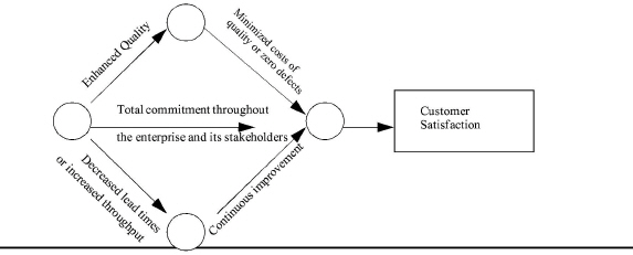
The dimensions of TQM are depicted in Exhibit 12-1
|
. Notice that quality and continuous improvement are increasing while costs of quality and lead times are decreasing. Notice also that the central thrust of a TQM system is total commitment throughout the enterprise and its stakeholders (e.g., vendors and distributors).
Quality and total commitment are discussed in the following subsections. Costs of quality will then be examined in a subsequent major section. Throughput, also called cycle time and lead time, will be discussed in Chapter 15. Continuous improvement has been and will continue to be emphasized throughout this book.
|
INSIGHTS & APPLICATIONS Sure You Know What Customer Satisfaction Is? Quality is defined by the customer. A technically perfect product or a particular service that does not meet customer expectations will fail, regardless of its “quality,” as perceived by workers and managers. The challenge to any company is to determine what customers want and whether they are satisfied with the company, its people, its products, and its services. Otherwise, a well-intentioned TQM system will fail. |
Obtaining customer feedback is therefore the key to determining customer expectations and setting the foundation for a successful TQM system. An insurance company thought its customers wanted to see their checks from claims sooner. Not so, it turned out. What customers wanted more than reduced cycle time was assurance of the date they would see their money. That little piece of information resulted in big savings. It would have been very expensive to reduce the cycle time for payments of claims, and the company would have been investing in something that was not of great value to its customers.a |
|
aAdapted from Nancy A. Karabatsos, “The State of Quality: What the Numbers Say,” Training March 1991, p. 39. Reprinted with permission from the March 1991 issue of TRAINING magazine, Lakewood Publications, Minneapolis, MN. All rights reserved. |
What Is Quality?
A wide array of definitions of quality are available. Philip R. Crosby, a quality expert, asserts that quality is “conformance to requirements.” Another expert in the field, J. M. Juran, defines quality as “fitness for use.” Armand V. Feigenbaum, a quality pioneer, states that quality is “what the customer says it is.” The International Organization for Standardization (ISO) offers the following: “Quality is the total features and characteristics of a product or service that provide its ability to satisfy stated or implied needs.”
Although all these definitions are acceptable, this book will use the following definition: Quality is customer satisfaction in which both internal customers (people within the enterprise) and external customers (ultimate consumers) are considered. Indeed, the goal of TQM is customer satisfaction.
Although there is no unambiguous, comprehensive definition of quality that will satisfy everyone, many of its basic attributes are commonly accepted. These attributes include the following:
• Form
• Fit
• Performance
• Features
• Reliability
• Conformance
• Durability
• Serviceability
• Aesthetics
• Consistency
Exhibit 12-2
|
Exhibit 12-2 Differing Views on Quality |
||
|
Traditional Management View |
|
World-Class management View |
|
Improving quality drives up time and costs |
|
Improving quality reduces time and costs |
|
Defects and failures of less that 10% are acceptable (95% good units is great) |
|
The goal is zero defects and failures (only 99.9997 to 100% good units will do) |
|
Quality should be inspected and reworked in |
|
Quality should be designed and built in. |
|
Quantity of output is as important as quality |
|
without quality, quantity is irrelevant |
compares the views of traditional management and world-class management on quality. One of the striking differences related to cost management is that quality can be improved while decreasing costs! Traditional wisdom was that improving quality would increase costs. In fact, some people contend that TQM should be called total cost management, because substantial cost savings are possible by improving quality.
The emphasis of TQM is to design and build quality in rather than trying to inspect and repair quality in. Emphasizing the designing and building in of quality focuses on the causes of superior quality. Devoting efforts to inspecting and repairing activities focuses incorrectly on fixing the “symptoms” instead of the “causes” of poor quality. Companies are moving away from the traditional “inspect-it-in” and even “fix-it-in” approaches to quality toward a newer and broader-based “create-it-in” or “design-it-in” approach.1
TQM is typically associated with manufacturing, but quality applies to services as well as to products, although in somewhat different ways. Exhibit 12-3 lists some of the more critical differences.2
|
Exhibit 12-3 Differences between Products and Services |
|
|
Products |
Services |
|
The customer owns an object |
The customer owns a memory. The experience cannot be sold or passed on to a third party |
|
The goal of producing products is to reduce variability and make products uniform |
The goal of service is uniqueness; each customer and each contract are “special” |
|
A product can be placed in inventory; a sample can be sent in advance for the customer to review |
A service happens in a moment. It cannot be stockpiled |
|
If improperly produced, the product can be pulled off the line or recalled |
If a service is improperly performed, apologies and reparations are the only means of recourse |
Many service companies, such as Federal Express and a host of other enterprises, are also employing TQM. Although the quality of service received in hotels, restaurants, and hospitals can be a matter of subjective judgment, it can be monitored and improved. Hotel guests, for example, can be asked if the service met their expectations. A service organization should have a procedure in place to record and deal with customer complaints. It should also hold regular quality review meetings to enable management to discuss and improve the methods of delivering service in order to correct problem areas.
What Is Total Commitment?
Total commitment is the mobilization of all managers and the empowerment of workers and stakeholders to engage themselves into linked value-added activities for the purpose of achieving the greatest customer satisfaction at the lowest cost. Quality is everyone's business, and each person is called on to seek perfection. Quality must, indeed, become a way of life. This is the basis for TQM. Notice that it is essentially what we have been proposing for Lean Processes.
|
INSIGHTS & APPLICATIONS Making Organizations Lean and Mean If you see a successful runner, you will notice that he or she has no excess fat. Top-flight runners are lean. So, if you want to be a top-flight runner, do you simply go on a crash diet? |
If you believe that, then you will believe that your company can become a tough competitor by laying off people. Your competitor can assemble an automobile with 28 hours of labor while you require 40, can you become competitive by laying off 30 percent of the people? It comes from making the right products and from delivering the right services. The important key to these three areas is quality... total quality... quality in everything you do. Total quality provides the lean route to competitiveness.a |
|
aMyron Tribus, “Lean on Quality,” National Productivity Review, Spring 1992, p. 277. Reprinted with permission from National Productivity Review, V. 11 N.2, Spring 1992, Copyright 1992 by Executive Enterprises, Inc., 22 West 21st Street, New York, NY 10010-6990. |
The following Lean tools are not needed for most of the TQM/6-Sigma projects, but notice that if they are well established the TQM/6-Sigma tools will work better. Additionally, most process defects can be removed by the Lean approach without the need for the detailed TQM/6-Sigma analyses you will see later in this chapter.
Andon (the visual factory) and the five Ss, discussed in Chapter 2, can serve as the bedrock for total commitment to quality. The English version also uses 5 Ss, which are listed after the description of the Japanese words. The 5 Ss are summarized as follows:
• Seiri. Organization and sorting out unneeded items. English: Sorting
• Seiton. Orderliness and arranging efficiently. English: Straighten
• Shitsuke. Discipline. English: Sustaining
• Seiso. Cleanliness. English: Sweeping or Shining
• Seiketsu. Standardization. English: Standardization [we got lucky with this one!]
If everyone in an organization practices andon and the 5 Ss, the result can be a new outlook throughout the organization and the elimination of defects in products and services and the activities that produce them. Such an approach produces lasting benefits by exposing numerous flaws that contribute to defects and failures.
Seiso, for example, is not just cleaning. It fosters co-operation among people to do a simple task such as housekeeping. Seiso also uses cleaning to discover and expose the malfunctions, abnormalities, and minor flaws that warn of impending failures and defects. People therefore come to realize the importance of precautionary, preventive action.3
TQM is an integrating force, because it involves everyone at all levels of the enterprise and links their activities. But TQM doesn't stop there. It also creates a tight linkage with vendors and external customers. This totally integrated system of quality, from inputs through production to outputs, is the essence of TQM and thus requires total commitment.
Some authorities estimate that more than 40 percent of downstream problems are caused by poor design. Hence, design should be linked with production. Since quality of raw materials can impact the quality of the product, companies should work very closely with their vendors to ensure that only high-quality materials enter production. The production process also lends itself to the improvement of quality. Rearranging the physical layout of the shop floor so that it uses U-shaped production cells and the management techniques covered in Chapter 2 is conducive to high-quality products.
Customer satisfaction requires more than individual effort. It requires teams of people empowered to achieve customer satisfaction. It takes consistent and strong commitment from top management to implement TQM. It also takes customized training and a commitment to ensure that what is learned is transferred to the workplace.
ISO 9000 Compliance and Certification
ISO 9000 is a series of five international quality standards developed by the International Organization for Standardization (ISO) in Geneva, Switzerland. The five standards are as follows:
• The ISO 9000 standard provides some basic definitions and serves as a guide to using the other standards in the series.
• The ISO 9001 standard ensures conformance to requirements during design and development, production, installation, and servicing of products. Enterprises covered under this standard are engineering, construction, and manufacturing companies.
• The ISO 9002 standard specifies a model for quality assurance when only production and installation conformance is required. This standard is particularly relevant to process industries where specific requirements for products are stated in terms of an established design or specification. Chemicals, food, and pharmaceutical companies generally seek certification under this standard.
• The ISO 9003 standard requires only conformance in final inspection and testing. This standard concerns small shops, equipment distributors that inspect and test the products they supply, and divisions within an organization such as laboratories.
• The ISO 9004 standard contains guidance on technical, administrative, and human factors affecting the quality of products and services. This standard provides for developing and implementing a TQM system.4
Companies not meeting these mandatory standards may be forced to submit their activities to audits and their products for expensive testing, or more importantly, they may be forbidden to sell them in European and other countries. As is the case with quality in general, ISO 9000 certification is an ongoing process. Once the initial certification is achieved, companies must submit to surveillance or maintenance audit visits twice a year to ensure that there is no degradation of the TQM system.
Many believe that ISO standards are relevant only to companies that export, yet a number of companies that do business only in the United States have sought ISO certification. They find this beneficial for several reasons. For one thing, a buying company that is ISO-certified will expect its vendors and distributors also to be ISO-certified. A number of American companies, such as AT&T and DuPont, are requiring their suppliers to include ISO compliance in their contracts.5 Furthermore, when a supplier is ISO-certified, buyers will not feel the need to audit. As a result, both the buying and the selling companies will save time and money. Finally, given the unrelenting drive toward TQM and increasing competition, organizations that embrace ISO standards see them as a better way to manage costs and run a business.
ISO can be summed up in four simple steps:
• Document what you do.
• Do what you said you would do.
• Control nonconformance.
• Control variability.6
|
INSIGHTS & APPLICATIONS IBM’s AS/400 Unit Gains ISO 9000 Approval There is little question that quality and continuous improvement are strategies that are here to stay. Many companies worldwide are using ISO standards as the basis for a company wide TQM system and continuous improvement program. |
ISO 9000 establishes minimum quality management guidelines against which companies are measured in order to compete for contracts under ISO 9000.The IBM AS /400 development and manufacturing unit has been recognized by the International Organization for Standardization (ISO) for meeting the ISO 9000 standards for quality. IBM expects the certification to help the firm gain contracts with worldwide government agencies. TQM systems help companies expand market share. As worldwide competition heats up, ISO 9000 certification will be required for not only marketing products and services internationally, but locally as well. |
ISO certification has become a symbol of companies around the world that provide superior quality.
THE COSTS OF QUALITY
LEARNING OBJECTIVE 2
Define costs of quality and explain their relationship and trade-offs. In addition, differentiate the costs-of-quality minimization approach from the zero-defects approach.
Costs of quality consist of prevention, appraisal, internal failure, and external failure costs. Some authorities view prevention as a “good” cost and the others as “bad” costs. The objective is to minimize and eliminate the “bad” costs of quality and manage the “good” costs to an appropriate level.7
This section describes a reporting and analysis tool that can work without any other quality programs in place, or it can support Lean, TQM, or 6-Sigma. If you use the ideas about cost of quality and develop weekly or monthly reports that become part of your organization’s standard reporting, that would be more consistent with Lean or TQM approaches. If, on the other hand you use it as a one-time analysis, that would be more typical of 6-Sigma. The interesting thing about the cost of quality report is that it can also be used in a traditional M-level organization to some good effect—even without any other quality or Lean focus. In seminars for professionals, we often use this as an example of the power of accounting to “name” things as good or bad. For example, just the name External Failure cost creates a powerful impact.
Costs of quality can be substantial. But, in most companies, they are buried in cost of goods manufactured and sold, salaries, travel expenses, insurance, technical services, and so forth. They remain unknown and therefore unmanaged. For many enterprises, one of the greatest opportunities for effective cost management and profit improvement lies in managing costs of quality. The conventional method for reporting, evaluating, and managing costs of quality is to identify all costs of quality under the four major categories mentioned before:
• Prevention costs
• Appraisal costs
• Internal failure costs
• External failure costs
Prevention Costs
Prevention costs are those costs incurred to prevent poor-quality products or services from being produced in the first place. These costs are for the following:
• Doing the job right the first time, every time, through re-engineering and continuous improvement efforts
• Improving quality of raw materials through technical support provided by vendors
• improving knowledge and skills of managers and workers through customized training programs
When quality of design, quality of raw materials, and quality of the production process increase, so do product quality and productivity.
|
INSIGHTS & APPLICATIONS Being Penny-Wise and Pound-Foolish Quality will always cost, but the return on an expenditure for quality always exceeds the money and effort that is expended. Prevention costs are usually the smallest cost that produces the largest returns.The purpose of prevention costs is to improve quality by preventing defects from occurring. Expenditures in this category ensure that “things are done right the first time, every time.” |
Jerry Tubbs, line manager of Electrograph Products board-dipping operation determines that his equipment is out of specification and will likely be turning out low quality circuit boards. He requests permission from Lesli Reynolds, department manager, to shut down the operation for one day to make some repairs and reset equipment. Permission is denied.Two weeks later, piles of defective circuit boards line the aisles in the downline departments. Bottlenecks appear throughout the plant as boards are reworked. Minimizing costs in the board-dipping operation didn’t minimize costs overall. In fact, it caused costs to rise sharply.a |
|
aAlfred J. Nanni, Jeffrey G. Miller, and Thomas E. Vollmann, “What Shall We Account For?” Management Accounting, January 1988, p. 42. Reprinted from Management Accounting. Copyright by Institute of Management Accountants, Montvale, N.J. |
Quality through prevention can be achieved at low cost. All other costs of quality are corrective, the most expensive means of achieving quality. Some would say that correction never achieves quality anyway, it only reworks something that should have never occurred.
Appraisal Costs
Appraisal costs are incurred to identify nonconformities before a product or service reaches another activity and is delivered to the ultimate customer. Appraisal costs include the following:
• Inspection and testing of incoming materials as well as work-in-process
• Supervision
• Quality audits
Inspection is a dominant activity that drives up appraisal costs. The effectiveness of inspection can he measured as follows:
Inspection = (# of defects at inspection) / (# of units completed in the process)
The desirable result of this performance measurement is a decreasing ratio, as indicated in the following computations:
Period 1:
= 100 defective units Inspection / 1,000 units produced = 10% defects
Period 2:
= 50 defective units / 1,000 units produced = 5% detects
Instead of trying to arrive at the ideal combination of inputs, most organizations focus on the completed product by inspecting the problem out. Discovering defects or errors after the job has been done is typical. Inspection keeps most problems away from customers, but it does little to keep costs down or improve the activities that created the defects or errors in the first place. Inspecting problems out takes time and money; it also fails to get to the source of the problem.
Before jumping to the conclusion that all inspection is necessarily bad, one must differentiate between final inspection and process inspection. Final inspection is performed to remove unacceptable products or services before they are delivered to the external customer. Process inspection is conducted to monitor a process or activity to ensure that it does not produce unacceptable products or services. Process inspection is more preventive because it identifies problems in the process or activity before they get out of control. This identification is achieved by using control charts, which are discussed in detail later in this chapter.
No two products are exactly alike in shape, finish, or dimension. They may seem identical by almost every test, but they are nevertheless different in some respect, causing variability. This variability is monitored by inspecting sample products from the process. As long as the quality attributes being measured are within certain control limits, the process is said to be in control and producing acceptable products. If the monitoring begins to show an out-of-control condition, corrective action is taken immediately to prevent the process from producing a large number of defective products. If process inspection is effective, there should be no need for final inspection.
Internal Failure Costs
Internal failure costs are those costs incurred when products or services fail to meet quality standards, and the defects are identified after the products or services are produced but corrected before they are delivered to the external customer. Armand V. Feigenbaum says that many companies have a “hidden plant,” which is a work force equal to as much as 40 percent of capacity that exists simply to undo mistakes. These internal failure costs entail:
• Rework
• Scrap
• Repair
• Downtime
• Re-testing
One performance measurement that helps measure the effectiveness of controlling internal failure costs is calculated as follows:
Internal failure causing rework = # of reworked units / # of finished units
The desirable result of this performance measurement is a decreasing ratio, as shown in the following computations:
Period 1: Internal failure causing rework = 900 units reworked / 3,000 finished units = 30% rework
Period 2: Internal failure causing rework = 600 units reworked / 3,000 finished units = 20% rework
External Failure Costs
External failure costs are those costs incurred because poor-quality products or services are delivered to external customers. Nonconformities are identified after the product or service reaches the ultimate customer. External failure costs are associated with the following:
• Sales returns and allowances
• Recalls
• Warranty repairs
• Replacements
• Product liability insurance
• Handling customer complaints
• Lost sales
• Lost customers
Three performance measurements that help measure the impact of external failure costs are as follows:
Sales returns and allowances % = Dollar value of products returned / Total sales dollars
Warranty repairs % = Cost of warranty repairs / Total sales dollars
Replacements % = Number of replacements / Number of units in the field
The desirable result of these performance measurements is a decreasing ratio, as shown in the following computations:
Period 1:
Sales returns and allowances = $10,000 in sales returns and allowances / $100,000 sales = 10% returned
Period 2:
Sales returns and allowances = $6,000 in sales returns and allowances / $120,000 sales = 5% returned
Summary Analysis of Costs of Quality
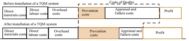
Prevention and appraisal costs are voluntary; that is, these costs do not have to be incurred. Internal failure and external failure costs are involuntary, because they are costs that the company is forced to pay. The only way to decrease, if not eliminate, these failure costs is by increasing prevention and appraisal costs. TQM is prevention-based. Advocates of TQM try to eliminate not only failure costs but also appraisal costs (usually not process inspection costs).
Prevention and appraisal costs are sometimes called costs of conformance (i.e., adherence to quality standards). Costs of conformance include all costs incurred in an effort to ensure that products or services meet customer requirements. Internal failure and external failure costs are sometimes referred to as costs of nonconformance. Costs of nonconformance involve all costs incurred before or during use because of rejections, corrective alterations, refusals of products or services, claims, returns, replacements, and reimbursements. The costs of quality equal the sum of conformance and nonconformance costs.
The examples of prevention, appraisal, internal failure, and external failure costs in this chapter are only a guide. Management accountants will have to decide which specific costs most accurately and completely measure costs of quality in their own organizations.
Relationship and Trade-offs between Costs of Quality
Total costs of quality can exceed 60 percent of sales revenue!8 A large number of enterprises are therefore working hard to reduce costs of quality, especially appraisal, internal failure, and external failure costs. The majority of quality experts believe that costs of quality could be reduced below 5 percent of sales revenue by installing a TQM system.
|
Focusing and spending money on prevention will significantly reduce overall costs of quality. Thus, the cost management rule that pertains to costs of quality is: Invest in prevention to minimize appraisal, internal failure; and external failure costs. A small investment in prevention will normally result in a huge savings in other costs of quality.
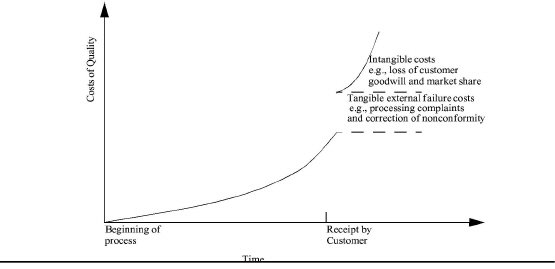
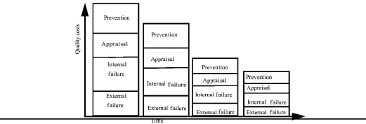
Exhibit 12-4 illustrates a hypothetical relationship between costs of quality and the time at which a nonconformity is detected. Clearly, the later a nonconformity is identified in the production process, the greater the cost of correcting it. Moreover, if the nonconforming product or service is identified by the ultimate customer rather than by the producer's appraisal activities, the costs increase dramatically.9
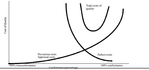
Exhibit 12-5
|
also demonstrates that prevention and appraisal costs are preferable to failure costs. As companies perform re-engineering and practice continuous improvement, the shift will be more and more to prevention with a downward shift in total costs of quality.
Total costs of quality decrease as companies shift their quality expenditures from failure costs to prevention and appraisal costs. This shift is accompanied by a corresponding improvement in quality, and the decrease in failure costs continues until 100 percent conformance is almost achieved. At this point, management cannot realize further cost reductions through additional prevention and appraisal expenditures. The focus must then shift to additional re-engineering and technological breakthroughs that can shift the prevention and appraisal cost curve down and to the right.
Exhibit 12-6
|
Exhibit 12-6 Minimizing Total Costs of Quality |
||||||
|
Prevention Costs |
Appraisal Costs |
Percentage Defective |
Internal Failure |
External Failure |
Costs of Lost Sales |
Total Costs of Quality |
|
$100 |
$100 |
5.00 |
$50.00 |
$15.00 |
$15.00 |
$280 |
|
120 |
80 |
3.50 |
35.00 |
10.50 |
10.50 |
256 |
|
140 |
65 |
2.25 |
22.50 |
6.75 |
6.75 |
241 |
|
160 |
55 |
1.25 |
12.50 |
3.75 |
3.75 |
235 |
|
180 |
50 |
.50 |
5.00 |
1.50 |
1.50 |
238 |
|
200 |
45 |
0.00 |
0.00 |
O.00 |
0.00 |
245 |
illustrates how different costs of quality are related and the trade-offs that exist among them. Assume that the maximum number of defects is 5 percent and that a minimum expenditure for prevention is $100. In this case, total costs of quality are minimized at $235, with $160 being spent on prevention and $55 on appraisal. With these quality expenditures, a total defective unit rate of 1.25 percent is expected, which then leads to failure costs of $16.25 and costs of lost sales of $3.7510. Costs of lost sales (and lost customers) may be included in the costs of external failure instead of being shown separately.
Reporting Costs of Quality
The performance measurements described earlier are effective for supervisors and workers. To gain top management's attention, the management accountant should prepare quantitative reports on the company's total costs of quality. When the company's quality problems are expressed in financial terms, top management will be more motivated to take action to improve quality.11 Note that making this a weekly or monthly report is probably not what you would see in a 6-Sigma organization, but likely in a Lean or TQM organization.
A form such as the report in Exhibit 12-7 can be used to collect costs of quality. If actual costs are not available, then estimates should be made. Any estimates should be verified by those most directly involved with the cost activities to ensure they are approximately accurate. The report in the exhibit represents the management accountant's first costs-of-quality report to management at Erecto.
The costs-of-quality report should include ratios of costs of quality to sales revenue because they reveal the relative burden of quality costs incurred by the firm. When these ratios are compared to the competition, they can help diagnose quality problems. For example, the ratio of external failure costs to sales revenue is a good gauge of the current level of customer dissatisfaction. A ratio that is high in comparison to that of the company's competitors suggests that customers have suffered unduly from product or service failures. This should signal to management the need for more expenditures on prevention and appraisal. On the other hand, an extremely low ratio may be signalling excessive prevention and appraisal costs.
|
INSIGHTS & APPLICATIONS The Costs of Quality Trade-offs A viable TQM system can become the ultimate marketing tool. Many customers consider quality more important than price. Today, many enterprises define quality in terms of customer satisfaction or meeting customer needs. This new paradigm includes the cost of lost sales due to external failure as a key measurement. Including the cost of lost sales motivates managers |
and workers to focus on what is important to an enterprise's success. Tom Varian of Organizational Dynamics, Incorporated says, “We talk about something called the '1-10-100 Rule,' which states that on a straight ratio, if your people prevent a defect or service failure, that might cost you $1. If your inspection mechanism catches the failure before it reaches the customer, that costs you perhaps $10. But if the defective product or service is delivered to the customer and leads to dissatisfaction, the cost of that failure is $100, because not only have you lost that customer’s business, chances are the customer will tell others about the dissatisfying experience. And that's going to cost you real dollars that you would have earned otherwise”a. |
|
aAdapted from Karabatsos, op. cit., p. 39. |
The purpose of a costs-of-quality report is to make management aware of the magnitude of the costs and to provide a baseline for gauging and tracking the impact of quality efforts. The report in Exhibit 12-7 shows that Erecto has been spending relatively few dollars on prevention and appraisal. As a result, the company's costs of nonconformance—that is, internal failure and external failure costs—were 55 percent of sales revenue. Erecto's management was astonished to learn that the costs of nonconformance were so high and wanted to know what could be done to reduce them. The answer was to invest in prevention. As prevention costs increase, other costs of quality will decrease. Furthermore, as long as the decrease in failure and appraisal costs is greater than the corresponding increase in prevention costs, the company should continue pursuing and implementing additional preventive measures to further reduce the total costs of quality. Theoretically, if prevention efforts are totally successful, there will be no need to incur appraisal, internal failure, and external failure costs.
|
INSIGHTS & APPLICATIONS Measuring the Cost of Lost Customers Some authorities believe that customer retention has a more powerful effect on profits than market share and many other variables that are traditionally associated with competitive advantage. As customer retention goes up, marketing costs go down. Additionally, |
loyal customers, in their role as “salespersons,” frequently bring in new customers. Can the costs of lost customers be measured? “Think again,” says John Goodman, president of a quality research firm. “They can be measured. Each time a customer has a problem, it creates about a 20 percent impact on loyalty. If 1,000 of your customers have a quality problem, you can say with some certainty that at least 200 of those customers are at risk of being lost. If you know how much each customer is worth (profit), you can multiply this amount by 200 to give the costs of lost customers.a |
|
aAdapted from Karabatsos, op. cit., p. 33. |
.
|
Exhibit 12-7 Costs-of-Quality Report before Prevention Efforts |
||||
|
ERECTO PRODUCTS Costs-of-Quality Report Period: 01/01/04 to 12/31/04 |
||||
|
Cost of Quality Category |
|
A = Actual E = Estimate |
|
Percentage of Sales (Sales = $4,000,000) |
|
Prevention Costs |
|
|
|
|
|
Quality Training |
A |
5,000 |
|
|
|
Improvement and Reengineering |
E |
5,000 |
|
|
|
Technical support for vendor |
A |
10,000 |
|
|
|
Preventive maintenance |
A |
10,000 |
30,000 |
0.75% |
|
Appraisal Costs |
|
|
|
|
|
Inspection and testing of incoming material |
A |
$ 40,000 |
|
|
|
Inspection and testing of work-in-process |
A |
60,000 |
|
|
|
Supervision |
A |
50,000 |
|
|
|
Quality Audits |
A |
50,000 |
200,000 |
5.00 |
|
Internal failure costs: |
|
|
|
|
|
Rework |
A |
$100,000 |
|
|
|
Scrap |
A |
200,000 |
|
|
|
Repairs |
A |
l00,000 |
|
|
|
Downtime |
E |
50,000 |
|
|
|
Retesting |
A |
50,000 |
500,000 |
12.50 |
|
External failure costs: |
|
|
|
|
|
Returns |
A |
$200,000 |
|
|
|
Recalls |
A |
500,000 |
|
|
|
Warranty repairs |
A |
100,000 |
|
|
|
Replacements |
A |
250,000 |
|
|
|
Product liability insurance |
A |
50,000 |
|
|
|
Handling Customer Complaints |
A |
100,000 |
|
|
|
Lost sales |
E |
200,000 |
|
|
|
Lost Customers |
E |
300,000 |
1,700,000 |
42.50 |
|
Total costs of quality |
|
|
$2,430,000 |
60.75% |
|
|
|
|
|
|
After the first costs-of-quality report, Erecto's management made enterprisewide efforts to install preventive measures, with the results shown in Exhibit 12-8. The initial preventive efforts took one year and involved vendors and transportation companies that serve Erecto, but as management realized, prevention is a process that requires ongoing efforts. Understandably, prevention costs rose to 8 percent of sales, but why did appraisal costs also rise? Appraisal costs will normally rise at the beginning of quality efforts as the firm ensures that quality is actually being achieved. At some point, possibly two or three years later, appraisal costs (especially final inspection costs) should decrease as work is done “right the first time, every time.”
Why are internal failure and external failure costs still excessive? These non-conformance costs will not disappear immediately. That will take time. Indeed, the total costs of quality at Erecto are still too high. Many authorities, including Philip B. Crosby, an internationally known expert on quality, believe that the total costs of quality should be no more than 2.5 percent of sales. Clearly, Erecto has a long way to go before it achieves this goal. With a continuing focus on prevention, Erecto will be able to reduce appraisal, internal failure, and external failure costs substantially. Over time, even prevention costs such as reengineering and technical support costs for vendors and transportation companies can be reduced, because these earlier costs should not have to be repeated (e.g., certified vendors do not need continuing technical support).
The intent of costs-of-quality reporting is to provide reasonably accurate cost information. The primary purpose is to advise management whether its TQM system is heading in the right direction and actually reducing the total costs of quality. An important consideration for management accountants is to avoid disagreements over minor cost elements.
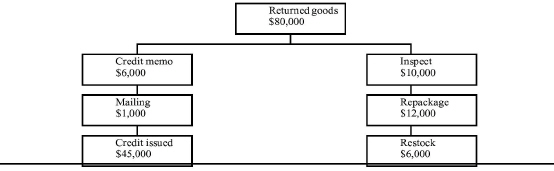
The Ripple Effect on Costs of Quality
Ripple charts show the impact of defects or failures throughout a series of activities. For example, as Exhibit 12-9 shows, “returns” cause a ripple effect among a number of activities. The total costs of returns (returned goods) in the costs-of-quality report in Exhibit 12-8 were $80,000. The ripple chart shows the costs incurred by Erecto to process these returned goods. Other costs that may not be so evident and easy to obtain are costs of replanning production and excess inventory when a large number of goods are returned.12 Again, such costs should be estimated, but presenting too much detail and too many intangible cost elements should be avoided—that is a sure way to lose the interest of managers and workers.
|
Exhibit 12-8 Costs-of-Quality Report after Prevention Efforts |
|
|||
|
|
ERECTO PRODUCTS Costs-of-Quality Report Period: 01/01/05 to 12/31/05 |
|
|
|
|
Prevention costs |
Quality Training |
$90,000 |
|
|
|
|
Improvement and re-engineering |
30,000 |
|
|
|
|
Technical support for vendors |
90,000 |
|
|
|
|
Technical support for transporters |
60 000 |
|
|
|
|
Preventive maintenance |
80,000 |
400,000 |
8.00% |
|
Appraisal costs: |
Inspection and testing of incoming materials |
$60,000 |
|
|
|
|
Inspection and testing of work-in-progress |
80,000 |
|
|
|
|
Supervision |
80,000 |
|
|
|
|
Quality audits |
30,000 |
300,000 |
6.00 |
|
Internal failure costs: |
Rework |
$50,000 |
|
|
|
|
Scrap |
40.000 |
|
|
|
|
Repairs |
50,000 |
|
|
|
|
Downtime |
40,000 |
|
|
|
|
Retesting |
20,000 |
200,000 |
40.00 |
|
External failure costs: |
Returns |
$80,000 |
|
|
|
|
Recalls |
90.000 |
|
|
|
|
Warranty repairs |
90.000 |
|
|
|
|
Replacements |
80,000 |
|
|
|
|
Product liability insurance |
40,000 |
|
|
|
|
Handling customer complaints |
60,000 |
|
|
|
|
Lost sales |
80,000 |
|
|
|
|
Lost customers |
80,000 |
600,000 |
12.00 |
|
Total cost of quality |
|
$ 1,500,000 |
30.00% |
|
|
|
|
|
|
|
Managers are always interested in trends. Exhibit 12-10
|
|
|
Exhibit 12-10 Bar Chart Showing Improving Trend in Costs of Quality |
illustrates a bar chart that shows trends in costs of quality. Band graphs, illustrated in Exhibit 12-11
|
|
, are visualization techniques in which internal composition and proportions are expressed by the length of a band. Drawing several parallel band graphs makes it easy to compare quantities and proportions and thus to see the trend in costs of quality and the change in profit. Ripple charts and band graphs are additional tools that management accountants can use to make their cost analysis and reporting more effective.
Pursuing Zero Defects
Zero defects is a quality standard that calls for products and services to be produced and delivered according to customer requirements. The basis of zero defects is doing it right the first time, every time, and eliminating all nonconformities. This philosophy of quality is more typical of earlier TQM-style efforts and is considered obsolete by 6-Sigma users because they believe that there is a financially optimal level of defects.
The ultimate aim of the zero-defects approach is the elimination of all failure costs. Quality experts who emphasize zero defects as the target say that minimizing total costs of quality at less than 100 percent conformance undercuts the spirit and objectives of world-class attitudes. This approach differs from the costs-of-quality minimization approach presented earlier, which argues that management should curtail voluntary expenditures (i.e., prevention and appraisal costs) when total costs of quality per unit reach a minimum, even though 100 percent quality conformance has not been achieved.13
Those who support the zero-defects approach disagree, saying that minimization implies the existence of a single specific optimal level of quality cost expenditures. They emphasize that achieving minimization and an optimal level of costs of quality is actually a moving target because of technological breakthroughs and continuous improvement. The focus, therefore, should be on using continuous improvement and prevention to achieve a zero-defects goal, not total costs-of-quality minimization. Quality-driven companies assume that defects do not need to exist. They back up this assumption with stringent preventive measures, including top-notch product design and engineering, consistent high-performance activities, and certified vendors that guarantee defect-free parts, supplies, and raw materials.
A zero-defects approach does not use percentage as the unit of measure. Why not? A product is made up of hundreds of parts and activities. If each part is affected by a 1 percent error rate, no product or service will be satisfactory.
A unit of measurement that helps in understanding the zero-defects goal is parts per million (PPM). Usually, most people consider anything less than 1 percent to be small, but a 1 percent defective rate means 10,000 defective units in 1,000,000. World-class companies do not tolerate such a defective rate! In more dramatic terms, 99 percent defect-free (or 1 percent defects) means:
• 30,000 babies dropped per day in maternity wards
• 20,000 lost articles of mail per hour
• Unsafe drinking water almost 15 minutes each day
• 5,000 incorrect surgical operations per week
• Two short or long landings at most major airports each day
• 200,000 incorrect drug prescriptions each year
• No electricity for over 7 hours each month
|
INSIGHTS & APPLICATIONS Quality Leadership from the Top Early on, manufacturers believed it w as too expensive to make things perfectly. Companies now know that the reverse is true. It's too expensive not to aim for zero defects. Motorola and many other companies discovered this new standard the hard way. “Ironically, I had been trained earlier on the right standard, but I didn't recognize it,” says Robert Galvin, chairman of Motorola. The unrecognized lesson came from Galvin's fifth grade teacher, a nun, who one day announced that the class would have a test on fractions in one week. |
There would be just two grades: 100 percent or F. Just one wrong answer meant failure on the test. “I didn't realize the real lesson,” says Galvin. “It's possible to do a job one had been trained for perfectly. You just had to decide what your objective was going to be. Making a personal commitment is the key to quality leadership Galvin says, “Our objective is perfection... no mistakes, zero defects.” Executives from other companies privately advised him to stop using the word perfection because it was “not believable.” Galvin told them he was “required” to establish perfection as a goal because “our customers don't tolerate any mistakes.”a |
|
aAdapted from “Quality Leadership,” Productivity (Norwalk, Conn.: Productivity Institute, 1992), pp. 1-2. With permission. |
One hundred PPM defective is still a large amount in quality-conscious companies, yet it represents only 0.01 percent defective, which is quite small but not to people who pursue zero defects. The advantage of the PPM unit of measurement, therefore, is that it transforms seemingly small numbers into large numbers. For example, the 0.01 percent measurement may induce passivity, whereas a 100 PPM defective measurement can create pressure for action.14 In fact, many companies (e.g., Digital Equipment Company) are achieving around 3 PPM defects, which is 0.0003 percent defects or 99.9997 percent defect-free. A long-term goal at DEC, and at a number of other companies, is around 2 parts per billion (PPB) defective, which is 99.9999998 percent defect-free.
TOOLS USED TO SOLVE QUALITY PROBLEMS
LEARNING OBJECTIVE 3
Describe Pareto charts and cause-and-effect diagrams, and discuss how they are used in solving quality problems.
Two popular tools used to solve quality problems in activities and processes are:
• Pareto charts
• Cause-and-effect diagrams
These 2 tools are used by almost all quality efforts, but at different times. In Lean or TQM organizations they are usually used for most processes and on a consistent basis. In 6-Sigma they would normally be used only during a specific quality project lead by a Black Belt.
These tools help discover quality problems and their root causes. Without such tools, problem solving is often just guesswork, sometimes very expensive guess-work. Based on such analysis, significant changes are made to improve substantially or re-engineer processes or activities. Once the proper changes are made, control charts, the subject of the next major section, are used to ensure processes and activities stay in control and continuous improvement is practiced.
Total quality management systems must be supported by an enterprisewide effort. Therefore, problem-solving tools are generally used by teams of people in a joint effort to identify and correct quality problems.
Pareto Charts
The Pareto chart is a vertical bar graph that can be used to rank quality problems, such as defects, rework, claims, failures, scrap, spoilage, complaints, or accidents. The Pareto chart is a good tool to use when the company is making an initial analysis of its activities and does not yet have a TQM system in place. It organizes and portrays data in a way that helps people understand the present performance of activities and processes.
The “Pareto principle,” credited to Italian economist Vilfredo Pareto, promotes the so-called 80/20 rule. Pareto discovered that 80 percent of the wealth in his country was concentrated in 20 percent of the population. This principle has been applied to the analysis of a number of things; for example, 20 percent of the inventory items generate 90 percent of the revenue. In the case of quality, the Pareto principle states that 20 percent of the nonconformities generate 80 percent of the quality problems.
The 80/20 rule does not always hold exactly, but a Pareto chart is a way to display the magnitude of quality problems. It separates “the vital few problems from the trivial many.”15 The vital quality problems typically provide the most promising targets for reengineering and improvement efforts.
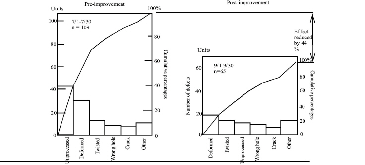
PRE-IMPROVEMENT AND POST-IMPROVEMENT PARETO CHARTS. Exhibit 12-12
|
|
aSource: Kazuo Ozeki and Tetsuichi Asaka, Handbook of Quality Tools. The Japanese Approach (Cambridge, Mass.: Productivity Press, 1988), p. 145. With permission. |
shows pre-improvement and post-improvement Pareto charts depicting the quality problems of an activity that makes bicycle frames. This activity was investigated from July 1 through July 30. The total number (n) of defects was 109. The number of defects in each quality problem category was plotted. The worst problems (i.e., the longest bars on the Pareto chart) were “unprocessed” and “deformed.” These problems were selected immediately for further study and corrective action. Points were also plotted for the cumulative total in each bar and connected with a line to create a graph that shows the relative incremental addition of each category to the total.
After quality improvement actions were taken, data were collected on the same activity from September I through September 30. The plots of these data are shown in the post-improvement Pareto chart. Shading is used to keep track of the categories, which are in a different order in the post-improvement Pareto chart. The dramatic improvement is evident.
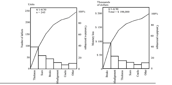
USING PARETO CHARTS TO SHOW MONETARY LOSSES. In some instances, the monetary loss can be a better measure of the severity of a quality problem than the number of nonconformities. Exhibit 12-13
|
|
aSource: Kazuo Ozeki and Tsuichi Asaka, Handbook of Quality Tools: The Japanese Approach (Cambridge, Mass.: Productivity Press, 1988), p. 146. With permission. |
presents two Pareto charts: one shows the number of defects (n = 245), and the other shows the monetary losses from the defects. Although both charts show the same categories of defects, they are in a different order of significance. The category “breaks,” for example, results in the largest monetary loss even though it does not account for the largest number of defects.
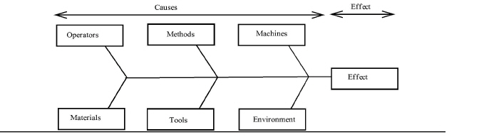
Cause-and-Effect Diagrams
The Pareto chart is an excellent tool for identifying quality problems and determining their frequency. The next critical step is to ferret out the root causes of quality problems. Here the cause-and-effect diagram is a useful tool. It is sometimes called a fishbone diagram because of its shape or an Ishikawa diagram after the late Professor Kaoru Ishikawa of Japan. In Chapter 10, a modified cause-and-effect diagram was used to show tasks that make up an activity. In this chapter, it is used as its developer intended; that is, to dig for the root causes of tough quality problems.
|
INSIGHTS & APPLICATIONS Finding the Root Causes of Quality Problems One of the tasks in a loan department of a bank is to prepare documents for signature by the buyer and seller, and to file them with the Registrar of Deeds. Mortgage and escrow-payment amounts are frequently typed incorrectly by the typing pool. Rather than going back to the source of the problem, loan officers simply toss out the forms with the incorrect numbers on them and have their own secretaries retype them correctly. What happens? |
Errors continue to show up and unit cost per loan package increases significantly. If quality and productivity are important to this bank, what should it do? Hiring people to inspect all of the work coming out of the typing pool is not the answer. A better solution is to go back and follow documents through the entire process to find out why the payment amounts are incorrect. Maybe some of the loan officers are providing the wrong information. Maybe the errors are due simply to haste and carelessness in the document-preparation area. The bank must find the cause of the problem and fix it, not just nurse the symptoms.a |
|
aAdapted from Ronald W. Butterfield, “Deming's 14 Points Applied to Service,” Training, March 1991, p. 52. Reprinted with permission from the March 1991 issue of TRAINING magazine. Lakewood Publications. Minneapolis, MN. All rights reserved. |
The basic shape of the cause-and-effect diagram is shown in Exhibit 12-14
|
. Worst-case quality problems identified by the Pareto chart become the spine of the cause-and-effect diagram. Generally, the following “ribs,” or main cause categories, are used initially:
• Operators
• Methods
• Machines
• Materials
• Tools
• Environment
|
INSIGHTS & APPLICATIONS Using a Fishbone Diagram to Streamline the Admitting Activity A fishbone diagram of the admitting activity in a large hospital revealed that new patients had to fill out no less than seven different forms before being admitted to the hospital. |
A close look at those forms revealed that there were no less than three separate admitting forms-one for men, one for women, and one for children. A senior staffer recalled that there used to be just one such form, but that it had been divided into separate forms to fulfill requirements of a study project long since completed. A single questionnaire was developed, and in that simple change in the admitting activity the hospital was able to cut ten minutes off the lead time for admitting patients.a |
|
aAdapted from Carson Reed, “The Big Q,” Colorado Business Magazine, March 1991, pp. 50-51. With permission. |
Other main cause categories specific to a particular quality problem may be added if the investigating team decides they are relevant. For example, “measurement” and “information” may be added as main cause categories.
To help the investigating team organize their thinking, a cause-and-effect diagram without the “bones” and “small bones” (i.e., one containing only main cause categories) may be displayed on a large piece of paper taped to the wall of a meeting room, or a blackboard or whiteboard may be used instead. In some cases, each member is asked to write down what he or she believes to be the root causes on a deck of 50 or so index cards. Then, these cards are attached to the “bones” that connect to the appropriate “rib” or main cause category. “Small bones” can be connected to bigger bones to indicate causes of causes. As the investigation progresses, subdivisions and attachments continue until the root causes are found. Once the root causes are determined, corrective action can be taken.
How can the main cause categories cause quality problems? Operators may not perform properly due to negative attitudes or poor training. Methods may be outdated and counterproductive. Machines may be inadequate for the work performed or poorly maintained. Materials may be faulty. Tools may be broken or worn. The environment may be too hot, cold, dirty, noisy, humid, or dark and therefore negatively influence the process.
Exhibit 12-15
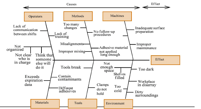
|
shows a cause-and-effect diagram devised by a company that has already used Pareto chart analysis to determine that poor adhesion is one of its major quality problems. Now, the cause-and-effect diagram is used to determine the causes of the adhesion problem. At the beginning of the investigation, “Poor adhesion” was written in the effect box. Then the six main cause categories were inserted and their ribs attached to the spine. Members of the investigation team were given index cards to record what they thought were the causes of poor adhesion. These causes were inserted on the cause-and-effect diagram as shown in the exhibit.
The resulting cause-and-effect diagram was checked to make sure that no cause had been left out. The investigating team also went back into the workplace to discuss the causes with all participants. A consensus was reached, and the cause-and-effect diagram became the basis for correcting the adhesion problem.
TOOLS USED TO KEEP ACTIVITIES AND PROCESSES IN CONTROL
Pareto charts and cause-and-effect diagrams are used to improve or re-engineer activities and processes. Presented in this section are control charts first introduced in Chapter 11, which are statistical devices used mainly to control processes or activities after they have been substantially improved or re-engineered and most, if not all, of the quality problems have been corrected. Control charts are also used to analyze and evaluate the process, thus stressing the idea of continuous improvement.
Once again we see that although Lean, TQM and 6-Sigma all use these methods, their use is different. 6-Sigma and Lean use these tools most often, and Lean the most of all. In Lean this type of chart is kept for a very large proportion of all processes, even those deemed to be in control. TQM would also use these tools, but given its broader approach, it a lower frequency. 6-Sigma would use these tools in the final Control phase of a project only.
The Statistical Basis for Control Charts
Every process or activity no matter how well it is engineered involves some variation. The study of the behavior of this variation in important quality characteristics is the main objective of control charts. Control charts show the amount and nature of variation by time, indicate statistical control or lack of it, and enable significant changes or patterns in the process or activity to be detected. As Exhibit 12-16
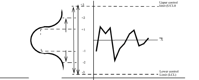
|
shows, to construct a control chart for X, the vertical scale is calibrated in units of X, and the horizontal scale is marked with respect to time or some other basis for ordering X; then, horizontal lines are drawn through the estimated mean of X and through an extreme value on the upper and lower tail of the normal distribution of X. When 50 percent of the observations of an activity or process are above the average or center line but not outside the upper control limit (UCL) and 50 percent of the observations are below the average or center line but not outside the lower control limit (LCL), the process or activity is considered in control or operating normally.
Any activity or process, no matter how precise, is subject at any given moment to a very large number of random disturbances, all of them so small as to be individually inconsequential. But, together, these random disturbances make the activity or process output vary slightly from the average, with the result that no two outputs are exactly alike. Thus, variations on either side of the center line are equally likely. This variability that is always present in a process or activity is the result of random causes. The only way to eliminate or reduce a particular set of random causes is to change the process or activity, such as by automating a manual activity.
In addition to the random causes, which are always present, there may be other more obvious sources of variability that cause the process or activity to deviate further from its average. These are assignable causes, which result in relatively large variations; these special causes are due to differences in the following:
• Operators
• Machines
• Methods
• Materials
• Tools
• Environment
When variations conform to a statistical pattern that might reasonably be produced by random causes, the assumption is that no special assignable causes are present. The conditions that produced these variations are, accordingly, said to be under control. On the other hand, when the variations in the data do not conform to a pattern that might reasonably be produced by random causes, one may conclude that one or more assignable causes are at work. In this case, the conditions producing the variations are said to be out of control.
Kinds of Control Charts
A successful process or activity is one that can consistently operate within the required limits of variation. Two kinds of control charts are used to portray this variation:
• Control charts for variables describe quality quantitatively in terms of dimension, pressure, voltage, temperature, weight, or other quantifiable characteristics.
• Control charts for attributes use qualitative terms, such as “good” or “had” and “acceptable” or “unacceptable,” to describe attributes such as finish and color.
Control charts for both types of data are available for analytical visualization of the data distribution for the quality characteristics being studied.
Control Charts for Variables
The following are the most commonly used control charts for variables:
• X chart
• R chart
The X chart (pronounced ex bar chart) helps control the average of the process or activity. An R chart_ helps control the general variability of the process or activity. Together, the X chart and R chart provide reasonably good quality control of the activity's output.
For variables control chart work, the following terminology is generally used:
k = Number of groups or sample groups
n = Number of observations in each group, the sample size
N = Total number of observations (kn)
X = Arithmetic mean of the n observations in each sample group
= Arithmetic mean of all N observations
= Range in any sample (largest value minus smallest value)
= Arithmetic mean of the ranges in k samples
A2, 12 = Factors for calculating limits for the X chart
A2= Distance of limits from X line
± A2= Limits for the X chart
± I2 = Limits for individual observations
D2 = a constant developed for the variance of a range in sample sizes less than 10. this makes it possible to use tables rather than actually computing most of the indicators.
D3, D4 = Conversion factors used in charts for ranges
D3, D4 = Limits for the range chart
Exhibit 12-17
|
Exhibit 12-17 Factors for X Chart and R Chart When n Is Less Than or Equal to 10 |
|||||
|
Dumber of Observations Sample (n) |
(Limits = ± A2 |
(Limits = D3, D4) |
|||
|
d2 |
A2 =3 / d2n1/2 |
I2 = A2n1/2 |
D3 |
D4 |
|
|
2 |
1.128 |
1.881 |
2.66 |
-0- |
3.268 |
|
3 |
1.693 |
1.023 |
1.77 |
-0- |
2.574 |
|
4 |
2.059 |
0.729 |
1.46 |
-0- |
2.282 |
|
5 |
2.326 |
0.577 |
1.29 |
-0- |
2.114 |
|
6 |
2.534 |
0.483 |
1.18 |
-0- |
2.004 |
|
7 |
2.704 |
0.419 |
1.11 |
0.076 |
1.924 |
|
8 |
2.847 |
0.373 |
1.05 |
0.136 |
1.864 |
|
9 |
2.970 |
0.337 |
1.01 |
0.184 |
1.816 |
|
10 |
3.078 |
0.308 |
0.97 |
0.223 |
1.777 |
contains a table of values for A2, I2, D3, and D4 for sample sizes from n = 2 to n = 10. Sample sizes larger than 10 are not well adapted to X and R chart analysis, because the range is not an efficient measure of dispersion in larger sample sizes.
The control limits for X and R charts, as well as for other control charts described in this chapter, are ±3 standard deviations from the center line. The normal curve reveals that 99.7 percent of all the values lie within ±3 standard deviations (or sigmas) of the center. Therefore, the chance that a point lies beyond the control limits is 0.3 percent. If the activity or process is in control or stable, it would be rare, indeed, for a point to fall outside the control limits, although it is possible. Points that are in an abnormal pattern or fall outside the control limits signal an unstable, out-of-control activity. The activity or process can be made stable by identifying and eliminating the causes of the abnormality and taking action to prevent recurrence.
In essence, the two charts reveal the presence of variability both between sample groups (X chart) and within sample groups (R chart). Together, they “spread a net from which it is difficult for an assignable cause to escape.”16 Note the date of this citation. These tools have been around for a very long time and we are just now beginning to use them across our economy.
Constructing and Analyzing X and R Charts
The activity for which X and R charts will be constructed and analyzed, as an example, is a grinding process that produces guide rollers. The variable being measured is the external diameter (in millimetres) of the guide roller. Five observations (n = 5) of the external diameter of the roller are made every hour and are entered in the data sheet in Exhibit 12-18
|
Exhibit 12-18 X Chart and R Chart Data Sheeta |
||||||||||
|
20X4Date |
Group Number |
Measured Values |
|
|
|
|||||
|
X1 |
X2 |
X3 |
X4 |
X5 |
Sum X |
|
Range R |
|||
|
7/16 |
1 |
27 |
24 |
28 |
27 |
26 |
132 |
26.4 |
4 |
|
|
|
2 |
25 |
26 |
29 |
28 |
23 |
131 |
26.2 |
6 |
|
|
|
3 |
23 |
27 |
25 |
24 |
27 |
126 |
25.2 |
4 |
|
|
|
4 |
26 |
25 |
28 |
25 |
27 |
131 |
26.2 |
3 |
|
|
|
5 |
25 |
29 |
25 |
26 |
24 |
129 |
25.8 |
5 |
|
|
|
6 |
22 |
23 |
29 |
24 |
23 |
121 |
24.2 |
7 |
|
|
7/17 |
7 |
28 |
27 |
25 |
26 |
26 |
132 |
26.4 |
3 |
|
|
|
8 |
24 |
27 |
27 |
26 |
24 |
128 |
25.6 |
3 |
|
|
|
9 |
24 |
27 |
26 |
24 |
23 |
124 |
24.8 |
4 |
|
|
|
10 |
26 |
26 |
25 |
27 |
25 |
129 |
25.8 |
2 |
|
|
|
11 |
25 |
30 |
23 |
28 |
27 |
133 |
26.6 |
7 |
|
|
|
12 |
23 |
28 |
25 |
24 |
22 |
122 |
24.4 |
6 |
|
|
7/18 |
13 |
25 |
26 |
23 |
26 |
24 |
124 |
24.8 |
3 |
|
|
|
14 |
25 |
27 |
23 |
26 |
27 |
128 |
25.6 |
4 |
|
|
|
15 |
24 |
24 |
25 |
25 |
23 |
121 |
24.2 |
2 |
|
|
|
16 |
24 |
27 |
23 |
28 |
27 |
129 |
25.8 |
5 |
|
|
|
17 |
28 |
29 |
25 |
26 |
24 |
132 |
26.4 |
5 |
|
|
|
18 |
26 |
28 |
27 |
25 |
28 |
134 |
26.8 |
3 |
|
|
7/19 |
19 |
30 |
26 |
30 |
28 |
3) |
146 |
29.2 |
6 |
|
|
|
20 |
26 |
29 |
27 |
27 |
28 |
137 |
27.4 |
3 |
|
|
|
21 |
28 |
26 |
24 |
25 |
25 |
128 |
25.6 |
4 |
|
|
|
22 |
25 |
27 |
24 |
26 |
27 |
129 |
25.8 |
3 |
|
|
|
23 |
27 |
29 |
26 |
25 |
23 |
130 |
26.0 |
6 |
|
|
|
24 |
25 |
24 |
28 |
26 |
21 |
124 |
24.8 |
7 |
|
|
7/20 |
25 |
26 |
25 |
26 |
27 |
25 |
129 |
25.8 |
2 |
|
|
|
26 |
23 |
24 |
27 |
24 |
28 |
126 |
25.2 |
5 |
|
|
|
27 |
25 |
26 |
30 |
20 |
27 |
128 |
25.6 |
10 |
|
|
|
28 |
23 |
27 |
24 |
28 |
22 |
124 |
24.8 |
6 |
|
|
|
29 |
27 |
23 |
24 |
25 |
24 |
123 |
24.6 |
4 |
|
|
|
30 |
25 |
25 |
26 |
24 |
28 |
128 |
25.6 |
4 |
|
|
|
|
|
|
|
|
|
|
|
|
|
|
|
|
|
|
|
|
|
|
|
|
|
|
control chart A2 = 2.61 |
R control chart UCL = D4= 9.58 LCL = D3 = ____ |
|
Total |
771.6 |
136 |
|||||
|
UCL= + A2= 28.33 LCL = - A2 = 23.11 |
|
|
|
= 25.72 |
= 4.53 |
|||||
|
|
|
|
|
|
|
|
|
n A2 |
D4 |
D3 |
|
|
|
|
|
|
|
|
|
4 0.729 5 0.577 |
2.28 2.11 |
-- -- |
|
aData from Kazuo Ozeki and Tetsuichi Asaka, Handbook of Quality Tools: The Japanese Approach (Cambridge, Mass.: Productivity Press, 1988), p. 207. |
.
|
A2 for samples of 5 (Exhibit 12-17) = |
0.577 |
|
D3 for samples of 5 (Exhibit 12-17) = |
0 |
|
D4 for samples of 5 (Exhibit 12-17) = |
2.114 |
|
A2R = 0.577 x 4.53 = 2.61 |
|
|
X upper control limit (UCL) = + A, = 25.72 + 2.61 = 28.33 |
|
|
X lower control limit (LCL) = - A2 = 25.72 - 2.61 = 23.11 |
|
|
R upper control limit (UCL) = D4 = 2.114 x 4.53 = 9.58 |
|
|
R lower control limit (LCL) = |
Ignore |
The five observations from the population of rollers produced during the same hour represent a group. Thirty sample groups (k = 30) are gathered during the period from July 16 through July 20. The 150 data points entered in the data sheet are used to construct X and R charts and analyze the state of the grinding activity.
Observations are taken from activities or processes in much the same way as a patient's temperature or blood samples are taken at regular intervals to evaluate the state of the patient's health. If results are satisfactory or normal, no action is needed. If results fall outside certain limits, emergency action is called for.
The general rule for sampling an activity or process using the X and R charts is “little and often.” The reason for sampling often (e.g., every hour) is to enable early detection of a process that is approaching or going out of limit, so that timely corrections can be made and less out-of-limit rework will be required. The sample size should be sufficient to disclose the quality conditions of the activity, but no larger. If a sample of 5 tells all that is needed, a sample of 20 tells all that is needed four times over. A sample of 5 every hour is better than 20 every 4 hours, because if the process goes out of limit, the results will catch it, on average, in one-fourth the time.
Sample sizes of 4 and 5 are the most popular. Most people find it easier to divide by 5 in calculating averages, though sometimes 4 is preferred. Samples of 4 are advisable if measurements are made in quarters of an inch. Samples of 5 are typically used if measurements are in decimals. Occasionally, sample sizes of 2, 3, or 6 to 10 are used. Generally, it is wise to use more than 20 groups before calculating X and limit lines. Most people use at least 30 groups and sometimes as many as 50 in calculating X ± A2R, D3R, and D4R for guiding future production.
Values on a control chart should represent groups of observations that are as homogeneous as possible. In other words, the groups should be such that if assignable causes are present, they will show up in differences between groups rather than in differences between the observations in a group. A natural group, for example, would be the output of a given shift. Another example of a natural group would be the output of individual machines in an activity. If one machine is properly maintained while the other is not, grouping observations from both machines would obviously produce erroneous results. The well-maintained machine would be producing good output while the poorly-maintained machine would be producing bad output.
Using graph paper, an X scale is drawn on the upper part of the vertical axis and an R scale on the lower part of that axis, as illustrated in Exhibit 12-19
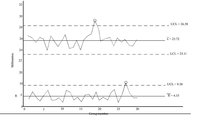
|
|
aSource: Kazuo Ozeki and Tetsuichi Asaka, Handbook of Quality Tools: The Japanese Approach (Cambridge, Mass.: Productivity Press, 1988), p. 210. With permission. |
. Then, a group number scale is drawn along the horizontal axis. From the data sheet containing samples, the values of X and R are plotted, and the points are connected to create a line graph. The X, R, upper control limit (UCL), and lower control limit (LCL) values calculated at the bottom of the data sheet in Exhibit 12-18 are used to draw the appropriate lines. The control charts are now ready for analysis.
Is the grinding activity stable? Group Number 19 exceeds the UCL in the X chart. Group Number 27 exceeds the UCL in the R chart. These results indicate that the grinding activity is not stable. When a point falls outside the control limits, lack of control is indicated, and it will pay to look for the cause. A successful process or activity is one that can consistently operate within their required limits of variation.
Control Charts for Attributes
Inspection by variables, as required for X and R charts, is not applicable in some activities. For example:
• Many qualities, such as appearance, color, and taste, cannot be checked as variables.
• Some processes call for 100 percent inspection of a combination of attributes on a “pass” or “fail” basis (e.g., food products, motors, or electronic components). Under such circumstances, the best procedure may be to record the number of tests performed and the number of failures (defects), and classify the product as either good or bad. For analyzing and controlling quality on this basis, the following control charts for attributes are used:
• pn charts
• p charts
The following terminology is used for these charts:
k = Number of groups or sample groups
n = Number of observations (items or units) in each group, the sample size
N = Total number of observations (kn)
p = Number of defects per observation
= Arithmetic mean of the number of defects per observation
pn = Number of defects per group
pn CHARTS. The pn chart records the number of defects per unit (or item), such as for a radio unit where defects may exist at a number of points. In such a case, it is natural to count the number of defects per unit sampled. On the pn chart, the center line is pn, which is calculated, by the following formula:

Control limits, at ±3 standard deviations, are calculated by the following formulas:
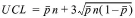
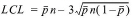
Suppose that an activity assembles 150 radios. Visual inspections and tests by diagnostic equipment are made on each of the radios to determine the number of defects produced. Exhibit 12-20 discloses pn defect data where N = 150 and k = 30.
In Exhibit 12-21, the number of defects is shown on the vertical axis, and the group numbers are shown on the horizontal axis. The number of defects in each group is plotted, and the UCL and center line are drawn. The resulting pn chart shows the results of the radio assembling activity. Is this activity in control? Yes, it is. All points are within the control limits, and there are no abnormal patterns in the distribution of points.
p CHARTS. The p chart records the fraction or percentage of defects in a process or activity. The defect rate for each group of samples is given by p where p is a defect rate in percentage terms. The center line of the p chart is given by p, also in percentage terms.
Sometimes it is not possible to maintain a constant sample size, as is required with pn charts. Samples from lots of varying sizes or tests of incoming parts from vendors often result in samples varying considerably in size. Because chance sampling fluctuations decrease as sample size increases, new control limits must be calculated for each point on the chart if the sample size is not constant. Although p charts can be used with sample sizes that are constant, they are also useful in situations where the sample size varies, as in the example given here.
|
Exhibit 12-20 pn Chart Data Sheeta |
|
||||||||||
|
Group Number |
Number of Defects pn |
Group Number |
Number of Defects pn |
Group Number
|
Number of Defects pn |
Group Number |
Number of Defects pn |
Group Number |
Number of Defects pn |
Group Number |
Number of Defects pn |
|
1 |
1 |
6 |
2 |
11 |
1 |
16 |
6 |
21 |
3 |
26 |
3 |
|
2 |
3 |
7 |
4 |
12 |
1 |
17 |
4 |
22 |
1 |
27 |
3 |
|
3 |
1 |
8 |
3 |
13 |
2 |
18 |
3 |
23 |
1 |
28 |
2 |
|
4 |
0 |
9 |
1 |
14 |
5 |
19 |
1 |
24 |
2 |
29 |
3 |
|
5 |
2 |
10 |
2 |
15 |
3 |
20 |
2 |
25 |
4 |
30 |
1 |
|
|
|
|
|
|
|
|
|
|
|
||
|
|
|
|
|
|
|
|
|
|
|
||


|
aData from Kazuo Ozeki and Tetsuichi Asaka, Handbook of Quality Tools: The Japanese Approach (Cambridge, Mass.: Productivity Press. 1988), p. 219. With permission. |
|
|
|
|
= 2.33 |
|
|
|
|
|
= 0.0156 |
|
|
|
|
|
= 2.33 + 4.54 |
= 6.87 |
|
|
|
|
|
= -2.21 (Ignore) |


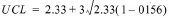

Assume an activity makes frames for railway cars. Random units are taken from each day's process and visually inspected for abrasions, cracks, and warps. The frames are considered “acceptable” or “defective.” Exhibit 12-22 shows the sample data collected from July 2 through July 14. Notice that the sample size varies considerably between groups of samples.
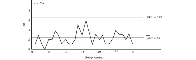
|
Because sample size n is different in each group, each group must have its own individual control limit values at ±3 standard deviations. To determine them, each individual value of n must be converted into a factor A for each group, using the formula:
|
Exhibit 12-22 p Chart Data Sheeta |
|||||||||
|
20X4 Date |
Lot Number |
Group Number |
Sample Size, n |
Number of Defects, pn |
Defect Rate (%), p |
|
(%) |
UCL (%) |
LCL (%) |
|
|
|
||||||||
|
7/2 |
5 |
1 |
526 |
3 |
0.6 |
0.131 |
1.32 |
2.34 |
- |
|
|
6 |
2 |
483 |
6 |
1 2 |
0.137 |
1.37 |
2.40 |
- |
|
7/3 |
7 |
3 |
602 |
5 |
0 8 |
0.122 |
1.23 |
2.25 |
- |
|
|
8 |
4 |
479 |
2 |
0.4 |
0.137 |
1.38 |
2.40 |
- |
|
7/4 |
9 |
5 |
531 |
9 |
1.7 |
0.130 |
1.31 |
2.33 |
- |
|
|
10 |
6 |
527 |
4 |
0.8 |
0.131 |
1.31 |
2.34 |
- |
|
7/5 |
11 |
7 |
206 |
8 |
3.9 |
0.209 |
2.10 |
3.13 |
- |
|
|
12 |
8 |
395 |
6 |
1.5 |
0.151 |
1.52 |
2.54 |
- |
|
|
13 |
9 |
610 |
4 |
0.7 |
0.121 |
1.22 |
2.24 |
- |
|
7/6 |
14 |
10 |
608 |
2 |
0 3 |
0.122 |
1.22 |
2.25 |
- |
|
|
15 |
11 |
586 |
10 |
1 7 |
0.124 |
1.25 |
2.27 |
- |
|
7/9 |
16 |
12 |
212 |
3 |
14 |
0.206 |
2.07 |
3.10 |
- |
|
|
17 |
13 |
231 |
6 |
2 6 |
0.197 |
1.99 |
3.01 |
- |
|
|
18 |
14 |
571 |
2 |
0 4 |
0.126 |
1.26 |
2.29 |
- |
|
7/10 |
19 |
15 |
550 |
4 |
0.7 |
0.128 |
1.29 |
2.31 |
|
|
|
20 |
16 |
382 |
2 |
0.5 |
0.153 |
1.54 |
2.57 |
- |
|
|
21 |
17 |
415 |
6 |
1.4 |
0.147 |
1.48 |
2.50 |
|
|
7/11 |
22 |
18 |
906 |
11 |
1.2 |
0.100 |
1.00 |
2.03 |
0.02 |
|
|
23 |
19 |
249 |
7 |
2 8 |
0.190 |
1.91 |
2.94 |
- |
|
7/12 |
24 |
20 |
611 |
4 |
0.7 |
0.121 |
1.22 |
2.24 |
|
|
|
25 |
21 |
524 |
5 |
1.0 |
0.131 |
1.32 |
2.34 |
- |
|
7/13 |
26 |
22 |
887 |
7 |
0.8 |
0.101 |
1.01 |
2.04 |
0.01 |
|
|
27 |
23 |
479 |
6 |
1.3 |
0.137 |
1.38 |
2.40 |
- |
|
7/14 |
28 |
24 |
538 |
3 |
0.6 |
0.129 |
1.30 |
2.32 |
- |
|
|
29 |
25 |
603 |
5 |
0.8 |
0.122 |
1.23 |
2.25 |
- |
|
Total |
12,711 |
130 |
|
||||||
|
|
|
|
|
|
|
||||


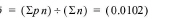


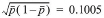
|
aData from Kazuo Ozeki and Tetsuichi Asaka, Handbook of Quality Tools: The Japanese Approach (Cambridge, Mass.: Productivity Press, 1988), p. 222. With permission. |
A = 3/n1/2
The values of A are then used in the following equations, and the resulting limits are drawn above each group:
UCL = 
LCL = 
The calculations and interpretation of the chart are easier when the sample size is kept constant. When constant sample times are used and the sample size varies, a single set of control limits can be used as long as the individual sample sizes do not differ too much. If any individual samples or groups of samples differ in size by 25 percent or less of the average sample size, n (where  ), a simplified method can be used to calculate the control limits, using the value of n:
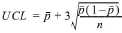
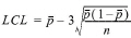
Because the values of n in the example (206 to 906) vary more than 25 percent of n, the simplified method of calculating the control limits cannot be used. In this case, interpreting the chart is trickier because it is more difficult to relate the point pattern to fluctuating control limits.
Exhibit 12-23
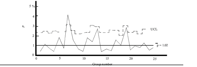
|
presents the resulting p chart. The defect rate p is calibrated on the vertical axis and the group numbers on the horizontal axis. Lines representing the control limits are drawn. Then the defect rate points for each group are plotted. Because the control limits vary for each group, numerical values are not written next to the control limits as was done in other control charts where sample sizes were constant.
Does this p chart represent a stable, in-control process? No, because a point exceeds the UCL in Group Number 7.
Additional Rules of Thumb on Sampling
The following rules of thumb will usually result in a satisfactory job of sampling:
• If the product comes in trays, tubs, or bins, at least a few items should be taken from every container.
• Items should be taken from the top, middle, and bottom of each container.
• If the product comes from a continuous process, samples should be taken at intervals, such as shifts or runs.
• The items should be selected randomly.
• Inspection, whether visual, gauging, or testing, should always be performed the same way.
• Visual inspection should have definite objective standards of finish, appearance, color, design, and so forth.
• All testing instruments should be properly checked and calibrated before inspection begins.
How to Interpret Control Charts
A process or activity is stable when it meets the following criteria:
• No points are outside the control limits. (A point on the control limit is considered outside the limit.)
• There are no abnormal patterns in the distribution of points.
The points on a control chart should follow a completely random pattern if a process or activity is in statistical control. Random distribution should follow the normal frequency distribution.
Points outside the control limits are easy to spot. Spotting abnormal patterns in the distribution is a little more difficult. The following are the kinds of abnormal patterns (see Exhibit 12-24
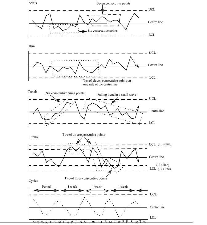
|
) that may occur:
Shifts. These patterns occur when the activity finds a new point of central tendency. A continuous sequence of 6 or 7 points on one side of the center line indicates that the activity or process has shifted. Shifts indicate improvements as well as problems in a process. A shift up on the R chart, for example, signals trouble because product variation has increased. A shift down on the R chart signals process improvement. The potential causes of shifts include:
• Poor maintenance of machines and tools (shift up)
• Careless or poorly trained operators (shift up)
• Change in material, with poor material causing a shift up and better material causing a shift down
• Clamps and fixtures not holding the work in place (shift up)
• Better operators and general improvement in the process or activity causing a shift down
Runs. A run occurs when 7 successive points, 10 of 11 points, or 12 of 14 points fall on the same side. If the run is upward, the potential causes are:
• Operator fatigue
• Machine and tool wear
• Gauge wear
• Loosening clamps or fixtures that hold work in place
• Machine due for adjustment
• Gradual introduction of poor material
If the run is downward, the potential causes are:
• General improvements
• Better maintenance program
• Gradual introduction of better material
Trends. These patterns occur when there is a steady rise or fall in the position of the points. The rule of thumb for a trend is 6 or more consecutive points rising or falling. The causes of trends are the same as for runs.
Erratic. This pattern occurs if 2 out of 3 consecutive points or 3 or more out of 7 points are approaching a control limit or are more than two-thirds of the distance from the center line to the control limit. Because the control limit lines are the average value of ±3 standard deviations (±3s), the two-thirds line is the value of ±2 standard deviations (±2 s). This line is sometimes referred to as the warning line
A steep, zigzag pattern approaching the UCL and then the LCL and back again is an erratic pattern. These frequent ups and downs indicate instability in the process or activity. Potential causes for an erratic pattern include:
• Over adjustments
• Mixture of materials of different quality from upstream activities or suppliers
• Frequent breakdowns and start-ups
• Loose clamps and fixtures that hold work in place
• Poor sampling procedures
• Faulty gauges
Inconsistent inspection standards
Cycles. These patterns occur when the points move up and down in a periodic waveform. Cycles signal that something is systematically affecting the process or activity. The key to finding causes of cycles is to investigate causes that would change the activity periodically. Likely causes of cycle patterns are:
• Power fluctuations
• Varying speeds on conveyor belts
• Temperature and seasonal changes
• Operator fatigue and shift changes
• Measurement gauge rotation
• Maintenance schedules
• Different vendors of materials
• Change in sampling methods
SUMMARY OF LEARNING OBJECTIVES
The major goals of this chapter were to enable you to achieve four learning objectives:
Learning objective 1. Discuss total quality management (TQM).
In the quest for competitive superiority, quality is the key. To ensure that quality is achieved, a TQM system needs to be installed. Such a system integrates the following dimensions to achieve customer satisfaction:
• Enhanced quality
• Continuous improvement in all activities and processes
• Decreased throughput
• Minimized costs of quality or zero defects
A TQM system requires total commitment from everyone throughout the organization as well as from the organization's stakeholders. A TQM system is not a program that is started and stopped, and then started again. It is an ongoing process that never ends.
Learning objective 2. Define costs of quality and explain their relationship and trade-offs. In addition, differentiate the costs-of-quality minimization approach from the zero-defects approach.
The costs of quality refer to resources spent to assure consistent customer satisfaction. The total costs of quality reflect the expenditures incurred in four areas:
• Prevention costs, which include all expenditures made to avoid errors, defects, failures, dissatisfactions, or any other nonconformities
• Appraisal costs, which include the costs of inspecting, testing, checking, and so forth to assure that nonconformities do not reach internal and external customers
• Internal failure costs are incurred to correct nonconformities before they reach external customers
• External failure costs are incurred to correct nonconformities after they have been discovered by external customers
Summary formulas for these costs are as follows:
• Costs of conformance = Prevention costs + Appraisal costs
• Costs of nonconformance = Internal failure costs + External failure costs
• Costs of quality = Costs of conformance + Costs of nonconformance
A TQM system is primarily prevention-based, which means that expenditures should be devoted to preventive measures. As more and more preventive measures are installed, the costs for appraisal, internal failure, and external failure will decrease substantially. The idea behind TQM is that it costs much less to prevent quality problems than to correct them. This is why high quality is much less expensive than low quality. Although it is probably impossible to reduce the costs of quality to zero, many authorities contend that it can be reduced to around 2.5 percent of sales. This figure is considerably less than the costs of quality in some companies, which are estimated to be as much as 60 percent of sales.
With the costs-of-quality minimization approach, prevention and some appraisal costs (especially for process inspection) are increased while failure costs are decreased. Total costs of quality continue to decrease until near-perfect quality is achieved. At this point, management cannot realize total costs-of-quality reductions through additional expenditures for prevention and appraisal. The focus then shifts to technological and reengineering breakthroughs to decrease the total costs of quality further.
The aim of the zero-defects approach is to eliminate all non conformities. The locus is on the parts per million (PPM) performance measurement rather than on percentages and cost figures. The ultimate aim of both approaches, however, is the same: To decrease costs of quality while achieving total customer satisfaction, increasing profitability, and attaining competitive superiority.
Learning objective 3. Describe Pareto charts and cause-and-effect diagrams, and discuss how they are used in solving quality problems.
The Pareto chart is a vertical bar graph that can be used to show the relative frequency of nonconformities, such as defects, errors, failures, and the like. A Pareto chart presents data in descending order, from the largest category to the smallest. Points are plotted for the cumulative total in each bar and are connected with a line to create a graph that shows the relative incremental addition of each category to the total.
Preparing a Pareto chart reveals key quality problems. These key problems are then targeted for improvement efforts. Pre-improvement and post-improvement charts are prepared to determine the effectiveness of the improvement efforts in both financial and nonfinancial terms.
The cause-and-effect diagram derives its name from its use. It is also called an Ishikawa diagram in honor of its developer, Professor Ishikawa, or a fishbone diagram because of its shape. By any name, it is an extremely effective tool for discovering root causes of quality problems. The spine of the “fish” connects to its “head,” which represents the problem. The ribs connected to the spine represent main cause categories. Bones attached to ribs represent specific causes. Small bones attached to the bones represent causes of causes. In a meeting, the investigation team develops causes and attaches them at the appropriate places on the diagram in full view of all members. After a great deal of discussion and analysis, a final cause-and-effect diagram reveals root causes of the quality problem.
Learning objective 4. Define control charts, and explain how they are used in a TQM system to control processes and activities.
There are two basic types of control charts:
• Variables
• Attributes
Both types of control charts are graphic aids for monitoring the status of any process or activity subject to random variations. They consist of three horizontal lines plotted on a horizontal time scale. The center line represents the average or mean value for the process or activity being controlled. The other two lines are the upper control limit (UCL) and the lower control limit (LCL). The processes or activities are measured periodically, and the values are plotted on the control chart. If the value falls within the control limits, no action is taken. If the value falls outside the control limits or plotted points show abnormal patterns, the activity is considered unstable or out of control, and an investigation is made for possible corrective action.
Two of the most widely used control charts for variables are the X chart and R chart, often called the average and range chart, respectively. Both charts are drawn on the same sheet of paper or screen. The X chart tracks the sample group mean. The R chart tracks the sample group range.
Small sample groups, usually four or five items per group, of consecutive items are taken. The dimension, weight, or some other variable of interest is measured, and the measurements are recorded on a data sheet for each sample. The mean and range for each sample group are calculated, recorded, and charted.
Control charts for attributes use pass/fail information for charting. An item passes inspection when it conforms to specifications or requirements, such as appearance, taste, color, and so forth. A nonconforming item tails inspection.
Two of the most commonly used control charts for attributes are pn and p charts. The pn chart tracks the number of nonconforming items in each sample group. it is easier to use than a p chart because the percentage of defective items does not have to be calculated. It has one restriction, however; all the sample groups have to be the same size.
The p chart tracks the percentage of nonconforming items in each sample group. The sample sizes are large, usually 100 or more, and the sample sizes may vary on a single chart.
“In control” conditions on control charts should exhibit the following characteristics:
• Most of the points are near the center line.
• A few points are near the control limits.
• Only an occasional rare point occurs on or beyond the control limits.
• The points occur in a random manner with no shifts, runs, trends, cycles, or other erratic behavior.
IMPORTANT TERMS
Appraisal costs Expenditures made to identify nonconformities before a product or service reaches another activity or is delivered to the ultimate customer.
Assignable causes Special causes that are not an inherent part of the process or activity. Examples include machine maintenance not being performed when scheduled, operators not following prescribed methods, and measurement tools not being read correctly.
Band graphs Visualization techniques that clearly show not only the trend in costs of quality but also the change in profit. They express their internal composition and proportions by the length of a band.
Cause-and-effect diagram (fishbone diagram, Ishikawa diagram) A tool for generating and sorting ideas about the causes of variation in a process or activity and for identifying the most likely root causes of quality problems.
Control charts Statistical devices to identify variation in a process or activity. All processes or activities are subject to random variation despite careful planning, reengineering, and continuous improvement. The aim is to reduce variation to an acceptable level.
Control charts for attributes Describe in qualitative terms such attributes as finish, color, or other qualitative characteristics that can be classified as “good” or “bad” or “acceptable” or “unacceptable.”
Control charts for variables Describe quality quantitatively in terms of dimension, pressure, voltage, temperature, weight, or other quantifiable characteristics.
Costs of conformance Expenditures incurred in an effort to ensure that products or services meet customer requirements. These expenditures are for prevention and appraisal.
Costs of nonconformance Expenditures incurred before or during use because of rejections, corrective alterations, refusals of products or services, claims, returns, replacements, and reimbursements.
Costs of quality Consist of prevention, appraisal, internal failure, and external failure costs.
Cycles Patterns that occur when the points move up and down in a periodic wave-form.
Erratic A pattern that occurs if two out of three consecutive points or three or more out of seven points are approaching a control limit or are more than two-thirds of the distance from the center line to the control limit.
External customers Those who are impacted by the product or service but are not members of the company that produces the product or service, except when an internal customer becomes an external customer (e.g., when a worker for a car manufacturer buys a car from the same manufacturer).
External failure costs Expenditures incurred because poor-quality products or services are delivered to external customers.
Final inspection Activity performed to remove unacceptable products or services before they are delivered to the external customer.
Internal customers Those who are impacted by the product. or service and are also members of the company that produces the product or service.
Internal failure costs Expenditures associated with products or services that fail to meet quality standards and are identified and corrected before being delivered to the external customer.
p chart A statistical device that records the fraction or percentage of defects in a process or activity.
pn chart A statistical device that records the number of defects per group.
Pareto chart Bar chart, named after the Italian economist Vilfredo Pareto, that categorizes quality problems into the “vital few and the trivial many.” Each bar represents a problem category, and its height represents the frequency of occurrence.
Prevention costs Expenditures made to prevent poor-quality products or services from being produced in the first place.
Process inspection Activity performed to monitor a processor activity to ensure that it does not produce unacceptable products or services.
Quality All the characteristics and attributes required to satisfy both internal and external customers.
R chart A statistical device that shows variations in the range in values of sample groups. It helps control the general variability of the process or activity. The R chart shows the presence of variability within sample groups.
Random causes Common causes that are an inherent part of the process or activity. The variation from the process is what is expected in its usual operation.
Ripple charts Hierarchical graphs that show the impact of defects or failures and other nonconformities throughout a series of activities or processes.
Runs Patterns that occur when 7 or more successive points, 10 of 1 t points, or 12 of 14 points fall on the same side of the center line.
Shifts Patterns that occur when an activity finds a new point of central tendency.
Total commitment The mobilization of all managers and the empowerment of work-ers and stakeholders to engage themselves into linked value-added activities for the purpose of achieving the greatest, customer satisfaction at the lowest cost.
Total quality management (TQM) An integrated system that anticipates, meets, and exceeds customers' needs, wants, and expectations. It is the totality of ways for achieving superior quality.
Trends Patterns that occur when there is a steady rise or fall in the position of points.
X chart A statistical device used in determining the limits of variation that can be expected in the averages of small sample groups taken from a process or activity. It helps control the average of the process or activity. The X chart shows the presence of variability between sample groups.
Zero defects A quality standard that calls for products and services to be produced and delivered according to customer requirements. The basis of zero defects is doing it right the first time, and eliminating all nonconformities.
DEMONSTRATION PROBLEMS
DEMONSTRATION PROBLEM 1 Classifying and reporting costs of quality.
At the beginning of the year, Tricore Company installed a TQM system. By the end of the year, various managers were reporting good results. For example, the production Manager stated that scrap and rework had both decreased. The owner of the company was pleased to hear of the success, but wanted a report of the financial impact of the quality improvements. To prepare this report, the following financial data were collected for actual and projected costs for 20X5. Actual and projected sales for 20X5 were $10 million.
|
TYPES OF COSTS |
ACTUAL |
PROJECTED |
|
Scrap |
$200,000 |
$300,000 |
|
Rework |
300,000 |
500,000 |
|
Design |
100,000 |
60,000 |
|
Training |
100,000 |
40,000 |
|
Incoming inspection |
200,000 |
100,000 |
|
Process inspection |
100,000 |
150,000 |
|
Final inspection |
200,000 |
100,000 |
|
Warranty repairs |
100,000 |
300,000 |
|
Recalls |
200,000 |
800,000 |
Required:
a. Prepare a costs-of-quality report and classify the costs as prevention, appraisal, internal failure, and external failure. If the actual costs are less than the projected costs, show the amount of variance and designate it as F (favorable); if the actual costs are more than the projected costs, show the amount of the variance and designate it as U (unfavorable). Also, calculate the costs of quality as a percentage of sales for both the total actual and projected costs.
b. If prevention costs are “good” costs, explain why an increase is designated as unfavorable (U) rather than favorable (F). Also, discuss why a decrease in process inspection costs, usually considered a “good” cost, is designated as favorable (F).
c. Assume that all other costs, both actual and projected, were $5 million. Show sales, other costs, costs of quality, and profit using band graphs.
SOLUTION TO DEMONSTRATION PROBLEM 1 a.
|
Tricore Company Costs-of-Quality Report For the Year Ended 20X5 |
|||
|
Cost Category |
Projected Costs |
Actual Costs |
Variance |
|
Prevention costs: Design |
$ 60,000 |
$ 100,000 |
<$ 40,000> U |
|
Training |
40,000 |
100,000 |
< 60,000> U |
|
Total prevention |
$ 100,000 |
$ 200,000 |
<$100,000> U |
|
Appraisal costs: Incoming inspection |
$ 100,000 |
$ 200,000 |
<$100,000> U |
|
Process inspection |
150,000 |
100,000 |
50,000 F |
|
Final inspection |
100,000 |
200,000 |
< 100,000> U |
|
Total appraisal |
$ 350,000 |
$ 500,000 |
<$150,000> U |
|
Internal failure costs: Scrap |
$ 300,000 |
$ 200,000 |
$100,000 F |
|
Rework |
500,000 |
300,000 |
200,000 F |
|
Total internal failure |
$ 800,000 |
$ 500,000 |
$300,000 F |
|
External failure costs: Warranty repairs |
$ 300,000 |
$ 100,000 |
$200,000 F |
|
Recalls |
800,000 |
200,000 |
600,000 F |
|
Total external failure |
$1,100,000 |
$ 300,000 |
$800,000 F |
|
Total costs of quality |
$2,350,000 |
$1,500,000 |
$850,000 F |
|
Percentage of sales |
23.50% |
15.00% |
8.50% F |
b. Management had projected (or budgeted) the prevention costs to be $100,000. Any expenditure over what management had planned for during the period is considered unfavorable. Other analysis may indicate that the extra $100,000 spent on prevention was money well spent, but such an analysis is beyond the scope of the costs-of-quality report. Costs for process inspection are considered “good” costs to make sure that processes and activities are operating as intended. But the actual costs for process inspection were $100,000, $50,000 less than projected. Is this $50,000 variance favorable? From the viewpoint of the costs-of-quality report, comparing actual costs to projected or budgeted costs, the answer is yes. But from a TQM perspective, it could be that if $50,000 to $100,000 more had been spent on process inspection, the costs of $200,000 for final inspection as well as a good proportion of internal failure and external failure costs could have been reduced. Much more analysis will have to be done before such decisions can be made. The purpose of the costs-of-quality report is to track such costs over time. Management decides how much and what kind of expenditures will be made for quality. However, the costs-of-quality report shows that a $250,000 increase in prevention and inspection, or 2.50% of sales, has apparently decreased internal failure and external failure costs by 11.00% of sales, not including intangible costs, such as lost customer goodwill.
C. Actual:
|
Sales $10,000,000 |
Other costs $5,000,000 |
Quality Costs $1,500,000 |
Profit $3,500,000 |
projected:
|
Sales $10,000,000 |
Other costs $5,000,000 |
Quality Costs $2,350,000 |
Profit $2,650,000 |
DEMONSTRATION PROBLEM 2 Prepare a cause-and-effect diagram.
Acme Distributors is a large mail order company that is suffering from poor order processing performance. Over 30 percent of its customer orders are lost, late, or not processed correctly. The main cause categories are:
• People
• Methods
• Machines
• Materials
• Environment
Required: Develop a cause-and-effect diagram that shows the possible causes of why Acme is suffering from poor order processing performance. Make any assumptions you deem necessary.
SOLUTION TO DEMONSTRATION PROBLEM 2
Cause-and-Effect diagram of why Acme is suffering from poor order processing performance:
DEMONSTRATION PROBLEM 3 Preparing a Pareto chart.
At Metalcraft, Inc., a molding activity stamps a metal fixture into a particular shape. The fixture is then covered with an adhesive and placed in a mold into which rubber is injected. A study was conducted to investigate the number of defects. The period of investigation was from June 1 through June 30. The following data were collected:
|
DEFECTIVE ITEMS |
NUMBER OF DEFECTS |
|
Bad rubber |
91 |
|
Poor adhesion |
128 |
|
Cracks |
9 |
|
Voids |
36 |
|
Impurities |
15 |
|
Cuts |
23 |
|
Other |
12 |
Required: Prepare a Pareto chart to reveal the results of the investigation.
SOLUTION TO DEMONSTRATION PROBLEM 3
|
NUMBER |
DEFECTIVE ITEMS |
NUMBEROF DEFECTS |
CUMULATIVE NUMBER |
||
|
I |
Poor adhesion. |
128 |
|
|
128 |
|
2 |
Bad rubber |
91 |
128 + 91 = |
219 |
|
|
3 |
Voids |
36 |
219 + 36 = |
255 |
|
|
4 |
Cuts |
23 |
255 + 23 = |
278 |
|
|
5 |
Impurities |
1 5 |
278 + 15 = |
293 |
|
|
6 |
Cracks |
9 |
293 + 9 = |
302 |
|
|
7 |
Other |
12 |
302 + 12 = |
314 |
|
|
|
Total |
314 |
|
|
314 |
Source: Kazuo Ozeki and Tetsuichi Asaka, Handbook of Qualify Tools: The Japanese Approach (Cambridge, Mass.: Productivity Press, 1988), p. 143.
DEMONSTRATION PROBLEM 4 Calculating X, R, and control limits.
Four successive doorknobs from a machining process are measured with a micrometer about every half-hour during two shifts' of production. The measurements are recorded in the following data sheet:
|
|
Data Sheet for Doorknobs (in 1/1,000 Inch) |
|
|
||||
|
|
Sample Number |
Measurements in Each Sample |
Average, X |
Range, R |
|||
|
Time |
a |
b |
c |
d |
|||
|
Apr. 23 |
|
|
|
|
|
|
|
|
8:00 A.M. |
1 |
735 |
745 |
739 |
738 |
739.25 |
10 |
|
8:35 |
2 |
742 |
736 |
739 |
737 |
738.50 |
6 |
|
9:05 |
3 |
739 |
741 |
739 |
744 |
740.75 |
5 |
|
9:25 |
4 |
740 |
736 |
737 |
739 |
738.00 |
4 |
|
10:00 |
5 |
738 |
744 |
738 |
742 |
740.50 |
6 |
|
10:30 |
6 |
740 |
744 |
739 |
745 |
742.00 |
6 |
|
10:55 |
7 |
742 |
739 |
740 |
742 |
740.75 |
3 |
|
11:35 |
8 |
741 |
742 |
743 |
736 |
740.50 |
7 |
|
12:00 |
9 |
742 |
742 |
736 |
737 |
739.25 |
6 |
|
1:00 P.M. |
10 |
746 |
746 |
746 |
745 |
745.75 |
1 |
|
1:35 |
11 |
749 |
746 |
748 |
744 |
746.75* |
5 |
|
2:00 |
12 |
745 |
744 |
748 |
746 |
745.75* |
4 |
|
2:30 |
13 |
747 |
745 |
746 |
746 |
746.00* |
2 |
|
3:05 |
14 |
739 |
740 |
741 |
738 |
739.50 |
3 |
|
3:30 |
15 |
740 |
739 |
739 |
740 |
739.50 |
1 |
|
3:45 |
16 |
742 |
739 |
741 |
737 |
739.75 |
5 |
|
4:30 |
17 |
740 |
744 |
738 |
738 |
740.00 |
6 |
|
5:00 |
18 |
740 |
740 |
735 |
742 |
739.25 |
7 |
|
5:30 |
19 |
745 |
742 |
737 |
740 |
741.00 |
8 |
|
6:00 |
20 |
739 |
741 |
742 |
740 |
740.50 |
3 |
|
6:30 |
21 |
740 |
740 |
742 |
736 |
739.50 |
6 |
|
6:55 |
22 |
744 |
745 |
741 |
743 |
743.25 |
4 |
|
7:30 |
23 |
748 |
743 |
744 |
736 |
742.75 |
12* |
|
8:00 |
24 |
741 |
745 |
742 |
746 |
743.50 |
5 |
|
8:35 |
25 |
743 |
745 |
746 |
742 |
744.00 |
4 |
|
|
|
Totals |
|
|
|
18,536.25 |
129 |
XX = 741.45
= 5.16
A2 for samples of 4 = 0.729
D3, for samples of 4 = 0
D4, for samples of 4 = 2.282
A2R = 0.729 x 5.16 = 3.76
X limits = ± A2 = 741.45 ± 3.76 = 745.21, 737.69
R limits
= D3R = 0 x 5.16 = 0
=D4R = 2.282 x 5.16 = 11.78
Data from William B. Rice, Control Charts in Factory Management (New York: John Wiley, 1947), p. 49
Required: Calculate X, R, and the control limits. Are any points out of control? If so, which ones? State what might he the cause of such out-of-control conditions.
SOLUTION TO DEMONSTRATION PROBLEM 4
 = 18,536.25 / 25 = 741.45
 = 129 / 25 = 5.16
A2 for samples of 4 = 0.729
D3 for samples of 4 = 0
D4 for samples of 4 = 2.282
A2R = 0.729 x 5.16 = 3.76
X limits:
UCL = + A2 = 741.45 + 3.76 = 745.21
LCL = + A2 = 741.45 - 3.76 = 737.69
R limits:
UCL=D4 x = 2.282 X 5.16 = 11.78
LCL = D3 x = 0 x 5.16 = 0
If plotted on an X chart, points Sample Number 10, 11, 12, and 13 would exceed the UCL of 745.21, and would therefore be out of control. On an R chart, point Sample Number 23 would exceed the UCL of 11.78.
The cause of the four out-of-control sample averages should be investigated. Possible causes include:
Different inspector
Improper machine settings
DEMONSTRATION PROBLEM 5 Calculating p and control limits.
Assume the following sample data:
|
Group number: |
1 |
2 |
3 |
4 |
5 |
6 |
7 |
8 |
9 |
10 |
|
Sample size: |
100 |
110 |
100 |
100 |
110 |
110 |
80 |
100 |
90 |
100 |
|
Number of defects: |
10 |
12 |
8 |
9 |
11 |
12 |
8 |
10 |
11 |
9 |
|
Percentage defective: |
10.0 |
10.9 |
8.0 |
9.0 |
10.0 |
10.9 |
10.0 |
10.0 |
12.2 |
9.0 |
Required: Calculate p and determine the UCL and LCL at ±3 standard deviations (or sigmas). What does p represent? Explain why points falling outside the LCL should be investigated.
SOLUTION TO DEMONSTRATION PROBLEM 5

 = 10%
= 10%
represents the center line of the p chart.

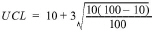
UCL = 19%
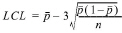
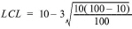
LCL = 1%
Clearly, if an activity suddenly makes more defects than is normal, points exceeding the UCL will show this and investigation is warranted. But why should anyone be concerned if the activity makes fewer defects than is normal? Points falling below the LCL will indicate this situation. Unless the activity has been improved or re-engineered, the causes may be due to a change in how the items are inspected and tested. For example, a new inspector may be inexperienced and therefore fail to find defects.
REVIEW QUESTIONS
12.1 What is the goal of TQM? At what point does a company complete its TQM effort?
12.2 List five attributes of quality.
12.3 TQM designs and builds quality in. How does traditional management try to attain quality? Name some other major differences in the way quality is viewed by traditional and world-class management.
12.4 Which individuals in an organization are involved in the TQM “total commitment” and why?
12.5 What percentage of downstream problems are caused by poor design? What steps can be taken to remedy poor design?
12.6 What “key elements” are necessary to achieve customer satisfaction?
12.7 Describe the ISO 9000 compliance and certification process and its purpose. What are the four required steps?
12.8 Rate the following costs associated with quality, with 1 being the lowest cost and 4 being the highest cost, and explain your reasoning:
• Prevention costs
• Appraisal costs
• Internal failure costs
• External failure costs
12.9 Name five types of costs associated with internal failure as well as five types of external failure costs.
12.10 Describe the typical formula used for internal failure performance measurements. Is improvement indicated by an increase or a decrease in this ratio?
12.11 Name three types of performance measurements that can be used to measure external failure.
12.12 Describe the costs of nonconformance.
12.13 What is the cost management rule regarding costs of quality?
12.14 Discuss the effect on the total costs of quality, as well as on quality itself, as companies shift their quality expenditures from failure costs to prevention and appraisal costs.
12.15 What is the “l-10-100 rule”?
12.16 Up to what point should prevention costs continue to be implemented?
12.17 During the first several years of TQM, do appraisal costs tend to increase or decrease? Explain.
12.18 What is the purpose of using ripple charts?
12.19 Discuss the objective of a zero-defects quality standard. What argument can be made against this approach?
12.20 Name the advantage of using parts per million as a defect measurement method.
12.21 Describe a Pareto chart, explain when it is most useful, and indicate what costs- of-quality information can be graphed. Discuss the “Pareto principle” and explain how it relates to Pareto chart analysis.
12.22 Discuss the primary purpose of using a fishbone diagram.
12.23 When would a company use control charts? Briefly describe their purpose and their key graphical features.
12.24 Discuss the difference between “random causes” and “assignable causes.” Name the six assignable causes.
12.25 The most common control charts used for variables are the X chart and the R chart. Describe how they are used and what they measure.
12.26 Describe the two common control charts used for attributes and explain how they differ.
12.27 Name five of the seven rules of thumb on sampling.
12.28 Name and briefly describe the five abnormal patterns of points in a distribution. Give at least three potential causes for each type of abnormal pattern.
CHAPTER-SPECIFIC PROBLEMS
These problems require responses based directly on concepts and techniques presented in the text.
12.29 Classifying costs of quality. Classify the following costs of quality by inserting an `X under the appropriate category
|
|
PREVENTION |
APPRAISAL |
INTERNAL FAILURE |
EXTERNAL FAILURE |
|
1. Final inspection |
|
|
|
|
|
2. Warranty repairs |
|
|
|
|
|
3. Goods returned |
|
|
|
|
|
4. Quality training |
|
|
|
|
|
5. Settlement of product liability suit |
|
|
|
|
|
6. Field service personnel |
|
|
|
|
|
7. Packaging inspection |
|
|
|
|
|
8. Complaint department |
|
|
|
|
|
9. Rework units from work-in-process |
|
|
|
|
|
10. Replacement of defective product |
|
|
|
|
|
11. Lost sales |
|
|
|
|
|
12. Scrap |
|
|
|
|
|
13. Recalls |
|
|
|
|
|
14. Downtime caused by defects |
|
|
|
|
|
15. Incoming inspection |
|
|
|
|
|
16. Maintenance of test equipment |
|
|
|
|
|
17. Calibration of test gauges |
|
|
|
|
|
18. Design engineering |
|
|
|
|
|
19. Quality improvement projects |
|
|
|
|
|
20. Reinspection of rework |
|
|
|
|
12.30 Preparing a pie chart and bar chart showing percentage of costs of quality. Costs of quality are 30% of sales. Costs of quality categories are as follows:
• Prevention: 10%
• Appraisal: 20%
• Internal failure: 30%
• External failure: 40%
Required: Prepare a pie chart that shows the proportion of costs of quality to sales. Separate the costs-of-quality pie segment from the pie chart and draw a bar chart showing the proportion of cost categories to this segment.
12.31 Improving quality and profitability. The Mastercraft Company reported the following sales, other costs, and costs of quality for the past three years:
|
Year |
Sales |
Other Costs |
Costs Of Quality |
|
1 |
$10,000,000 |
30% |
40% |
|
2 |
12,000,000 |
32 |
30 |
|
3 |
15,000,000 |
34 |
10 |
|
|
|
|
|
Required:
a. Draw three band graphs depicting the preceding data.
b. Assume that the quality standard is 2.5% of sales. Also assume that sales will be $20,000,000 and other costs are estimated to be 30% of sales for year 4. Draw a band graph that reveals this data. Calculate the dollar amount of other costs, costs of quality, and profit.
12.32 Preparing a ripple chart. Rework is a major internal failure cost. Rework costs for Associated Fabricators were $200,000. The rework impacted several other areas with total expenditures of $200,000 as follows:
|
|
|
|
Technician wages: |
$40,000 |
|
Materials handling: |
$20,000 |
|
Downtime Caused by Rework |
$60,000 |
|
Reinspection of rework: |
$30,000 |
|
Repackaging: |
$15,000 |
|
Extra raw materials for rework: |
$20,000 |
|
Extra overtime wages: |
$15,000 |
Required: Prepare a ripple chart that reflects these costs of rework.
12.33 Preparing a costs-of-quality report. The Halstrom Company incurred the following costs of quality:
|
|
20X4 |
20X5 |
|
Warranty repairs |
$200,000 |
$ 50,000 |
|
Product recalls |
500,000 |
100,000 |
|
Rework |
300,000 |
50,000 |
|
Testing |
100,000 |
200,000 |
|
Calibration |
50,000 |
100,000 |
|
Training |
50,000 |
200,000 |
|
Product design |
100,000 |
200,000 |
|
Product liability |
100,000 |
50,000 |
|
Retesting |
200,000 |
100,000 |
Required: Prepare a costs-of-quality report that classifies each of the above costs under the proper costs-of-quality category. Indicate whether the costs are increasing or decreasing and by how much.
12.34 Decreasing the total costs of quality. Management of the Lormis Company believes that its overall costs of quality could be further reduced by increasing expenditures in certain key costs-of-quality categories. Management has identified the following costs of quality:
|
COSTS OF QUALITY |
EXPENDITURES |
|
Rework |
$ 5,000 |
|
Supervision |
15,000 |
|
Recalls |
12,000 |
|
Scrap |
8,000 |
|
Training |
14,000 |
|
Inspection of work-in-process |
20,000 |
|
Reengineering efforts |
8,000 |
|
Repair |
10,000 |
|
Replacements |
10,000 |
|
Downtime |
9,000 |
|
Retesting |
4,000 |
|
Product liability insurance |
11,000 |
|
Quality audits |
6,000 |
|
Continuous improvement |
1,000 |
|
Warranty repairs |
13,000 |
|
Testing of incoming materials |
8,000 |
Required:
a. Classify these costs into the four costs-of-quality categories.
b. Determine the total dollars being spent on each costs-of-quality category.
c. Based upon the company's current expenditures by costs-of-quality category, on which cost category should the company concentrate its efforts in order to decrease its overall costs of quality and thereby improve its profitability?
12.35 Calculating costs-of-quality ratios. As a management accountant for a start-up electrical household fan manufacturer, you have just been assigned the task of analyzing the company's first two years of operating data. The following operating results were provided to you:
|
|
PERIOD A |
PERIOD B |
|
Total sales dollars |
$100,000 |
$110,000 |
|
Units produced |
10,000 |
11,000 |
|
Defective units |
1,429 |
1,402 |
|
Number of reworked units |
1,225 |
1,101 |
|
Dollar value of sales returns and allowances |
$37,500 |
$38,600 |
|
Number of warranty repairs |
98 |
102 |
|
Dollar value of warranty repairs |
$980 |
$1,020 |
|
Number of replacements |
156 |
248 |
|
Number of units in the field |
10,000 |
21,000 |
Required:
a. Determine the effectiveness of inspection by calculating the inspection ratio,
b. Measure the effectiveness of controlling internal failure by calculating the internal failure causing rework ratio.
c. Measure the impact of external failure by calculating the following ratios:
1. Sales returns and allowances.
2. Warranty repairs.
3. Replacements.
d. Based upon your ratio analysis, where has the company improved the most?
12.36 Preparing a trend report. The management accountant at Proactive Company has calculated and tracked costs of quality as a percentage of sales for the past four years (19X1 was the first year the company implemented a TQM system). This information is presented below:
|
Year |
Prevention |
Appraisal |
Internal Failure |
External Failure |
|
19X1 |
2% |
6% |
10% |
20% |
|
19X2 |
3 |
7 |
7 |
12 |
|
19X3 |
4 |
7 |
4 |
7 |
|
19X4 |
5 |
3 |
2 |
1 |
Required: Prepare a bar graph that reveals the trend of these data. Discuss what the graph has to say about the success of the TQM system.
12.37 Preparing a bar chart showing costs-of-quality trends as a percentage of sales. The Starbrite Company has had a TQM system in place for three years. The costs of quality as a percentage of sales for these years follow:
|
|
YEAR 1 |
YEAR 2 |
YEAR 3 |
|
Prevention costs |
0.50% |
10.00% |
2.00% |
|
Appraisal costs |
1.00 |
5.00 |
3.00 |
|
internal failure costs |
15.00 |
10.00 |
5.00 |
|
External failure costs |
30.00 |
15.00 |
10.00 |
Required: Prepare a bar chart showing the costs-of-quality trends as a percentage of sales.
12.38 Minimizing costs of quality. The Progresso Company is planning on implementing a TQM system. Cost projections and defective rates are as follows:
|
Prevention Costs |
Appraisal Costs |
Percentage Defective |
Internal Failure Costs |
External Failure Costs |
|
$ 50,000 |
$ 60,000 |
20.00% |
$500,000 |
$800,000 |
|
150,000 |
200,000 |
15.00 |
300,000 |
400,000 |
|
200,000 |
250,000 |
10.00 |
250,000 |
300,000 |
|
220,000 |
200,000 |
7.00 |
180,000 |
150,000 |
|
260,000 |
180,000 |
4.00 |
100,000 |
120,000 |
|
280,000 |
140,000 |
1.00 |
80,000 |
100,000 |
|
300,000 |
100,000 |
0.001 |
20,000 |
30,000 |
|
400,000 |
30,000 |
0.0001 |
18,000 |
15,000 |
Required: Determine the combination of costs that minimizes total costs of quality.
12.39 Preparing Pareto charts to show number of defects and monetary losses. The Dockman Pants Factory's production from June 1 through June 30 resulted in 245 nonconforming pants. An analysis of the nonconforming pants revealed the following defects:
|
Defect |
Number Of Pants |
Monetary Loss |
|
Loose threads |
95 |
$ 87,000 |
|
Hemming wrong |
55 |
42,000 |
|
Material flaw |
40 |
24,000 |
|
Tear |
20 |
18,000 |
|
Buttonholes |
20 |
10,000 |
|
Other |
15 |
17,000 |
|
Totals |
245 |
$198,000 |
The nonconforming pants were discounted according to defect and sold to Cutrate Stores and the monetary losses recorded.
Required: Prepare a Pareto chart showing the number and types of defects. Prepare a Pareto chart showing the monetary losses by types of defects. In both charts, shade the loose threads bar, crosshatch the hemming wrong bar, and hatch the material flaw bar. The other bars should be clear; that is, no shading or hatching should be used.
12.40 Preparing a Pareto chart for customer complaints. The Rusty Bowl Restaurant recorded 260 complaints during a one-week period as follows:
|
Type Of Complaint |
Number Of Complaints |
|
Cold food |
105 |
|
Salad not fresh |
94 |
|
Lack of cleanliness |
25 |
|
Food tastes bad |
13 |
|
Poor service |
10 |
|
Food too greasy |
9 |
|
Flimsy utensils |
2 |
|
Not courteous |
2 |
Required: Prepare a Pareto chart for the preceding data.
12.41 Preparing pre-improvement and post-improvement Pareto charts. The grinding process in Ingersoll Company was producing various defects. A quality investigation team discovered a total of 81 cases containing the following number and type of defects:
• Defect A = 40
• Defect B = 10
• Defect C = 8
• Defect D = 7
• Defect E = 6
• Defect F = 4
• Other = 6
• A number of improvements were installed in the grinding process to reduce these defects. One month later, the quality investigation team again took a sample from the grinding process and discovered a total of 44 cases containing the following number and type of defects:
• Detect A = 8
• Defect B = 9
• Defect C = 7
• Defect D = 7
• Detect E = 3
• Defect F = 5
• Other = 5
Required: Prepare a pre-improvement Pareto chart and a post-improvement Pareto chart. Shade defect A in both charts.
12.42 Preparing a cause-and-effect diagram. The main cause categories of late shipments at the Flying Dragon Distribution Company are people, information, equipment, and procedures. The underlying causes follow:
• Incomplete data on form
• Lack of performance measures
• Too many authorizations
• No follow-tip
• Forklift unavailable
• Trucks unavailable
• Printer failure
• Forms unavailable
• Lack of communication between shifts
• Lack of training
• Failure to collect correct and sufficient data front customers
Required: Prepare a cause-and-effect diagram for the preceding information.
12.43 Preparing an Ishikawa diagram. You are the owner of a dairy operation. Milk production is dropping when it should be increasing. You are about to contact the agricultural extension agent when your college-educated daughter expounds on the benefits of analyzing the situation using an Ishikawa diagram.
You and your daughter identify the following items as possible reasons for the decrease in milk production:
• Clogged milking equipment
• Cows sold and not replaced
• Decline in quality of breeding stock
• Failure to completely milk cows
• Failure to impregnate cows at appropriate time
• Inaccurate milk measurement by milk cooperative
• Inaccurate milk production gauges
• Inadequately trained milker
• Lack of feed grain
• Milk theft
• Poor-quality feed
• Stray voltage from milking equipment
Required: Prepare an Ishikawa diagram based upon the preceding information.
12.44 Preparing a cause-and-effect diagram. A molding process makes motor blocks. The worst defect is cracks in the motor block. An investigation team is trying to determine the causes of such cracks. The team uses the 4M method for main cause categories. The team discovered the following root causes:
• Molding equipment worn
• Poor maintenance
• Molded blocks allowed to cool too quickly
• Too much pressure applied
• Material contains contaminants
• Quality of material fluctuates
• Operators' poor physical condition because they are tired and nervous
• Inadequate training
Required: Prepare a cause-and-effect diagram based on the preceding information.
12.45 Analyzing sample data with X and R charts. Data for 20 samples of five are shown below. These measurements represent deviations from specified nominal net weight grams of a medicated cream packaged in glass jars.
|
|
|
1 |
2 |
3 |
4 |
5 |
6 |
7 |
8 |
9 |
10 |
|
|
2 |
1 |
3 |
0 |
3 |
3 |
1 |
1 |
2 |
2 |
|
|
|
1 |
0 |
0 |
0 |
2 |
0 |
1 |
0 |
0 |
1 |
|
|
|
0 |
-2 |
-1 |
-2 |
1 |
0 |
0 |
0 |
0 |
0 |
|
|
|
-1 |
-3 |
-2 |
-2 |
0 |
0 |
0 |
0 |
-1 |
-1 |
|
|
|
-2 |
-3 |
-3 |
-3 |
-1 |
-1 |
-1 |
-1 |
-1 |
-3 |
|
|
Total |
0 |
-7 |
-3 |
-7 |
5 |
2 |
1 |
0 |
0 |
-1 |
|
|
|
|
11 |
12 |
13 |
14 |
15 |
16 |
17 |
18 |
19 |
20 |
|
|
1 |
3 |
2 |
2 |
2 |
1 |
2 |
5 |
1 |
4 |
|
|
|
0 |
1 |
2 |
1 |
-1 |
1 |
1 |
2 |
1 |
1 |
|
|
|
0 |
1 |
1 |
0 |
-2 |
0 |
-1 |
2 |
-1 |
0 |
|
|
|
-1 |
1 |
1 |
-1 |
-2 |
-1 |
-1 |
1 |
-1 |
0 |
|
|
|
-1 |
-1 |
1 |
-2 |
-3 |
-2 |
-3 |
-1 |
-2 |
0 |
|
|
Total |
-1 |
5 |
7 |
0 |
-6 |
-1 |
-2 |
9 |
-2 |
5a |
|
|
aSource: Harrison M. Wadsworth, Jr., Kenneth S. Stephens, and A. Blanton Godfrey, Modern Methods for Quality Control and Improvement (New York: John Wiley, 1986), p. 145. |
Required: Calculate X and R for the data. Then calculate X and R and then UCL and LCL. Plot the data on the X and R control charts and state whether the packaging activity is in control. Explain why.
12.46 Calculation of X R, and control limits. In a packaging process, the weight of each package must be controlled as accurately as possible. From this process, an inspector takes a sample from each batch made. Over ten successive hatches, the inspector obtained the following results (X values have been rounded):
|
|
|
Measured Value |
|
|
|
||
|
Batch Number |
X, |
X2 |
X3 |
X4 |
X5 |
Average, |
Range, R |
|
1 |
177 |
176 |
177 |
178 |
175 |
176.6 |
3 |
|
2 |
178 |
179 |
176 |
180 |
177 |
178.0 |
4 |
|
3 |
174 |
177 |
177 |
176 |
175 |
175.8 |
3 |
|
4 |
175 |
178 |
180 |
172 |
176 |
176.2 |
8 |
|
5 |
175 |
175 |
174 |
173 |
174 |
174.2 |
2 |
|
6 |
177 |
178 |
176 |
178 |
175 |
176.8 |
3 |
|
7 |
170 |
175 |
178 |
177 |
173 |
174.6 |
8 |
|
8 |
172 |
177 |
177 |
176 |
177 |
175.8 |
5 |
|
9 |
181 |
174 |
174 |
175 |
176 |
176.0 |
7 |
|
10 |
174 |
175 |
175 |
175 |
173 |
174.4 |
2 |
Required: Calculate , , and control limits at 1.96 and 3.00 standard deviations from . A2 for a sample size of 5 at 1.96 standard deviations is 0.38. What could the control limits set at 1.96 (or two) standard deviations be used for?
12.47 Calculating UCL and LCL for X and R and commenting on the number of sample groups. Five sample groups taken from a milling process resulted in the following data:
|
Sample Group |
Mean |
Range |
|
1 |
40.0/4 = 10.0 |
10.2 - 0.8 = 0.4 |
|
2 |
40.0/4 = 10.0 |
10.4 - 9.8 = 0.6 |
|
3 |
39.6/4 = 9.9 |
10.1 - 9.7 = 0.4 |
|
4 |
40.0/4 =10.0 |
10.5 - 9.9 = 0.6 |
|
5 |
40.4/ =10.1 |
10.3 - 9.7 = 0.6 |
a. Calculate the UCL and LCL for X and R. Is the milling process in control?
b. Comment on the number of sample groups. Should there be more or less?
12.48 Calculating and discussing UCL and LCL for R. Twenty-five samples of n = 10 observations have been taken from a finishing activity. The average sample range was 0.02 centimetre.
a. Determine upper and lower control limits for sample ranges.
b. What are R charts used for? Discuss the meaning of your solution in Requirement (a).
12.49 Revising n and control limits after assignable causes are eliminated. A continuous production process in a foundry makes truck frames. A random sample of 50 frames is taken from each day's output and inspected for cracks, abrasions, and nonconformities. The results of 28 days of past operations are as follows:
|
DATE |
NUMBER OF DEFECTS, pn |
DATE |
NUMBER OF DEFECTS, pn |
|
April 27 |
1 |
May 11 |
2P |
|
28 |
2 |
12 |
1 |
|
29 |
1 |
13 |
1 |
|
30 |
2 |
14 |
1 |
|
May 1 |
2 |
15 |
2 |
|
2 |
8 |
16 |
2 |
|
3 |
7 |
17 |
2 |
|
4 |
8 |
18 |
3 |
|
5 |
10 |
19 |
1 |
|
6 |
8 |
20 |
l |
|
7 |
2 |
21 |
2 |
|
8 |
3 |
22 |
3 |
|
9 |
3 |
23 |
1 |
|
10 |
3 |
24 |
2 |
Required: Calculate n and the control limits for the preceding data. What days represent out-of-control conditions? Should pn and the control limits be revised? Explain why or why not.
12.50 Spotting abnormalities and out-of-control conditions. The following graph illustrates a distribution of points on a control chart:
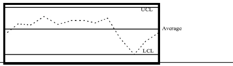
Required: Circle the points that are out of control. Explain why you circled these points.
THINK-TANK PROBLEMS
Although these problems are based on chapter material, reading extra material, reviewing previous chapters, and using creativity may be required to develop workable solutions.
12.51 costs-of-quality analysis. The chief executive officer (CEO) of Ukiah Company relieves that the firm can improve its profitability substantially by implementing a TQM system. Before committing the company to a TQM system, however, the CEO wants a preliminary estimate of the total costs of quality currently being incurred. The following information is available from the past year:
1. Sales revenue: $10,000,000; profit: $1,000,000
2. During the year, 2,000 units already sold and under warranty had to be repaired. Warranty repair costs average $100 per unit.
3. Nine inspectors are employed to perform final inspection. Each earns an annual salary of $30,000.
4. The company installed a quality training program that it requires its employees to take. The estimated annual cost of the program is $100,000.
5. Six employees handle customer complaints. Each earns an annual salary of $40,000.
6. A customer cancelled an order that would have increased profits by $300,000. The customer's reason for cancellation was poor product quality.
7. Each year, approximately 10,000 units are rejected in final inspection. It costs $50 per unit to rework these units.
8. The company gave sales allowances totalling $500,000 due to substandard products being returned by customers.
9. Total scrap is $600,000, of which 80% is quality related.
10. Product liability insurance premium is $100,000 per year.
11. Depreciation for testing equipment is $400,000 per year.
12. Retesting for reworked items runs approximately $200,000 annually.
13. Process inspection runs $300,000 annually.
Required:
a. Prepare a costs-of-quality report, classifying costs by category.
b. Calculate the ratio of quality costs to sales for each category.
c. Prepare a pie chart for the costs of quality. Discuss the distribution of the costs of quality among the four categories. Are they properly distributed? Explain.
d. Discuss how the company can improve its quality and at the same time reduce total costs of quality.
e. By how much will profits increase if quality costs are reduced to 2.5% of sales?
12.52 Preparing a pie chart and bar chart to show percentage of costs of quality. Costs of quality for Prime Company are 20% of sales. Costs of quality include the following:
• External failure costs, which are about 25 to 30% of costs of quality
• Internal failure costs, which are about 30 to 35% of costs of quality
• Appraisal costs, which are about 20 to 25% of costs of quality
• Prevention costs, which are about 5 to 10% of costs of. quality
Required: Draw a pie chart showing by a separated segment the costs of quality of 20%. Then draw a vertical bar chart showing the proportion of each category of cost contained within the separated pie chart segment. Discuss how Prime Company could improve its distribution of costs of quality.
12.53 Preparing a fishbone diagram. You are an entrepreneur who owns and manages a convenience store in Florida. Recently, your operation has been experiencing significant inventory variations, such as shortages in inventory and overages in related inventory items. This problem directly affects the profitability of your operation and your success in implementing just-in-time delivery.
Required: Develop a fishbone diagram that shows the possible causes of the operation's inventory variation. Draw upon your professional business experience in solving this significant problem.
12.54 Quality performance and ethical behavior. Zelac Manufacturing gives bonuses and trips to famous vacation spots in January to its plant managers who are able to incur less costs of quality than were budgeted. Travis Scarborough is plant manager of a plant in North Dakota. He decided to take the following actions during the last quarter of the year to beat the budgeted amounts and create a favorable production volume variance:
• Inspectors for final inspection will be transferred to a quality training program. The removal of inspectors will result in less rework and downtime. By increasing the quantity of products, the plant will incur less internal failure costs and also improve its production volume variance. Moreover, by transferring the inspectors to a quality training program, the budgeted level for prevention costs can be met.
• Travis also intends to delay all replacements and warranty repairs until the beginning of next year. This decision will increase customer dissatisfaction substantially, but Travis will try to get back in the good graces of customers next year when he reinstates the policy of promptly dealing with dissatisfied customers. In the meantime, his actions will enable him to incur internal failure costs substantially less than what was budgeted.
Required:
a. Assess Travis's ethical behavior. Is he justified in taking the actions described in the problem?
b. You are a CMA and the chief management accountant at Zelac. What will you do if Travis takes the preceding actions? Refer to the ethical code for management accountants in Chapter 1.
c. Provide a better way of measuring plant manager's quality performance than budgeting costs of quality for the managers to meet or beat. Also, comment on how a production volume variance may induce plant managers to produce low-quality products.